Attio design research
A measured teardown of attio.com: typography, colour, layout, heroes, sections, components, art direction, brand assets, motion and copy. It explains why each choice works and how to build in the same system.
- Captured: 2026-11-21. 32 pages at 1440 × 900, stitched from viewport tiles. Plus 390px and 768px captures of home and 390px of pricing.
- Measured with
getComputedStyle on every visible element (data/<page>.json), a style probe on 6 pages (data/<page>.probe.json), and the site's own CSS tokens (data/css-tokens.json).
- Public page inventory: public-pages.md, 1,216 URLs from the sitemaps, grouped.

The system in five lines
- A ruled grid. The 1,392px frame and every section are drawn with 1px cool-grey lines, like the product's record tables.
- Monochrome chrome, colour only in the product. Blue-tinted greys, one blue accent
#266df0, near-black CTAs.
- Inter at weight 500 everywhere. Inter Display for headings, Tiempos Text only for human quotes, JetBrains Mono for engineering.
- Two-tone headings. Claim in
#1c1d1f, proof in #6f7988, in one sentence.
- Product as illustration, hairlines for ideas. Live HTML mocks with believable data; 1px line art, dot clouds and dithered portraits for everything abstract.
System docs
| # |
Doc |
What is inside |
| 01 |
Design principles |
The seven rules behind every decision |
| 02 |
Color system |
Both neutral ramps, the accent, status colours, gradients, WCAG ratios |
| 03 |
Typography |
4 families and licences, the declared and measured scales, recipes |
| 04 |
Layout, grid and spacing |
Frame, content edges, columns, breakpoints, mobile changes, radii, shadows |
| 05 |
Heroes |
Six hero types and when each is used |
| 06 |
Section types |
25 section patterns with examples |
| 07 |
Copywriting |
The claim + proof formula, rhythm fragments, microcopy, vocabulary |
| 08 |
Components |
Nav, buttons and states, pills, inputs, cards, accordion, footer |
| 09 |
Art direction |
The five image families and their rules |
| 10 |
Brand assets |
Logo rules from /brand, official downloads, a 25-item graphics inventory |
| 11 |
Motion and interaction |
Easing tokens, measured transitions, keyframes, scroll effects |
| 12 |
Glossary |
The vocabulary to brief and build this style |
| 13 |
Build recipe |
CSS tokens, components, section skeletons, checklist |
Page reviews
Folder layout
attio_design/
  README.md  public-pages.md  01–13 system docs
  pages/        one review per page or template
  images/full/  32 full-page captures (1440px)
  images/<page>/  section crops (sections.json indexes them)
  images/assets/  26 graphic-asset crops (index.json)
  images/responsive/  390px and 768px captures
  data/         per-page measurements, probes, CSS tokens, public-pages.json
Notable findings
- The only blue CTA on the site is the Pro plan button on /pricing (02, pricing).
- Mobile changes the conversion goal. The home hero and closing CTA become an email field + "Send me a demo" at 390px (04).
- The product pages'
<h1> is the small product-name pill, not the big headline (platform-ai).
- The home page is 17,627px with only 5
<img> tags. Every mock is HTML.
- AI-search readiness.
robots.txt allows GPTBot, ClaudeBot and PerplexityBot. The footer links an "LLMs" page, and guides carry "Open in ChatGPT / Claude" buttons.
- Inconsistency: home says 30,000+ customers, About says 35,000+.
Gaps and limits
- Hover and focus values come from the CSS rules and resting styles. They were not filmed.
- Scroll effects and canvas animations (wormhole, AI dot cloud) were observed in captures but not timed. The
pipeline-radar keyframe bodies sit in a page-level CSS chunk that was not downloaded; only names and durations were measured.
- Customer-story and blog-post captures have sticky elements unstuck so they appear once. Help-article keeps its tall sticky sidebar, which shows twice in the stitched image.
- The home and platform pages were captured before the sticky fix. On home this is intended: it shows the scroll-spy rail at several positions.
- Not captured: individual pages of the 313 apps, 253 help articles, 228 changelog entries and the localised landing pages. They are listed in
public-pages.md, and one or two samples per template were captured.
- Logos and photos are Attio's property. Official files are linked from
pages/brand.md, not redistributed.
Public pages · every public attio.com URL
Source: https://attio.com/sitemap.xml and https://attio.com/f/sitemap.xml (listed in /robots.txt), plus /changelog, which is not in the sitemap. Fetched 2026-11-21. 1216 URLs. Titles come from each page's <title> tag, with the " | Attio" suffix removed.
Core marketing
17 pages.
Platform (product pages)
14 pages.
Solutions and tools
5 pages.
Customers
13 pages.
Blog
36 pages.
Engineering blog
14 pages.
Changelog
234 pages.
- Changelog (redirects to current year)
- 2021
- All notes page
- Collection permissions
- Dashboard views
- Notes on mobile
- Social handle improvements
- Team table
- 2022
- All records
- Bulk personalized email sending
- Collections overhaul
- Email sending
- Filtering and sorting improvements
- Improvements to automatic record creation
- Improvements to record pages
- ISO 27001
- Kanban improvements
- Kanban update and redesign
- Settings improvements
- Sidebar redesign
- 2023
- 100s of new icons
- Attributes for linked objects
- Automations
- Calendar event pages
- Changelog (Apr 18, 2023)
- Changelog (August 17, 2023)
- Changelog (December 12, 2023)
- Changelog (Feb 23, 2023)
- Changelog (July 13, 2023)
- Changelog (June 1, 2023)
- Changelog (June 22, 2023)
- Changelog (Mar 22, 2023)
- Changelog (May 18, 2023)
- Changelog (May 4, 2023)
- Dedicated search
- Downloadable reports
- Drag and drop table columns
- Email attachments
- Enhanced color palettes 🎨
- Enhanced permission controls
- Filter records by inclusion or exclusion in lists
- Full inbox sharing
- Historical reporting
- Improved API functionality
- Improved filter editing experience in automations
- June.so integration: your product data inside Attio
- Mobile list sorting
- Multi-cell copy and paste
- New activity timelines
- New API docs / dev center
- New comments system
- New currency formatting
- New integrations: Fillout, Relay, and more
- New integrations portal
- New template UI
- Next due task
- Real-time, dynamic reporting
- Record creation attribution
- Redesigned command palette
- Relative date filtering
- Relative time formatting
- Rename table columns
- Report and list duplication
- Subject line variables in emails
- Trigger test webhook events
- Updated Chrome extension
- Updated email editor
- Variables inside filter automation blocks
- View duplication
- Webhook updates
- Workspace and User objects
- 2024
- AI-boosted automations
- AI-powered email personalization
- Changelog (August 27, 2024)
- Changelog (December 11, 2024)
- Changelog (February 28, 2024)
- Changelog (January 18, 2024)
- Changelog (June 20, 2024)
- Changelog (May 8, 2024)
- Changelog (November 6, 2024)
- Changelog (September 25, 2024)
- Configurable record pages
- Drill-down emails
- Drill down into your reporting data
- Email read receipts
- Email signatures are here
- Enhanced core pages
- Ephemeral filtering
- Even more Sequences enhancements
- Expanded automations features
- Expanded automations features
- Export your data as a CSV
- Help center updates
- Image support in notes
- Importing improvements
- Mobile notes are here
- New browser extension integrations
- New ETL integrations
- New extensible workflow blocks
- New integrations
- New integrations
- New integrations: Cardinal, Circleback, and more
- New interaction tracking capabilities
- New Polytomic integration
- New referral program
- New reporting data tables
- Next-level note taking
- Pin favorites in your sidebar
- Powerful new integrations
- Powerful time comparison reporting
- Preview attribute updates
- Record and list entry creation templates
- The Attio Community is live
- Updated Zapier integration
- Updated Zapier integration
- View attribute edit history
- 2025
- AI insight templates
- API and Developer updates
- API updates
- Attio x Granola
- Attio x Linear
- Attio x PandaDoc
- Auto summaries and labels
- Automated call recap emails
- Automated sequence exiting
- Call transcripts in any language
- Cc/Bcc in mass send emails
- Changelog (April 15, 2025)
- Changelog (August 14, 2025)
- Changelog (December 17, 2025)
- Changelog (January 28, 2025)
- Changelog (July 16, 2025)
- Changelog (June 17, 2025)
- Changelog (March 13, 2025)
- Changelog (May 13, 2025)
- Changelog (October 14, 2025)
- Changelog (September 16, 2025)
- Compose emails directly in Attio
- Connect any record to your meetings
- Custom record actions
- Default AI insight templates for calls
- Ecosystem updates
- Improved settings pages
- Introducing Attio for desktop
- Introducing the Attio Ecosystem
- Meet the Developer Platform
- Meeting and Call Recording APIs (Beta)
- Meeting data in Quick actions
- Minimize your call screens
- New Aircall integration
- New: Attio Engineering blog
- New CPQ integration: Sequence
- New Default integration
- New integration: Super
- New integrations
- New to the App Store
- Numeric attribute formats
- Pin your windows while working
- Record overview page
- Record widgets
- Refreshed in-app help drawer
- Regenerate transcripts
- Respond to emails directly in Attio
- Share calls with anyone
- Shareable call sections
- Status tracking for People and Companies objects
- Teams
- Vibe code with our App SDK
- 2026
- A more intuitive Ask Attio
- A refreshed sidebar
- Activities
- App updates
- Ask Attio
- Ask Attio in Slack
- Ask Attio to take action
- Ask Attio updates
- Associated notes in meetings
- Attio in Clay
- Calls on mobile
- Changelog (April 29, 2026)
- Changelog (August 25, 2026)
- Changelog (February 25, 2026)
- Changelog (January 14, 2026)
- Changelog (July 28, 2026)
- Changelog (June 29, 2026)
- Changelog (March 24, 2026)
- Changelog (May 28, 2026)
- Changelog (October 29, 2026)
- Changelog (September 23, 2026)
- Claude Opus 4.7
- Custom context in Ask Attio
- Developer changelog is live
- Developer platform updates
- Emails on Deals and Custom Objects
- Files API
- Files on Deals and Custom objects
- Filter by current user
- Formula attributes are here
- IOS app update
- MCP server
- Mobile activity feed
- More App Store updates
- More models in Ask Attio
- New activity timeline
- New apps
- New apps in the store
- New Apps: Productboard and JustCall
- New blocks for workflows
- New Plain app
- New workflow blocks
- New Workflows apps
- New Workflows blocks
- Notion custom agents
- Performance improvements
- Permissions
- Record page redesign
- Redesigned record pages
- Rename system objects
- Request access to workflows directly
- The mobile app just got faster
- The new Workflows
- Updates to Ask Attio
- Updates to Developer platform
- Web research agent
- What's new in Workflows
- Work anywhere with Attio
- Workflow history and agent log
- Workflows updates
- Your new inbox
Apps marketplace
313 pages.
Templates
22 pages.
Help center and Academy
253 pages.
Careers
23 pages.
Partners and programs
7 pages.
Comparison and guides (/f)
28 pages.
Paid landing pages (/p)
54 pages.
Localized landing pages
171 pages.
- (Danish) Go to market, supercharged by AI
- (Danish) Go-to-market, forstærket af AI
- (Danish) CRM for the next generation of teams.
- (Danish) CRM for the next generation of teams.
- (Danish) CRM for the next generation of teams.
- (Danish) CRM'et til den næste generation af teams.
- (Danish) CRM for the next generation of teams.
- (Danish) CRM for the next generation of teams.
- (Danish) CRM for the next generation of teams.
- (Danish) CRM for the next generation of teams.
- (Danish) CRM for the next generation of teams.
- (Danish) CRM for the next generation of teams.
- (Danish) CRM'et til den næste generation af teams.
- (Danish) CRM for the next generation of teams.
- (Danish) CRM for the next generation of teams.
- (Danish) CRM for the next generation of teams.
- (Danish) CRM for the next generation of teams.
- (Danish) CRM'et til den næste generation af teams.
- (Danish) CRM for the next generation of teams.
- (German) Go to market, supercharged by AI
- (German) Go-to-Market, aufgeladen durch KI
- (German) CRM for the next generation of teams.
- (German) CRM for the next generation of teams.
- (German) CRM for the next generation of teams.
- (German) Das CRM für die nächste Generation von Teams.
- (German) CRM for the next generation of teams.
- (German) CRM for the next generation of teams.
- (German) CRM for the next generation of teams.
- (German) CRM for the next generation of teams.
- (German) CRM for the next generation of teams.
- (German) CRM for the next generation of teams.
- (German) Das CRM für die nächste Generation von Teams.
- (German) CRM for the next generation of teams.
- (German) CRM for the next generation of teams.
- (German) CRM for the next generation of teams.
- (German) CRM for the next generation of teams.
- (German) Das CRM für die nächste Generation von Teams.
- (German) CRM for the next generation of teams.
- (Spanish) Go to market, supercharged by AI
- (Spanish) Go-to-market, potenciado por IA
- (Spanish) CRM for the next generation of teams.
- (Spanish) CRM for the next generation of teams.
- (Spanish) CRM for the next generation of teams.
- (Spanish) El CRM para la próxima generación de equipos.
- (Spanish) CRM for the next generation of teams.
- (Spanish) CRM for the next generation of teams.
- (Spanish) CRM for the next generation of teams.
- (Spanish) CRM for the next generation of teams.
- (Spanish) CRM for the next generation of teams.
- (Spanish) CRM for the next generation of teams.
- (Spanish) El CRM para la próxima generación de equipos.
- (Spanish) CRM for the next generation of teams.
- (Spanish) CRM for the next generation of teams.
- (Spanish) CRM for the next generation of teams.
- (Spanish) CRM for the next generation of teams.
- (Spanish) El CRM para la próxima generación de equipos.
- (Spanish) CRM for the next generation of teams.
- (French) Go to market, supercharged by AI
- (French) Go-to-market, dopé par l'IA
- (French) CRM for the next generation of teams.
- (French) CRM for the next generation of teams.
- (French) CRM for the next generation of teams.
- (French) Le CRM pour la nouvelle génération d'équipes.
- (French) CRM for the next generation of teams.
- (French) CRM for the next generation of teams.
- (French) CRM for the next generation of teams.
- (French) CRM for the next generation of teams.
- (French) CRM for the next generation of teams.
- (French) CRM for the next generation of teams.
- (French) Le CRM pour la nouvelle génération d'équipes.
- (French) CRM for the next generation of teams.
- (French) CRM for the next generation of teams.
- (French) CRM for the next generation of teams.
- (French) CRM for the next generation of teams.
- (French) Le CRM pour la nouvelle génération d'équipes.
- (French) CRM for the next generation of teams.
- (Italian) Go to market, supercharged by AI
- (Italian) Go-to-market, potenziato dall'IA
- (Italian) CRM for the next generation of teams.
- (Italian) CRM for the next generation of teams.
- (Italian) CRM for the next generation of teams.
- (Italian) Il CRM per la prossima generazione di team.
- (Italian) CRM for the next generation of teams.
- (Italian) CRM for the next generation of teams.
- (Italian) CRM for the next generation of teams.
- (Italian) CRM for the next generation of teams.
- (Italian) CRM for the next generation of teams.
- (Italian) CRM for the next generation of teams.
- (Italian) Il CRM per la prossima generazione di team.
- (Italian) CRM for the next generation of teams.
- (Italian) CRM for the next generation of teams.
- (Italian) CRM for the next generation of teams.
- (Italian) CRM for the next generation of teams.
- (Italian) Il CRM per la prossima generazione di team.
- (Italian) CRM for the next generation of teams.
- (Dutch) Go to market, supercharged by AI
- (Dutch) Go-to-market, versterkt door AI
- (Dutch) CRM for the next generation of teams.
- (Dutch) CRM for the next generation of teams.
- (Dutch) CRM for the next generation of teams.
- (Dutch) Het CRM voor de volgende generatie teams.
- (Dutch) CRM for the next generation of teams.
- (Dutch) CRM for the next generation of teams.
- (Dutch) CRM for the next generation of teams.
- (Dutch) CRM for the next generation of teams.
- (Dutch) CRM for the next generation of teams.
- (Dutch) CRM for the next generation of teams.
- (Dutch) Het CRM voor de volgende generatie teams.
- (Dutch) CRM for the next generation of teams.
- (Dutch) CRM for the next generation of teams.
- (Dutch) CRM for the next generation of teams.
- (Dutch) CRM for the next generation of teams.
- (Dutch) Het CRM voor de volgende generatie teams.
- (Dutch) CRM for the next generation of teams.
- (Polish) Go to market, supercharged by AI
- (Polish) Go-to-market wzmocniony przez AI
- (Polish) CRM for the next generation of teams.
- (Polish) CRM for the next generation of teams.
- (Polish) CRM for the next generation of teams.
- (Polish) CRM dla nowej generacji zespołów.
- (Polish) CRM for the next generation of teams.
- (Polish) CRM for the next generation of teams.
- (Polish) CRM for the next generation of teams.
- (Polish) CRM for the next generation of teams.
- (Polish) CRM for the next generation of teams.
- (Polish) CRM for the next generation of teams.
- (Polish) CRM dla nowej generacji zespołów.
- (Polish) CRM for the next generation of teams.
- (Polish) CRM for the next generation of teams.
- (Polish) CRM for the next generation of teams.
- (Polish) CRM for the next generation of teams.
- (Polish) CRM dla nowej generacji zespołów.
- (Polish) CRM for the next generation of teams.
- (Portuguese) Go to market, supercharged by AI
- (Portuguese) Go-to-market, potenciado por IA
- (Portuguese) CRM for the next generation of teams.
- (Portuguese) CRM for the next generation of teams.
- (Portuguese) CRM for the next generation of teams.
- (Portuguese) O CRM para a próxima geração de equipas.
- (Portuguese) CRM for the next generation of teams.
- (Portuguese) CRM for the next generation of teams.
- (Portuguese) CRM for the next generation of teams.
- (Portuguese) CRM for the next generation of teams.
- (Portuguese) CRM for the next generation of teams.
- (Portuguese) CRM for the next generation of teams.
- (Portuguese) O CRM para a próxima geração de equipas.
- (Portuguese) CRM for the next generation of teams.
- (Portuguese) CRM for the next generation of teams.
- (Portuguese) CRM for the next generation of teams.
- (Portuguese) CRM for the next generation of teams.
- (Portuguese) O CRM para a próxima geração de equipas.
- (Portuguese) CRM for the next generation of teams.
- (Swedish) Go to market, supercharged by AI
- (Swedish) Go-to-market, förstärkt av AI
- (Swedish) CRM for the next generation of teams.
- (Swedish) CRM for the next generation of teams.
- (Swedish) CRM for the next generation of teams.
- (Swedish) CRM:et för nästa generations team.
- (Swedish) CRM for the next generation of teams.
- (Swedish) CRM for the next generation of teams.
- (Swedish) CRM for the next generation of teams.
- (Swedish) CRM for the next generation of teams.
- (Swedish) CRM for the next generation of teams.
- (Swedish) CRM for the next generation of teams.
- (Swedish) CRM:et för nästa generations team.
- (Swedish) CRM for the next generation of teams.
- (Swedish) CRM for the next generation of teams.
- (Swedish) CRM for the next generation of teams.
- (Swedish) CRM for the next generation of teams.
- (Swedish) CRM för nästa generations team.
- (Swedish) CRM for the next generation of teams.
Legal
12 pages.
01 · Design principles
Seven rules explain almost every measured decision on attio.com. Each one names the evidence, so you can check it in the screenshots and the data/ files.
1. The product is the hero image
The home hero is a live-looking Attio window, ≈1,080 × 620px at y≈580 (measured from the screenshot): sidebar, "Good morning, Alex", an AI prompt box and a meetings list. Every feature section after it is another product fragment: a lead table with ICP scores, a workflow graph, a Kanban pipeline, a SQL tool-call trace, an ARR chart.
The site contains no stock photography and no abstract illustration in the product story. Photography appears only in customer stories and on out-of-home campaign shots.
Why. A CRM is judged on whether its data model fits your business. Attio sells "flexible" and "agentic", so it shows the agents doing visible work on believable records. These are realistic fake companies with real-looking ICP scores, dates and dollar values.
How it is built. The mocks are real HTML, not screenshots. The whole 17,627px home page loads only 5 <img> elements, all customer-story covers, plus 1 <canvas>. The text is selectable, and the type is the product's own 14px/500 Inter at #242629. That is why the mocks stay sharp at every zoom and can animate.
2. Monochrome chrome, colour only inside the product
The nav, headings, buttons and footer use only grey and near-black. Blue #266df0 and the status colours appear only inside the product mock-ups (see 02).
Why. The eye goes to the only saturated pixels on the page, which are the product. A black CTA reads as confident and editorial rather than generic SaaS.
3. Two-tone headlines carry the whole message hierarchy
Almost every section heading is one sentence in two colours:
- Claim in
#1c1d1f, then explanation in #6f7988.
- Example: "The intelligent system that never sleeps. Picks up leads at 2am. Catches renewals before they slip."
- Same size (40/44, weight 500), same element. The muted half is a
<span> inside the <h2>.
Why. It replaces the classic H2 + subtitle pair with one typographic block. The reader gets the claim at a glance and the proof in the same breath, and the page saves a whole text style. It also keeps headings short in their dark part: about 3–7 words.
4. Medium weight everywhere
Weight 500 is the default for nearly all text. Body copy, nav, buttons, card titles and section headings all use it. Weight 600 is reserved for H1s (56–80px) and a few small labels. Weight 400 is used only for the footer links and the Tiempos serif quote.
Why. Inter at 500 has more presence on a white page without looking bold, which suits a dense, data-heavy UI. When everything sits at 500, colour (#1c1d1f vs #6f7988) does the hierarchy work instead of weight.
5. A visible grid, drawn as hairlines
The page sits inside a 1,392px frame with 1px vertical rules at both edges (x≈24 and x≈1416). Sections are separated by horizontal hairlines (#e4e7ec/#dee2e7). Feature blocks are cells of a table-like grid: a left rail of 289px, then content.
Dark sections draw a fine 8px vertical stripe texture in #fff/0.035.
Why. The ruled grid makes the marketing page feel like the product's spreadsheet-style record views. It is "structured data" expressed as layout. It also lets sections butt against each other with no shadows or card chrome.
6. Structure through cells, not cards
Feature content sits in grid cells with hairline borders. The cells have no shadows and no rounded card stacks. Shadows exist (--shadow-attio-layer-1…7, all at 1–7% black), but only to lift product windows off the page.
Why. It reads calm and dense at the same time. Each cell is a fixed frame that the product mock fills.
7. Motion explains the product, it does not decorate
The measured motion explains the product rather than decorating the page:
- The tabbed feature rail on home: Build pipeline → Convert leads → … The active tab is #1c1d1f, inactive tabs are #d3d8df, and the mock swaps when the tab changes.
- Workflow graph nodes get "Triggered / Completed" badges.
- Testimonial words go from #a4adba to ink as you scroll.
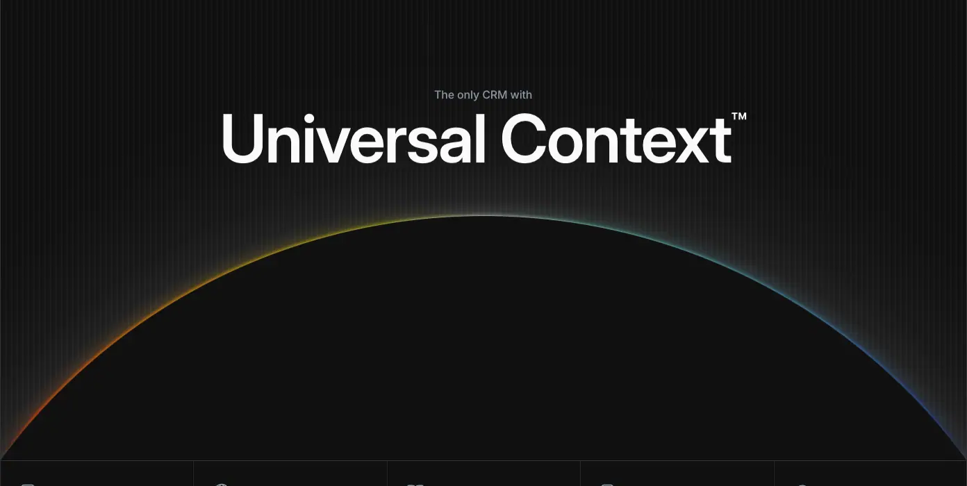
- The Universal Context horizon lights up.
- The footer has no animation.
- Keyframes in the CSS are short: dialog-scale-in scales from 0.96, and navigation-enter-from-right translates 200px with an 8px blur. See 11.
Why. Every animated element is a product behaviour: agents working, records updating, a number being explained. The page never animates for its own sake.
02 · Color system
Attio's marketing site is a cool-grey monochrome with one blue. Every neutral has a faint blue cast. Blue is the only colour that carries meaning: links, the eyebrow tag above each heading, and selected states. Red, yellow, green and violet appear only inside product UI mock-ups, where they mean something in the product (deal stage, status, risk).
Sources:
- data/css-tokens.json holds the primitives, read straight from the site's CSS (--color-*).
- data/<page>.json holds the computed colours actually painted on each page.
- The browser reports colours in lab() and oklab(). They were converted to sRGB hex with a D50→D65 Bradford transform (scratchpad/attio/labhex.py).
- Every computed value matched a token, to the hex.
The two neutral ramps
Attio names its greys by direction, not by lightness: black-* runs from ink toward mid grey, and white-* runs from paper toward mid grey. Higher numbers are closer to the middle.
| Token |
Hex |
Where it is used (measured) |
--color-black-0 |
#000000 |
Announcement bar background |
--color-black-50 |
#101010 |
Dark section background (Universal Context, Signals, SDK band), outline buttons on dark |
--color-black-100 |
#1c1d1f |
Heading ink. Every H1/H2/H3 on light sections. Footer background (#1c1d1f → #2e3238 gradient) |
--color-black-200 |
#202124 |
Primary button fill ("Start for free") |
--color-black-300 |
#232529 |
Strong UI text, author names |
--color-black-400 |
#2e3238 |
Nav link text, outline-button text |
--color-black-500 |
#383e47 |
Primary button hover fallback |
--color-black-600 |
#505967 |
Primary button border, footer column labels, stat captions |
--color-black-700 |
#6f7988 |
The second voice. Muted half of every two-tone heading, lead paragraphs, dates |
--color-black-800 |
#8f99a8 |
Muted text on dark sections, card body copy |
--color-black-900 |
#a4adba |
Testimonial words before they "light up" on scroll |
--color-white-100 |
#ffffff |
Page background, outline button fill |
--color-white-200 |
#fafafb |
Panel fill inside the feature frame, headings on dark |
--color-white-300 |
#f3f4f6 |
Primary button text, ghost hover |
--color-white-400 |
#edeff3 |
Text on dark outline buttons |
--color-white-500 |
#e4e7ec |
Hairline dividers in grids |
--color-white-600 |
#dee2e7 |
Hairlines |
--color-white-700 |
#d3d8df |
Inactive tab labels on the home "Build pipeline" rail |
--color-white-800 |
#cad0d9 |
Outline button border (lab(83.2…) = #cad0d9) |
--color-white-900 |
#b5bdc9 |
Footer link text, the 1px grid-line gradient |
Why two named ramps instead of one 50–950 scale. The two ramps match how the team reasons about a surface. On light pages you pick from white-* for surfaces and black-* for ink. On dark sections you swap them. The button tokens are built this way: --button-outline-bg: white-100, --button-outline-text: black-400.
Why the greys are blue-tinted. black-700 #6f7988 has blue 0x88 against red 0x6f. That 25-step lean is constant down the ramp. Against the one saturated blue, a blue-leaning grey reads as the same family. A warm grey would fight it. The product app uses the same cast, so screenshots placed on the page match the page.
The accent: one blue
| Token |
Hex |
Use |
--color-blue-100 |
#e8f0ff |
Eyebrow tag fill ("Platform", "Changelog") |
--color-blue-200 |
#c8dcff |
Eyebrow tag text on dark sections |
--color-blue-300 |
#94b9ff |
Gradient tint in grid backgrounds |
--color-blue-400 |
#709ff5 |
Second stop of the "Universal Context" horizon arc |
--color-blue-450 |
#538bf3 |
Chart fills |
--color-blue-500 |
#266df0 |
The accent. Product-mock primary buttons, chart bars, the "Pro" plan column, "New" badges |
--color-blue-600 |
#245bc2 |
Eyebrow tag text on light sections |
--color-blue-800 |
#1a2233 |
Eyebrow tag fill on dark sections |
Blue #266df0 appears 19 times as a background on the home page, and every one is inside a product mock-up or a badge. The marketing chrome (nav, hero CTAs and footer) has no blue. The CTA is near-black.
One exception, measured on /pricing: the Pro plan's "Start for free" button is #266df0 with a white label. It is the only blue CTA in the captured marketing chrome (see pages/pricing.md).
Why the CTA is black, not blue. Blue belongs to the product, plus the one plan Attio wants to sell. Inside the product, blue means "the action". Keeping it out of the marketing chrome gives the screenshots the only saturated colour on screen, so they become the focal point. The black pill CTA then reads as an editorial choice rather than as "SaaS blue".
Status colours (product mock-ups only)
| Token |
Hex |
Meaning in the mocks |
--color-green-500 |
#0fc27b |
Completed, healthy, positive deltas (+42% seats) |
--color-green-600 |
#0db472 |
|
--color-red-500 |
#ff5b59 |
At-risk, high priority |
--color-red-700 |
#ce2e4b |
|
--color-yellow-500 |
#f5b900 |
Watch, warning |
| violet (no token) |
#9b69ff |
"Proposal" stage dot, avatar tints |
| orange (no token) |
#f97514 |
Sequence step icons |
None of these touch the marketing typography. They prove the product is real: a pipeline has stages, so the stages have colours.
Dark sections
The home page switches to dark between y≈9,250 and y≈13,000: Universal Context, Signals, Connectivity and the SDK band. The closing CTA band and footer are dark too.
| Role |
Value |
| Section background |
#101010 (black-50) |
| Heading |
#fafafb (white-200) |
| Muted heading half and body |
#8f99a8 (black-800) |
| Eyebrow tag |
text #c8dcff on fill #1a2233 |
| Grid lines |
repeating-linear-gradient(to right, #ffffff/0.035 0 1px, transparent 1px 8px), a vertical hairline every 8px |
| Footer |
linear-gradient(-30.12deg, #1c1d1f 25.6%, #2e3238 163%) |
Why go dark in the middle of the page. The dark run covers the "platform" story: context, signals, integrations, SDK. That is the infrastructure part, and the dark band reads as "under the hood". It also resets the eye after about 9,000px of white product screenshots.
Gradients and light (measured)
| Where |
CSS |
| Hero wash behind the product window |
radial-gradient(90% 80% at 50% 100%, #e6ecff 0%, #bccbff 45%, #86a0ee 100%), faded by a white radial mask radial-gradient(70% 106.667% at 50% 0%, #fff 32%, transparent 64%) |
| Universal Context horizon |
conic-gradient(#eef1ea 0deg, #6cbdb0 10deg, #161e69 60deg, … #bb2a1e 180deg …): a teal-to-navy-to-red rim light on a black planet edge |
| Primary button |
radial-gradient(at center -10%, var(--from), var(--to)). At rest from = to = #202124. On hover, from becomes #505967, so a soft light appears from the top edge |
| Engineering blog |
Same #101010 black with ASCII-art imagery |
| Grid-line stripes |
linear-gradient(#000/0, #a4adba 50%, #000/0), 1px lines that fade at both ends |
Contrast (WCAG 2.x, computed)
| Pair |
Role |
Ratio |
Result |
#1c1d1f on #ffffff |
Heading ink |
16.87 |
AAA |
#2e3238 on #ffffff |
Nav, button text |
12.89 |
AAA |
#505967 on #ffffff |
Footer labels, captions |
7.08 |
AAA |
#6f7988 on #ffffff |
Muted heading half, lead paragraph |
4.41 |
AA large only (fails AA for 14–18px body) |
#8f99a8 on #ffffff |
Card body copy on light |
2.88 |
Fails |
#a4adba on #ffffff |
Unrevealed testimonial words |
2.27 |
Fails (decorative state) |
#266df0 on #ffffff |
Blue on white |
4.64 |
AA |
#245bc2 on #e8f0ff |
Eyebrow tag (light) |
5.47 |
AA |
#c8dcff on #1a2233 |
Eyebrow tag (dark) |
11.46 |
AAA |
#fafafb on #1c1d1f |
Heading on dark |
16.17 |
AAA |
#8f99a8 on #101010 |
Body on dark |
6.61 |
AA |
#505967 on #101010 |
Labels on dark |
2.69 |
Fails |
#fafafb on #202124 |
Primary button label |
15.43 |
AAA |
Reading this. Attio uses #6f7988 (4.41:1) as the muted half of 40px headings. At that size the text is "large", so it passes AA (3:1). The same grey on 16px lead copy is 0.09 short of AA. The site accepts that trade for the softer two-tone look. Copy this system, but use black-600 #505967 (7.08:1) for any body-size muted text.
03 · Typography
Attio uses four families, each with one job:
| Family (CSS name) |
Role |
Weights loaded |
Where to get it / licence |
Inter Display (interDisplay) |
Every headline: H1, two-tone H2s, stats, eyebrow labels in caps |
500, 600, 700 |
Free, SIL OFL. Inter Display is the optical "display" cut of Inter 4 (rsms.me/inter, Google Fonts "Inter" with opsz). |
Inter (inter) |
UI, nav, body copy, product mock-ups, buttons, footer |
400, 500, 600, 700 |
Free, SIL OFL (rsms.me/inter) |
Tiempos Text (tiemposText) |
One job: large customer quotes, regular and italic |
400, 400 italic |
Commercial, Klim Type Foundry (klim.co.nz). Free substitutes: Source Serif 4, Newsreader, Literata. |
| JetBrains Mono |
Engineering blog wordmark, ASCII art, code blocks, // partner labels, docs URLs |
variable 100–800 |
Free, SIL OFL (jetbrains.com/lp/mono) |
Source: @font-face rules in the site CSS (data/css-tokens.json → font_faces). Every family ships a metric-matched fallback: inter Fallback is local(Arial) with size-adjust:107.89%; ascent-override:89.79%. That stops layout shift when the web font swaps in. Copy this; Next.js next/font generates it.
Why two Inters. Inter's text cut has open spacing and large x-height, built for 11–16px UI. At 40–80px those features look loose. Inter Display has tighter default spacing and finer details, so headings need less negative tracking. Attio still applies −0.01 to −0.025em on top. Same skeleton, two optical sizes. The page looks like one typeface but each size is tuned.
Why a serif for quotes only. One serif moment marks a voice change: "a human is talking now". Tiempos Text is a text serif, so it stays calm even at 48px.
The declared scale (CSS tokens)
The site's Tailwind theme declares this scale. Every value is paired: size / line-height / weight / tracking.
| Token |
Size |
Line height |
Weight |
Tracking |
text-xs |
12px |
18px |
500 |
0 |
text-sm |
14px |
20px |
500 |
−0.005em |
text-base |
16px |
22px |
500 |
−0.01em |
text-lg |
18px |
24px |
500 |
−0.01em |
text-xl |
20px |
26px |
500 |
−0.01em |
text-2xl |
24px |
30px |
500 |
−0.01em |
text-heading-xs |
28px |
34px |
600 |
−0.01em |
text-heading-sm |
32px |
36px |
600 |
−0.01em |
text-heading-md |
40px |
44px |
600 |
−0.01em |
text-heading-lg |
56px |
60px |
600 |
−0.015em |
Notice the default weight is 500 for every body size. That is the single most distinctive Attio type decision. See principle 4 in 01-design-principles.md.
The measured scale (what is actually painted)
Measured with getComputedStyle on each page (data/<page>.json → heads, texts, hist).
Display and headings
| Use |
Family |
Size / LH |
Weight |
Tracking |
Colour |
Pages |
| About H1 |
Inter Display |
80 / 80 |
600 |
−2px (−0.025em) |
#1c1d1f |
about |
| Universal Context™ |
Inter Display |
96 / 96 |
600 |
−2.304px (−0.024em) |
#fafafb |
home |
| Home H1 |
Inter Display |
64 / 60.8 (0.95) |
600 |
−1.28px (−0.02em) |
#1c1d1f |
home |
| Page H1 (product, pricing, blog, stories) |
Inter Display |
56 / 60 |
600 |
−0.84px (−0.015em) |
#1c1d1f or #fff |
pricing, platform-*, customers, blog-post |
| Closing CTA |
Inter Display |
56 / 56 |
500 |
−0.84px |
#ffffff |
every page |
| Two-tone section H2 (home) |
Inter Display |
40 / 44 |
500 |
−0.4px |
#1c1d1f + #6f7988 |
home, pricing |
| Section H2 (product pages) |
Inter Display |
32 / 36 |
600 |
−0.32px |
#1c1d1f |
platform-*, about |
| Feature-rail H3 (two-tone) |
Inter Display |
24 / 27.6 |
500 |
−0.24px |
#1c1d1f + #6f7988 |
home |
| Article H2 |
Inter |
24 / 30 |
700 |
−0.24px |
#1c1d1f |
blog-post, engineering-post |
| Card / cell title |
Inter |
18 / 22–24 |
500–600 |
−0.18px |
#1c1d1f, #232529 |
home, platform-* |
| Big stat |
Inter Display |
56 / 60 (stories), 32 / 32 (home) |
600 / 500 |
−0.84 / −0.32px |
#1c1d1f |
customer-story, home |
| Testimonial |
Tiempos Text |
48 / 52 (40 / 44 on product pages) |
400 |
−0.72px |
#a4adba → ink on scroll |
home, pricing, workflows |
| Mixed-font heading |
Inter Display 600 + Tiempos Text 400 |
40 / 44 |
600 / 400 |
−0.4 / −0.6px |
#1c1d1f |
customers, customer stories ("The CRM behind thousands of companies.") |
Two heading registers. The home page and pricing use weight 500 two-tone headings at 40px: soft, conversational, explanatory. Product pages (/platform/*), about and stories use weight 600 single-tone headings at 32px: firmer, more like documentation titles. The H1 is always 600.
Line height tightens as size grows. It is 1.375 at 16px, 1.1 at 40px, 1.07 at 56px, 0.95 at 64px and 1.0 at 80–96px. Display lines sit almost solid, so a two-line H1 reads as one block.
Tracking tightens as size grows. It is −0.01em at body sizes, −0.015em at 56px, −0.02em at 64px and −0.024 to −0.025em at 80–96px. This is the standard optical rule: big type needs tighter tracking to look evenly spaced.
Labels and small type
| Use |
Family |
Size / LH |
Weight |
Tracking |
Case |
Colour |
| Eyebrow tag (pill) |
Inter |
14 / 20 |
500 |
−0.14px |
Sentence |
#245bc2 on #e8f0ff (light), #c8dcff on #1a2233 (dark) |
| Eyebrow (product pages) |
Inter |
13 / 18.2 |
500 |
−0.16px |
Sentence |
#232529 in an outlined pill |
| Meta caps ("TABLE OF CONTENTS", "A CONVERSATION WITH", dates, categories) |
Inter Display |
12 / 14 |
600 |
+0.72px (+0.06em) |
UPPERCASE |
#a4adba light, #505967/#8f99a8 dark |
| Bracket label ("[ DEVELOPER PLATFORM ]", "[PRODUCT]") |
Inter Display |
12 / 14 |
600 |
+0.72px |
UPPERCASE in [ ] |
#8f99a8 |
| Mono label (engineering) |
JetBrains Mono |
12–14 / 18–20 |
500 |
0 |
UPPERCASE |
#8f99a8, #fff |
| Nav link |
Inter |
15 / 22 |
500 |
−0.16px |
— |
#2e3238 |
| Button |
Inter |
14 / 20 (36px tall), 12 / 18 (32px tall) |
500 |
−0.07px / 0 |
— |
see 08 |
| Footer column label |
Inter |
14 / 20 |
500 |
−0.07px |
— |
#505967 |
| Footer link |
Inter |
14 / 20 |
400 |
−0.07px |
— |
#b5bdc9 |
| Legal line |
Inter |
12 / 18 |
400 |
0 |
— |
#505967 |
| Announcement bar |
Inter |
13 / 20 |
500 |
−0.16px |
— |
#ffffff on #000 |
Why caps get positive tracking. Every lowercase style is tracked negative and every uppercase style positive, at +0.06em. Capitals packed at body tracking collide visually, and opening them up makes 12px caps legible. This is a classic typesetting rule applied consistently.
Body and reading
| Use |
Family |
Size / LH |
Weight |
Tracking |
Colour |
Measure |
| Hero lead (home) |
Inter |
18 / 23.4 |
500 |
−0.18px |
#6f7988 |
486px ≈ 50 characters |
| Hero lead (product pages) |
Inter |
20 / 26 |
500 |
−0.2px |
#232529 |
556px |
| Feature cell body |
Inter |
16 / 22 |
500 |
−0.16px |
#8f99a8 |
459px |
| Article body |
Inter |
16 / 26 (1.625) |
400 |
−0.16px |
#232529 (light), #edeff3 (dark) |
811px column ≈ 95 characters |
| Article emphasis |
Inter |
16 / 26 |
600 |
−0.16px |
same |
— |
| Inline code / tokens |
Inter at 16px, coloured #709ff5 |
— |
400 |
— |
— |
— |
| Code block |
JetBrains Mono |
13 / 19.5 (1.5) |
400 |
−0.07px |
#d4d4d4 |
— |
Why articles drop to 400 and open up to 1.625. Marketing copy is a few words per block, so weight 500 gives it presence. Long-form reading at 500 becomes heavy and dark grey. At 400 with leading-relaxed (1.625), a page of text gets an even grey texture. The site switches register as soon as you are reading, not scanning.
Article H2 uses Inter Bold 700, not Inter Display. In a reading column the subheads must stop the eye inside running text, so they need weight contrast against 400 body. Display headings rely on size, which an 811px column cannot afford.
Recipes
/* Two-tone section heading */
.h-two-tone { font: 500 40px/44px "interDisplay", "Inter Display", Inter, sans-serif; letter-spacing: -0.01em; color: #1c1d1f; text-wrap: balance; }
.h-two-tone span { color: #6f7988; }

/* Page H1 */
.h1 { font: 600 56px/60px "interDisplay", sans-serif; letter-spacing: -0.015em; color: #1c1d1f; }

/* Meta caps */
.meta { font: 600 12px/14px "interDisplay", sans-serif; letter-spacing: 0.06em; text-transform: uppercase; color: #a4adba; }

/* Article body */
.prose p { font: 400 16px/26px Inter, sans-serif; letter-spacing: -0.01em; color: #232529; max-width: 811px; }
.prose h2 { font: 700 24px/30px Inter, sans-serif; letter-spacing: -0.01em; color: #1c1d1f; }

/* Quote */
.quote { font: 400 48px/52px "Tiempos Text", "Source Serif 4", Georgia, serif; letter-spacing: -0.015em; }
04 · Layout, grid and spacing
Sources: data/<page>.probe.json → maxw, radii, nav, CSS tokens (--spacing: .25rem, --container-*, --breakpoint-lg: 992px), and element positions in data/<page>.json.
The frame
| Measure |
Value |
Evidence |
| Page container |
max-width 1440px, padding 0 24px |
The most common non-100% max-width on every probed page (21× on home) |
| Ruled frame |
1px vertical lines at x = 24 and x = 1416. Content cells run 25 → 1415 (1,390px) |
About H2 at x=25, w=1390; customer cards at x=26, w=1388 |
| Marketing content edge |
x = 83 (59px inside the frame) |
Every home section H2 starts at x=83 |
| Document content edge |
x = 141 (117px inside the frame) |
Blog, changelog, brand, career, customer-story and developer H1s all start at x=141 |
| Left rail |
289px (x 24–313) |
Home feature rail buttons are 289px; help sidebar is 265px + padding; app sidebar starts at x=83 |
| Content after a rail |
x = 401–430 |
Home feature H3s at x=430; app detail main at x=459; help article at x=430 |
| Reading column |
656px (changelog entry, blog post body, career post), 811px (article H2 width) |
maxw: 656.094px (21× on blog-post) |
| Cell width in a 2-up grid |
481px (product pages) or 578px (customer rows) |
[01]–[04] cells at x=190 and x=769, w=481 |
| Cell width in a 3-up grid |
392px |
Engineering blog, changelog (maxw 392px, 61× on changelog) |
| Cell width in a 4-up grid |
319–322px |
Home changelog cards, pricing plan cards |
| Cell width in a 5-up grid |
≈278px |
Home logo grid, Universal Context benefits |
Why a ruled 1,392px frame. Most SaaS sites centre a 1,200px container on an empty page. Attio draws the container. The two vertical rules and the horizontal section rules turn the page into a table, the same visual model as the product's record grid. Content snaps to cells, so nothing floats.
Why two content edges. Marketing sections start at x=83, close to the frame. They feel wide and confident. Documents start at x=141, further in, with a narrower column, so they read like a page in a book. One frame, two margins.
Breakpoints (from the CSS media queries)
| Query |
Role |
min-width: 360px, 480px, 576px |
Small-phone refinements |
min-width: 992px (--breakpoint-lg) |
The main desktop switch: nav, grids and rails turn on |
max-width: 1199px / min-width: 1200px |
Wide-desktop refinements |
(not (min-height: 700px)) and (min-width: 992px) |
Short-laptop heroes (height-aware) |
(hover: hover) and (pointer: fine) |
Hover styles only for mouse users |
(prefers-reduced-motion: reduce) |
Motion fallbacks |
Responsive captures: images/responsive/home-mobile.png (390px, 16,243px tall), home-tablet.png (768px) and pricing-mobile.png (390px).

What changes at 390px (seen in the capture):
- The nav collapses to the wordmark and a ☰ menu button.
- The hero CTA changes. "Talk to sales" and "Start for free" become an email field + a full-width black "Send me a demo" button, with "Talk to sales →" as a text link. The closing CTA band does the same. On a phone, nobody signs up for a CRM, so the page asks for an email to send a demo instead. This is a different conversion goal per device.
- The logo grid becomes 2 columns of ruled cells.
- The sticky feature rail becomes a horizontal tab strip ("Build pipeline · Convert leads · Run sales mo…") that scrolls sideways.
- Two-tone headings wrap to 4–7 lines and keep both colours. Section headings in the dark band switch to centre alignment.
- The frame rules stay at the screen edges.
Spacing
- Base unit:
--spacing: .25rem (4px). That is Tailwind's default multiplier.
- Section rhythm on home: sections are separated by a hairline, not by empty space.
- Eyebrow → heading: 48px from eyebrow top to H2 top (1669 → 1717). The pill is 24px tall, so the gap is ≈24px.
- Heading → content: the two-tone H3 sits in a ≈120–140px tall text cell. The mock panel starts at the next rule.
- Buttons: 36px tall in heroes and nav, 32px for in-section link buttons, 40px for the newsletter "Subscribe".
- Nav: 48px announcement bar + 68px nav row = 116px header (
HEADER h=116). The bottom border is 1px solid #e4e7ec, the background #ffffff/0.95. The nav row stayed in view in every capture tile, so it is sticky on scroll.
Radii (counted on home)
| Radius |
Count |
Use |
| 8px |
136 |
Product mock cards, inputs, small panels |
9999px (3.35544e+07px, a full pill) |
130 |
Eyebrow pills, tags, avatars, status dots |
| 12px |
82 |
Product windows, larger cards |
| 10px |
55 |
All marketing buttons (primary, outline, nav links) |
| 6px |
36 |
Chips inside mocks |
| 23px |
30 |
App icon tiles (≈48px squircles) |
| 16px / 20px |
5 / 4 |
The largest frames (pricing cards use 20px) |
| 30% |
363 (engineering blog) |
The rounded squares of the PR contribution grid |
Why 10px for buttons. It is softer than the 8px product radius, so marketing buttons read as slightly more inviting than in-app controls. They are not pills, which would clash with the ruled, rectangular frame.
Shadows
The tokens --shadow-attio-layer-1…7 stack 1–7% black at growing blur (1px → 128px). On home, the most common shadows are:
- inset 0 .2px .2px 2px #fff/0.1, 0 1.5px 1.5px #000/0.25 (30×): the dark app-icon tiles, a lit top edge.
- 0 0 1px 1px #00163e/0.01, 0 4px 12px -1px #00163e/0.04, 0 1px 3px -1px #00163e/0.18 (15×): product cards, with a navy-tinted shadow.
- 0 1px 3px #000/0.04, 0 0 2px #1c2840/0.18 (13×): small chips.
Why navy-tinted shadows. A shadow tinted with the blue-grey ramp's hue (#00163e, #1c2840) blends into the cool page. A pure black shadow looks dirty on blue-grey surfaces.
05 · Hero styles
attio.com uses six hero types. Each one is matched to what the page sells. All measurements come from data/<page>.json.
| # |
Type |
Pages |
Alignment |
Headline |
Art |
| A |
Category statement + product window |
home, /p/ landing pages |
Centred |
64/60.8 weight 600 (home), 56/60 (landing) |
Live HTML product window on a blue radial wash |
| B |
Product split |
/platform/ai, /platform/workflows, /careers, /startups |
Left text (556px), art right |
56/60 weight 600, the <h1> is the pill |
Canvas dot cloud, workflow graph, or halftone squares |
| C |
Centred + orbiting metrics |
/platform/reporting |
Centred |
56/60 |
Floating metric cards and concentric hairline circles |
| D |
Blueprint dark |
/platform/developers |
Left |
56/60 white |
Wireframe logomark on a grid, #101010 |
| E |
Centred title + logo wall |
/customers, /apps, /partners, /download, /help |
Centred |
56/60 |
A logo or icon grid below, or nothing |
| F |
Document header |
blog posts, changelog, brand, career posts, customer stories, templates |
Left at x=141 |
56/60 (24/30 for changelog entries) |
Caps meta row above; cover image, video or nothing |
| — |
Mission statement |
/about |
Centred |
80/80, −2px |
Full-width team photo |
A · Category statement + product window
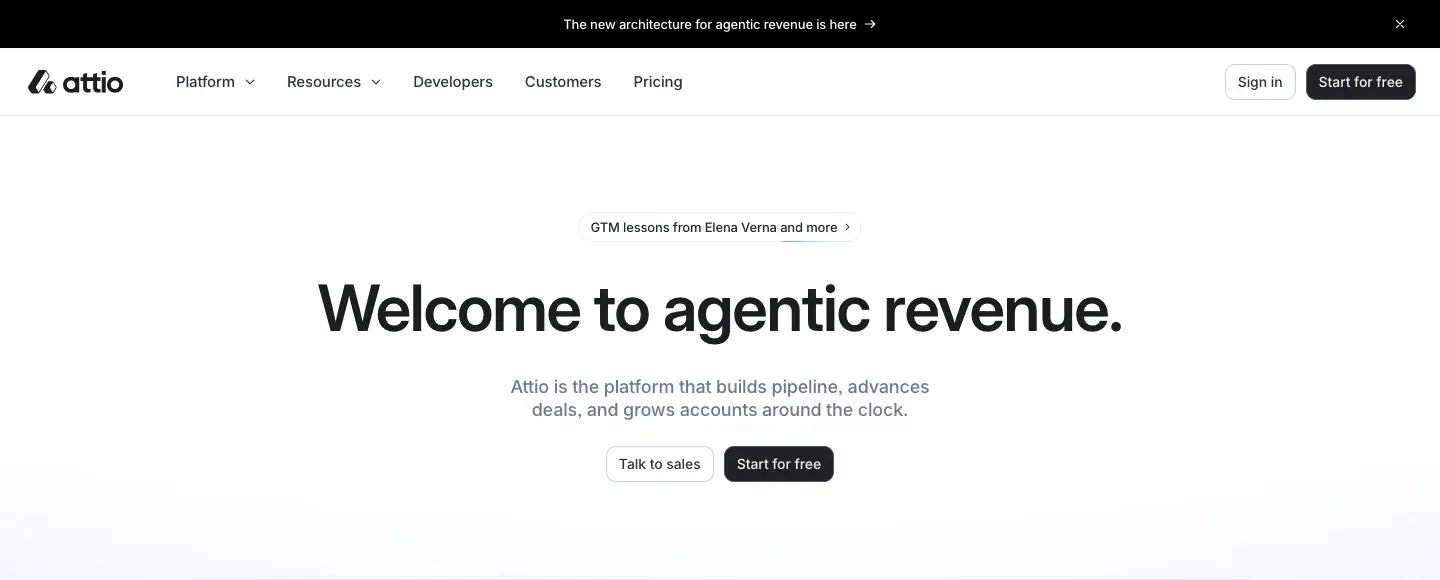
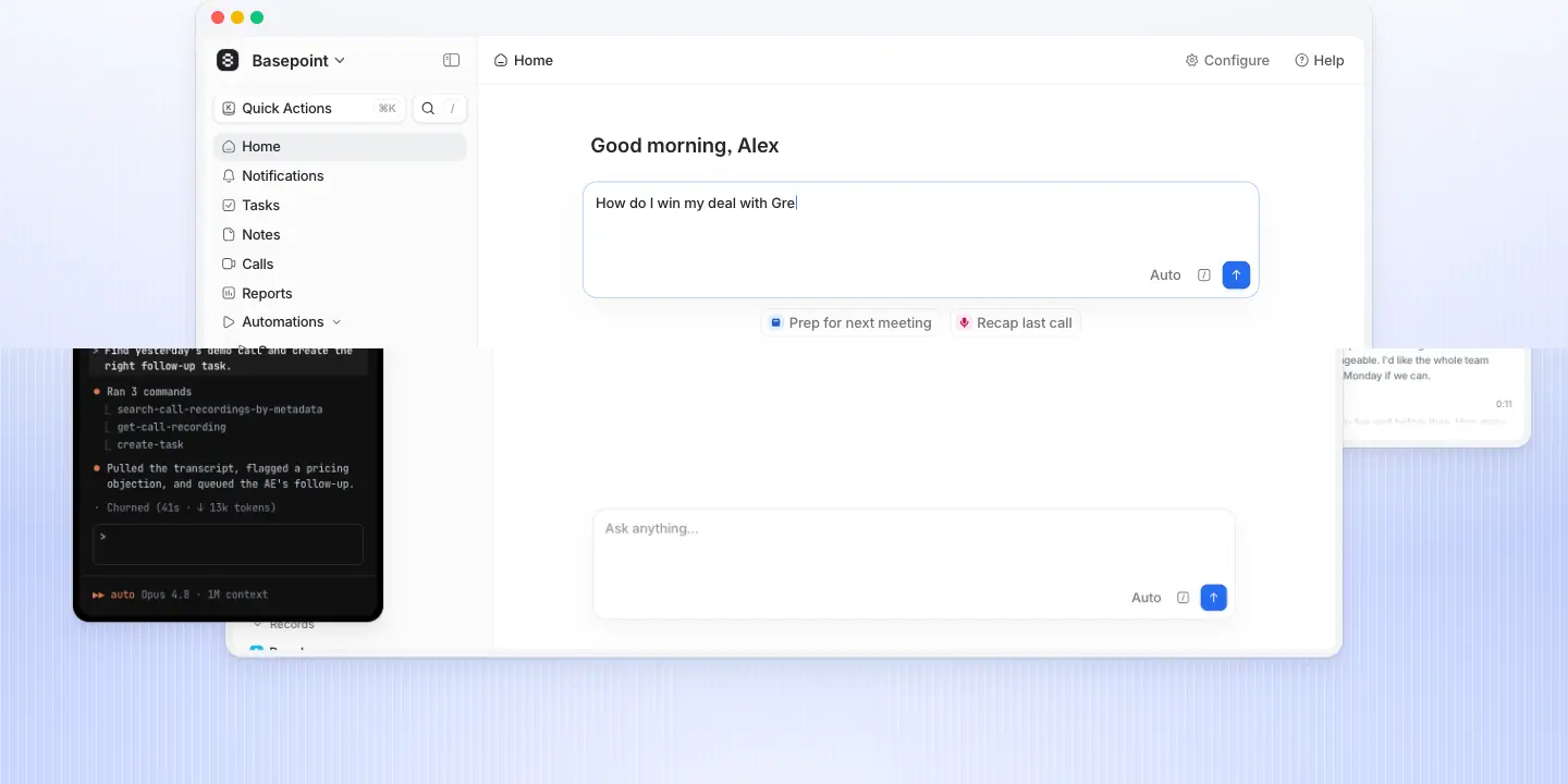
The structure, top to bottom:
1. a news pill (30px tall, hairline border);
2. a one-line H1 at 64px;
3. a two-line grey lead at 18/23.4;
4. two 36px buttons (outline, then solid);
5. a ≈1,080px product window rising out of a blue radial glow.
When to use it: on the home page, when the headline is a category claim and the product is the proof.
B · Product split
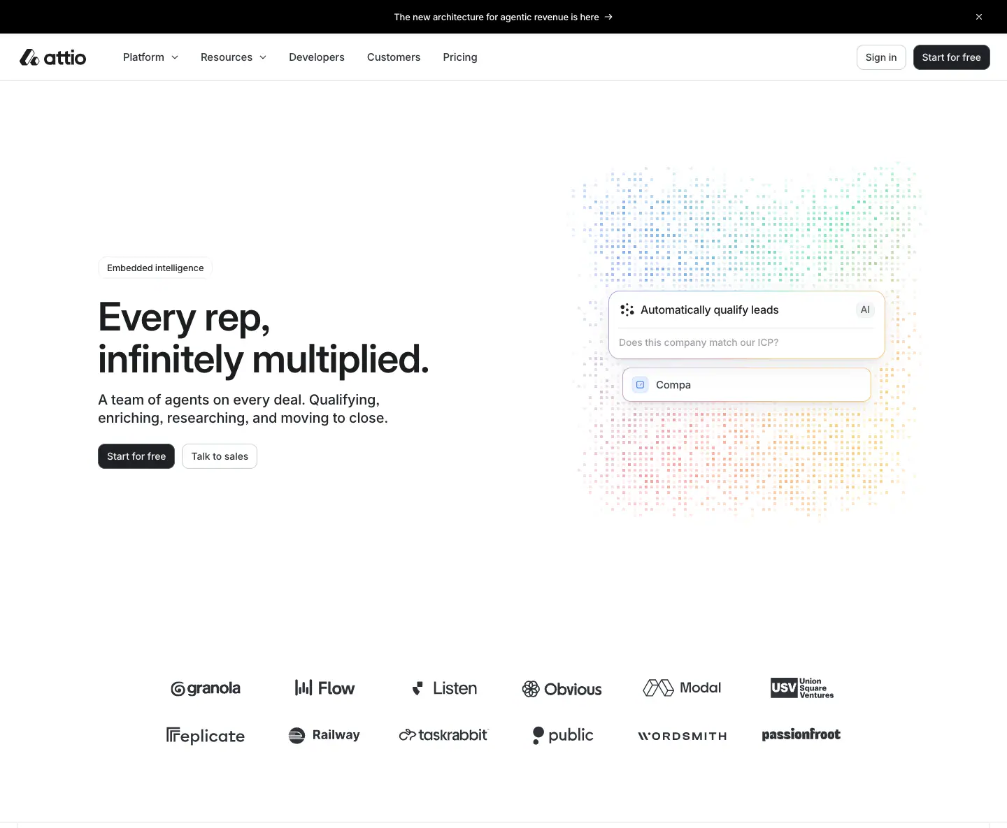
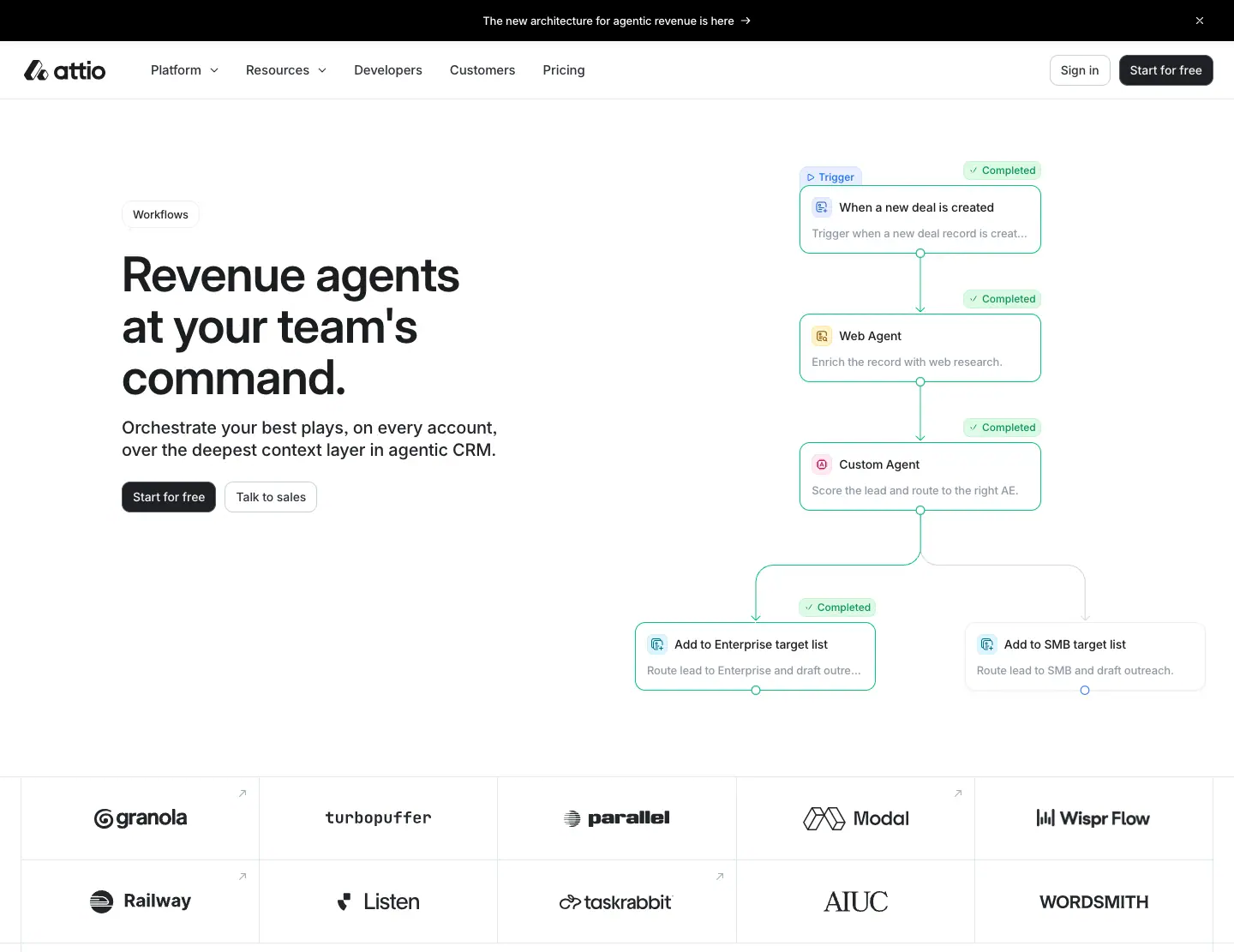
Left column, top to bottom:
1. a product-name pill (13/18.2, outlined);
2. a slogan at 56/60, 2–3 lines;
3. a lead at 20/26 in #232529, darker than home;
4. "Start for free" (solid) then "Talk to sales" (outline).
The right column holds an "idea" image: the AI dot cloud, the workflow graph, the careers square cloud. A ruled logo grid follows.
Why the primary button comes first here: these are deeper-funnel pages. Visitors arriving on a product page are closer to signing up, so the self-serve CTA leads.
C · Centred + orbiting metrics
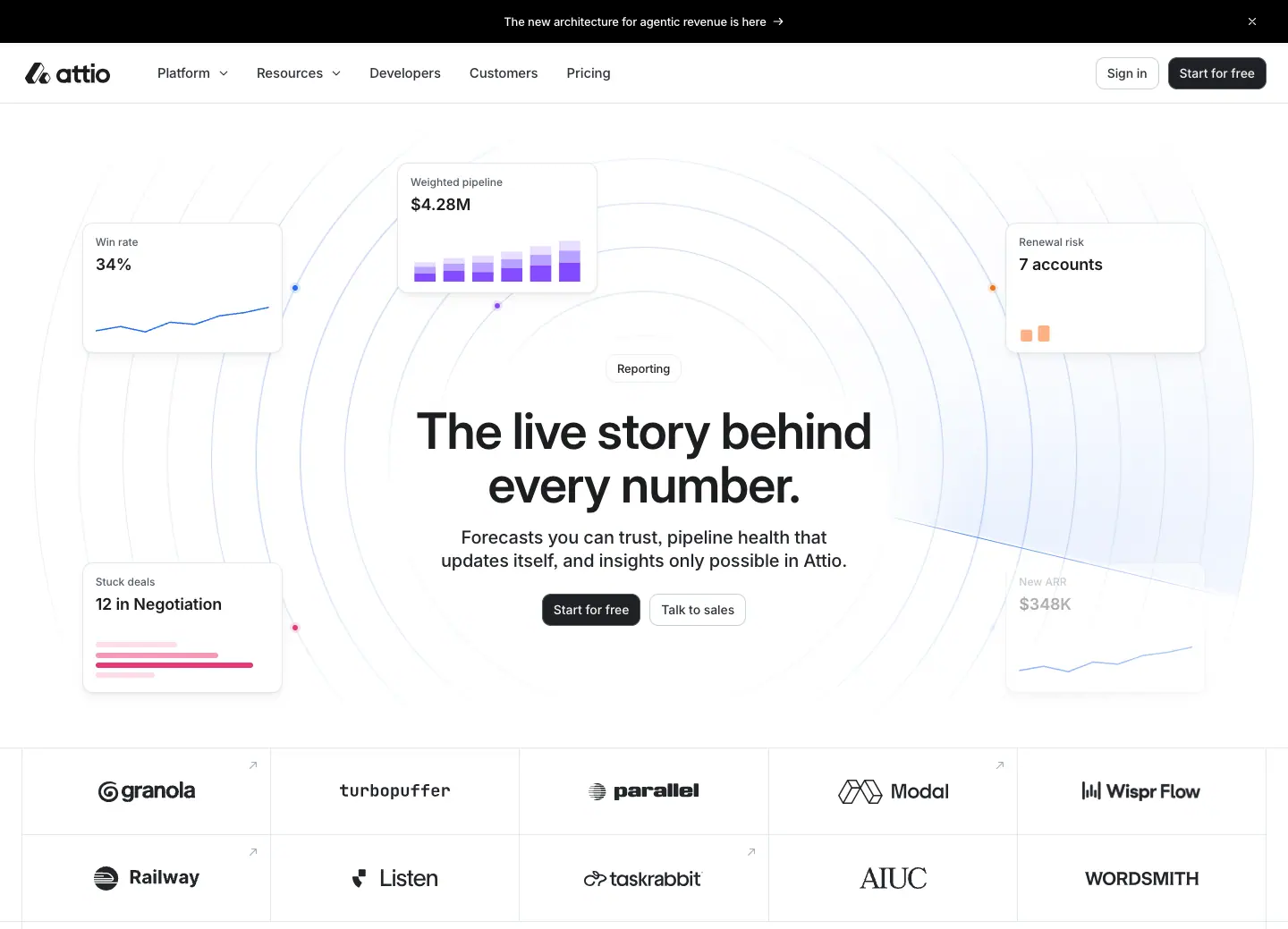
The text is centred. Six small metric cards float at the corners, with concentric hairline circles behind. Use it for analytics or data products: the reader sees numbers before reading.
D · Blueprint dark
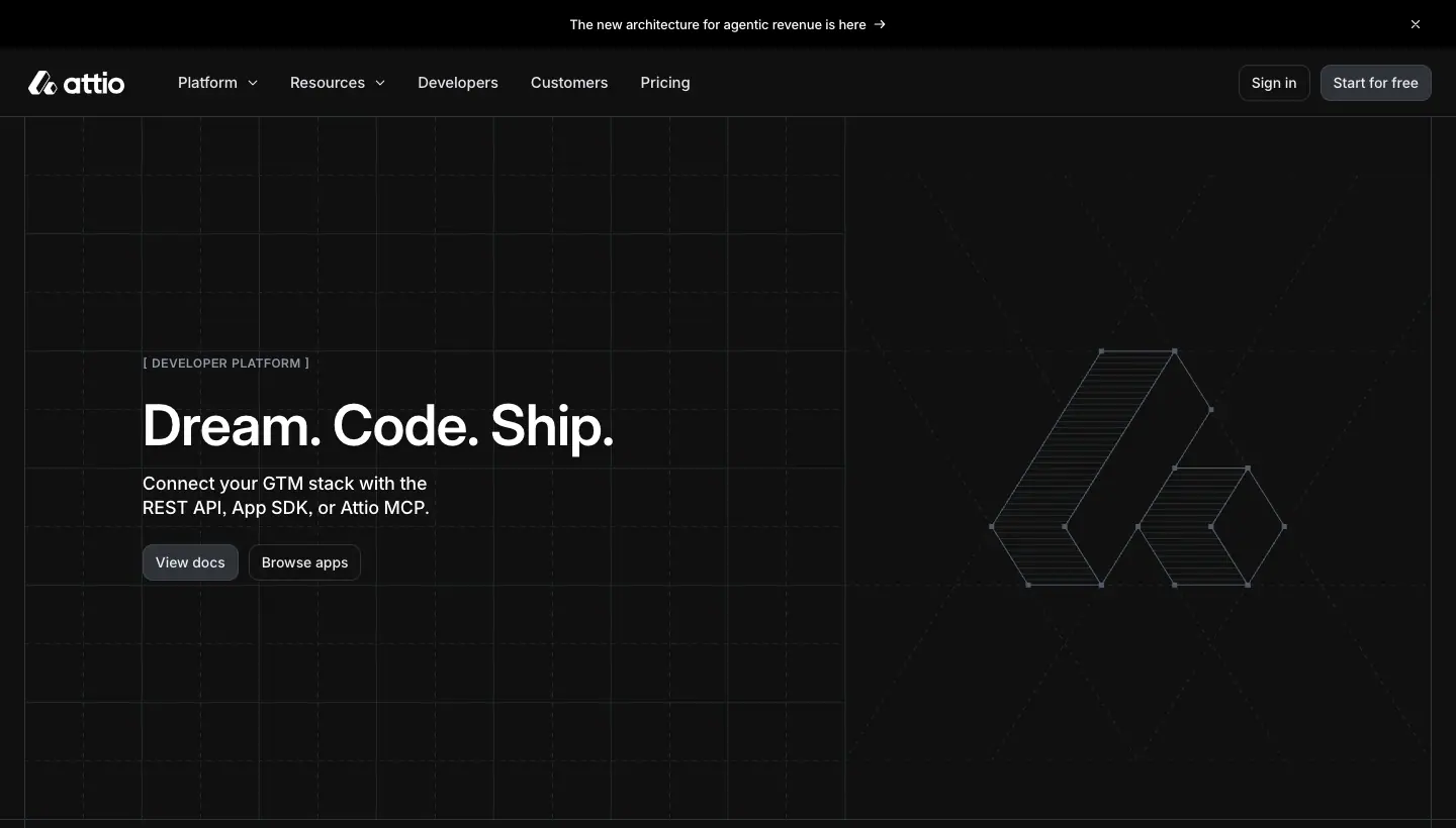
The <h1> is a bracketed caps label, "[ DEVELOPER PLATFORM ]". The headline is a three-word rhythm, "Dream. Code. Ship.". CTAs are "View docs" (filled #2e3238) and "Browse apps". The art is a construction drawing of the logomark. Use it for a technical audience.
E · Centred title + logo wall
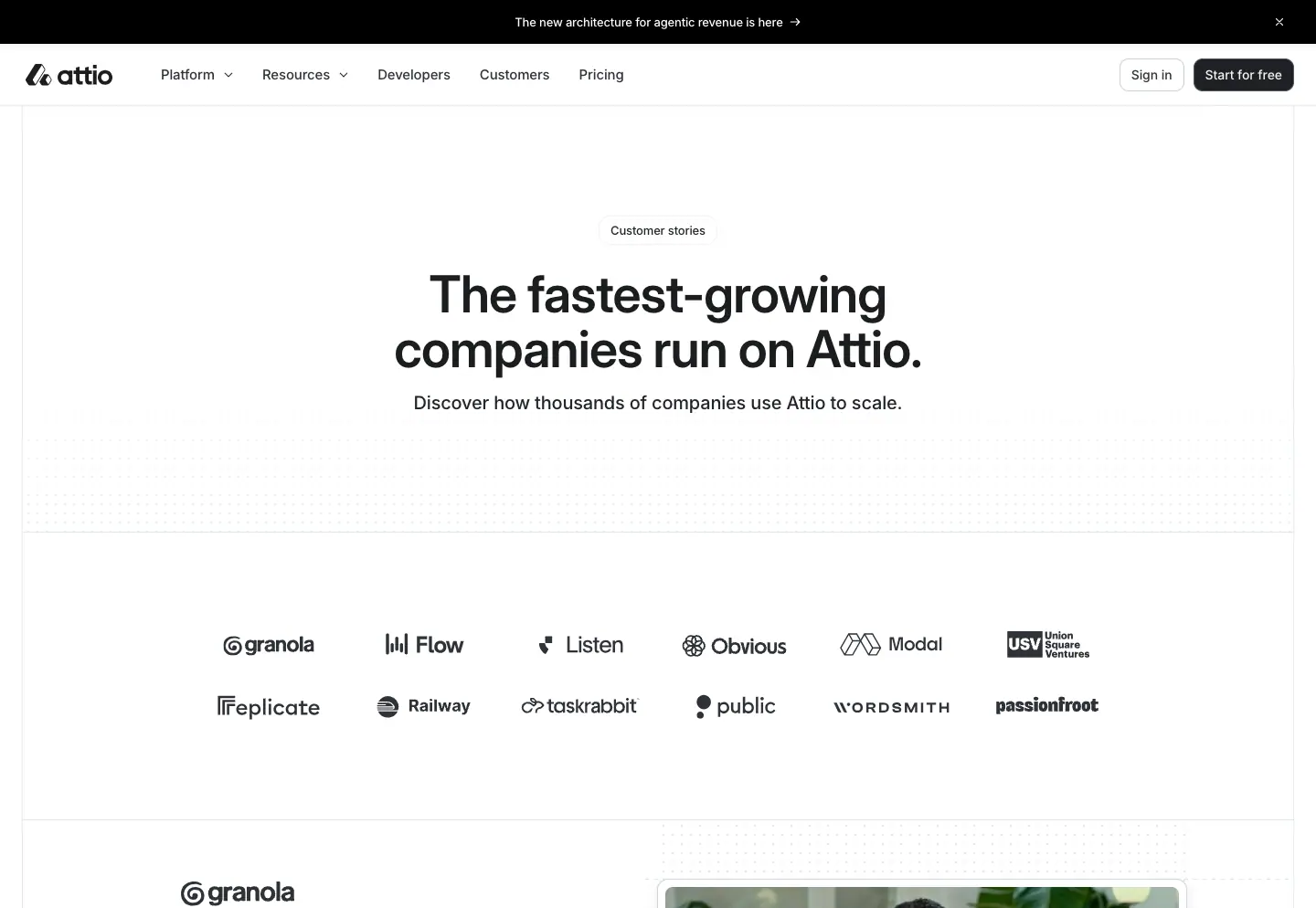
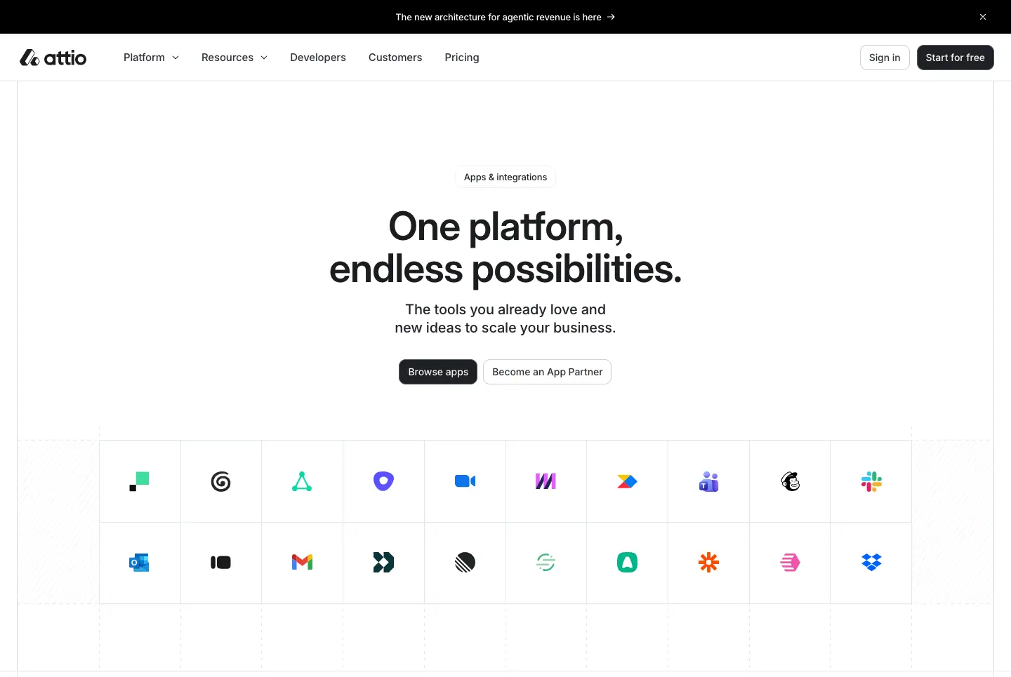
A pill, a 56px centred headline and one lead line, then a grid of logos or app icons. This is the simplest hero, for index pages whose content is the list.
F · Document header
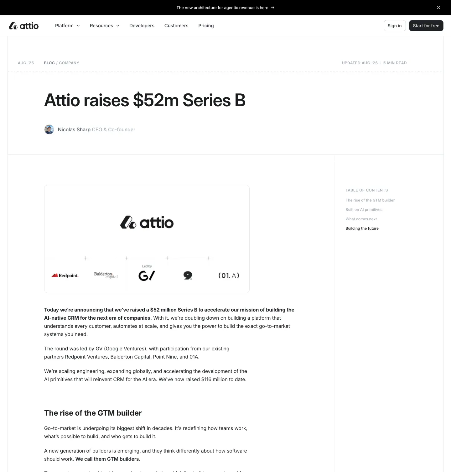
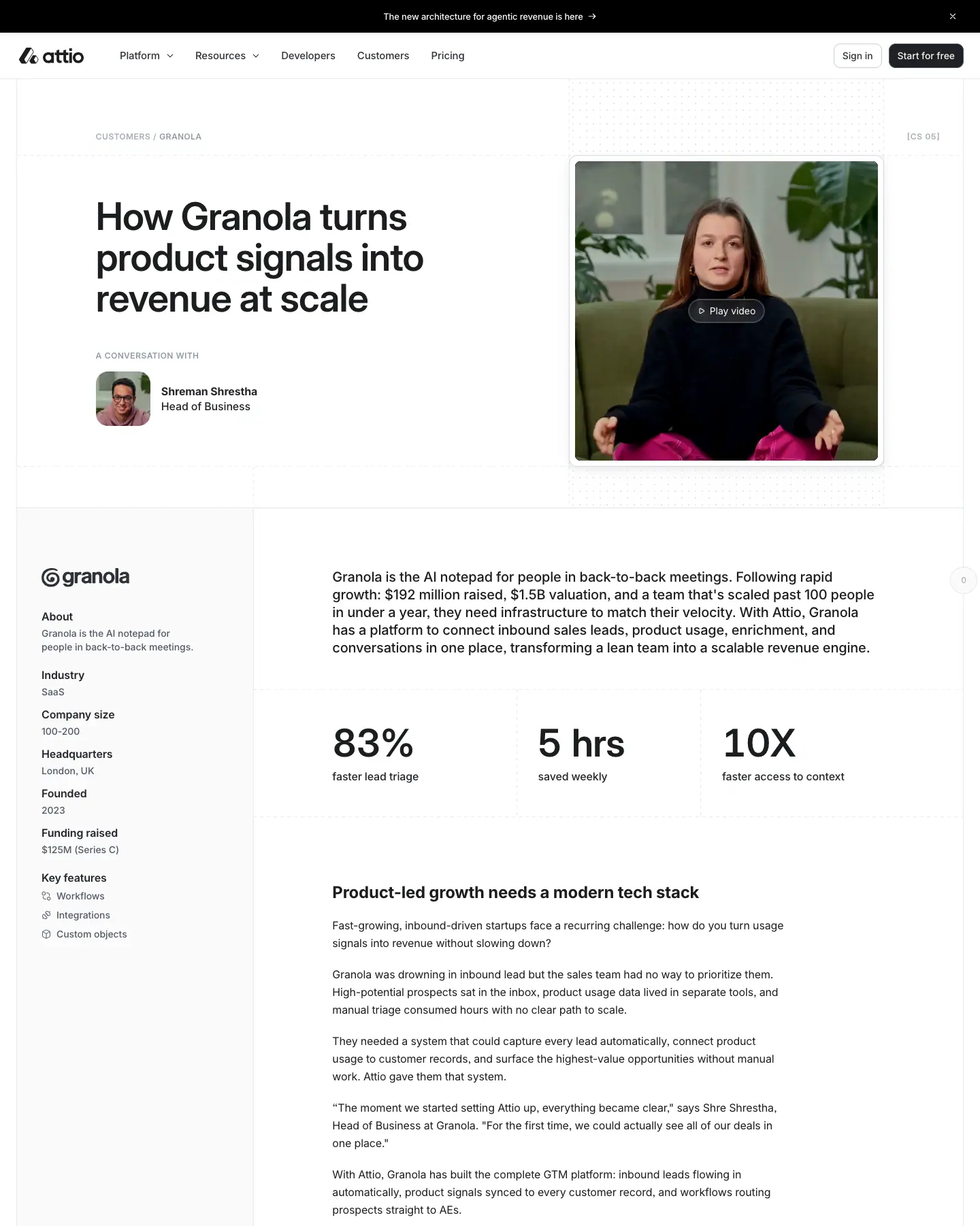
A caps meta row (date · [CATEGORY] · read time, or a breadcrumb), the H1 left-aligned at x=141, a byline, then a hairline. Customer stories add a looping <video> thumbnail at the right.
Shared hero rules
- One H1 size (56/60, weight 600) everywhere except the home (64), the about page (80) and changelog entries (24).
- The lead is never wider than ≈576px (measured: 486, 556 and 576px).
- Never more than two buttons. Both are 36px tall with a 10px radius.
- The announcement bar (48px, black) sits above every hero on every page, a sitewide promo slot.
- On mobile, home and landing heroes swap the buttons for an email field + "Send me a demo" (see 04).
06 · Section types
A catalogue of every section pattern found on the 32 captured pages. Each entry names a canonical example; images come from the per-page crops.
1 · Two-tone statement
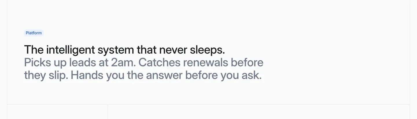
An eyebrow pill, then one H2 in two colours (claim #1c1d1f + proof #6f7988), left at x=83 or centred. It opens every home chapter. Use it to introduce any section. See 07 for the copy formula.
2 · Sticky scroll-spy feature rail
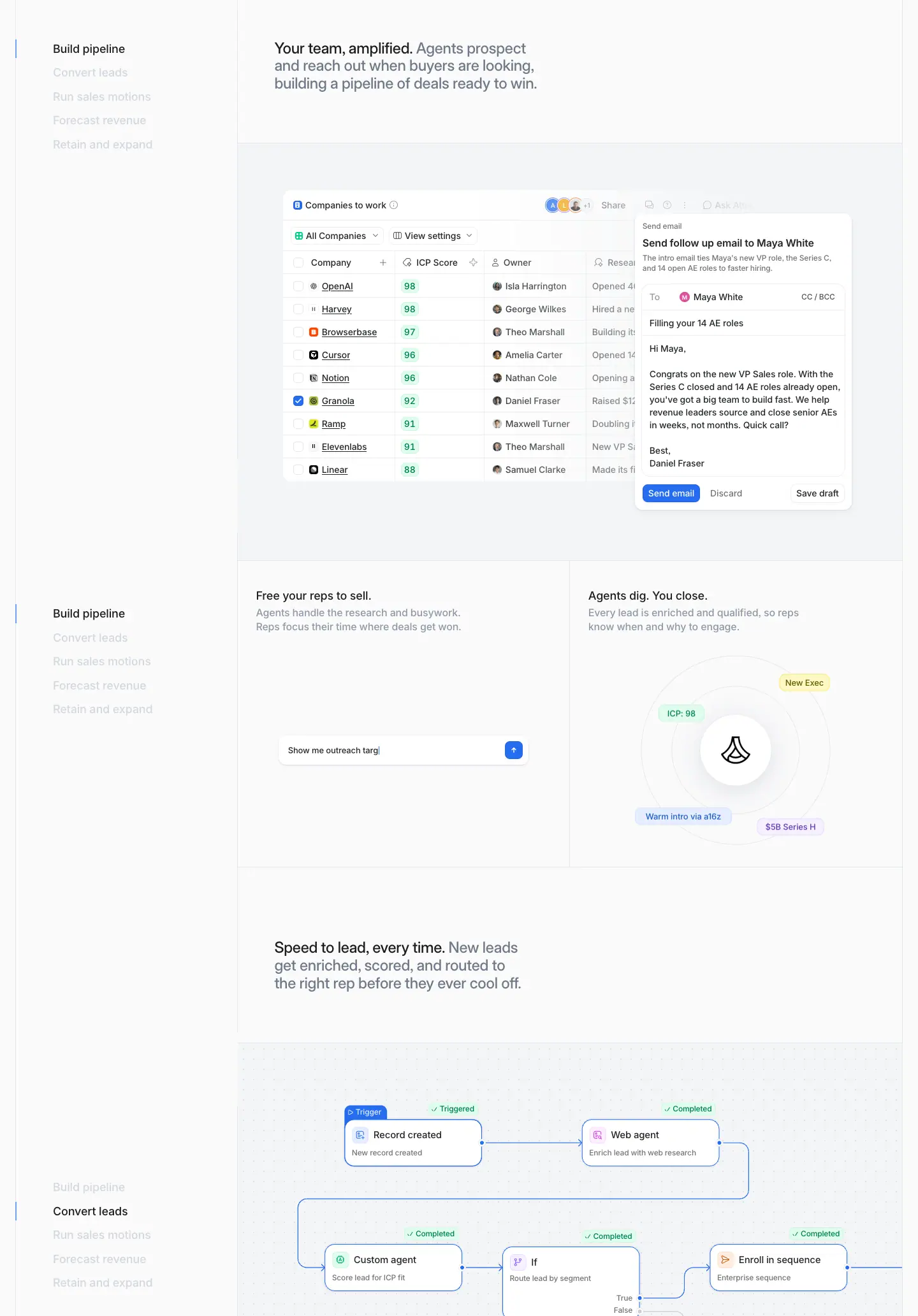
A 289px pinned list of chapters on the left. Feature cells scroll on the right, each a two-tone H3 + large mock + 2-up proof cells. Use it to tell a 4–6 step story without tabs or clicks.
3 · Big mock panel
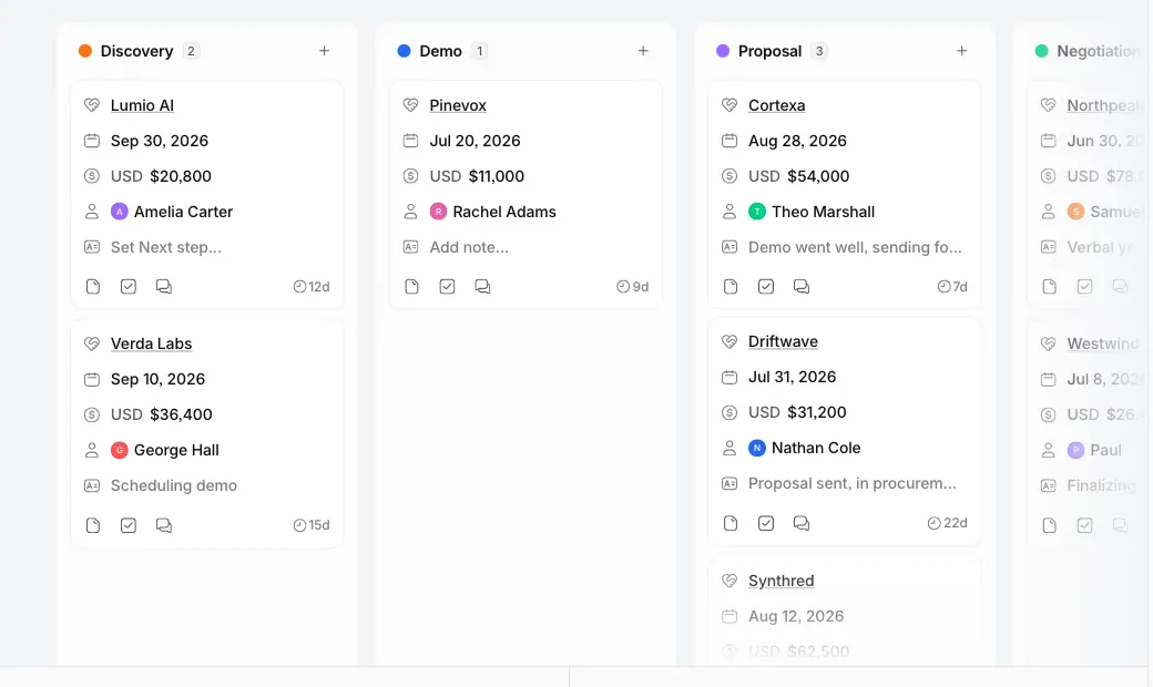
A full-width #fafafb cell with one product screen, cropped by the cell edges. There is no shadow on the panel itself; only the mock cards carry the faint navy shadow.
4 · 2-up proof cells
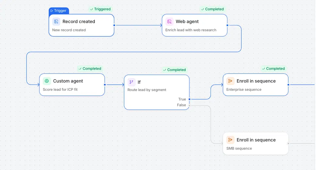
Two equal cells under a mock, each with an 18/22 H4, a 16/22 #8f99a8 body and a small animated vignette (radar chips, a typing prompt, a person card).
5 · Numbered spec grid [01]–[04]
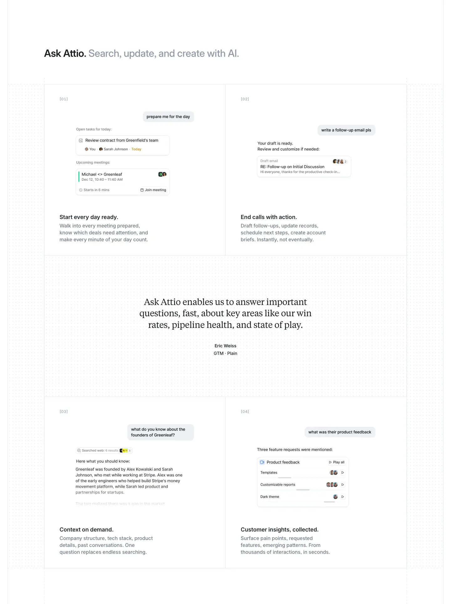
A 2 × 2 (or 3 × 2) ruled grid. Each cell has a bracketed number label, an image, an 18/24 weight 600 title and grey body text. Used on product pages and startups.
6 · Asymmetric bento
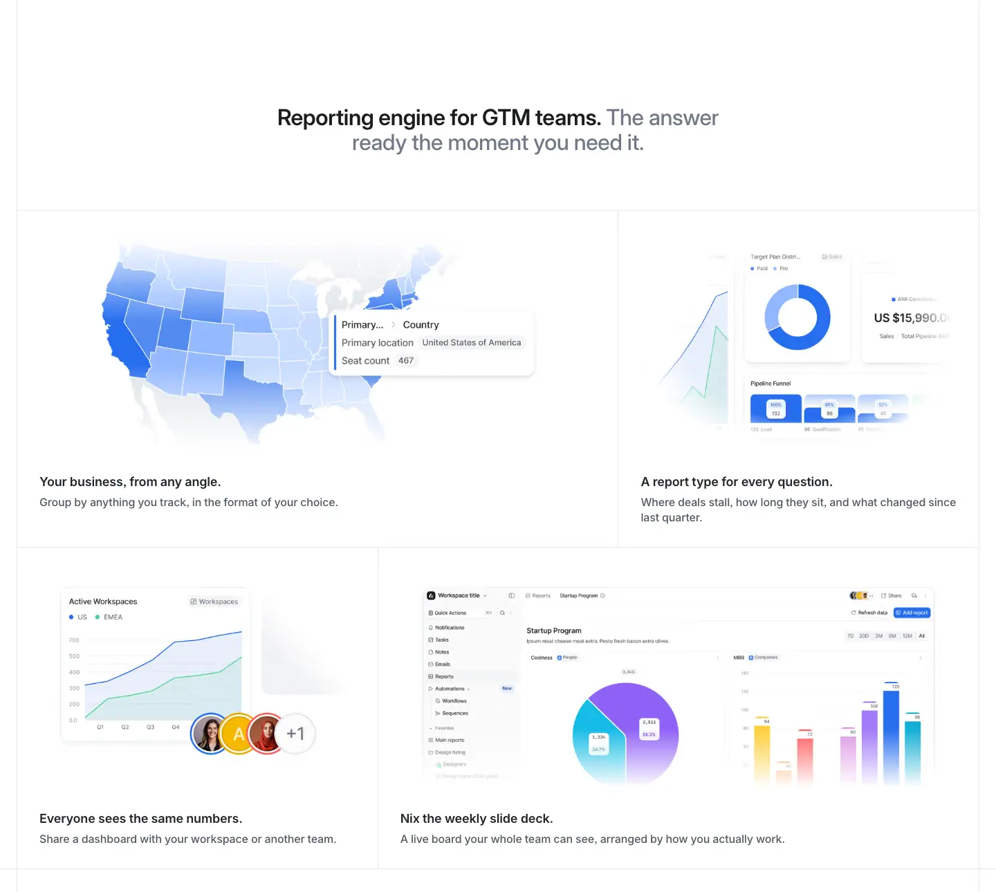
Rows of wide + narrow cells (804 + 457px), alternating. This is the only true bento on the site, on /platform/reporting.
7 · Accordion + product panel
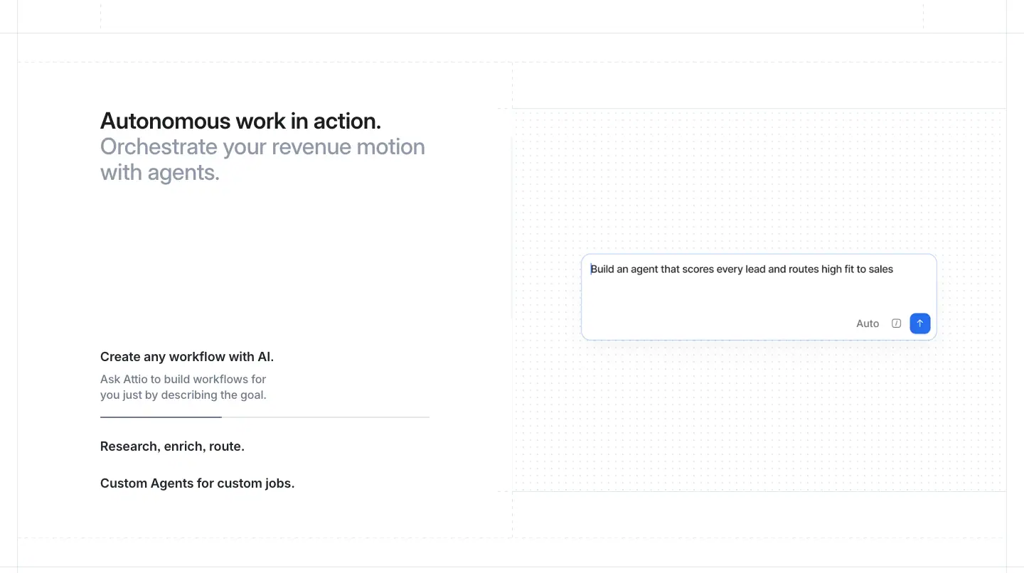
Left: a two-tone H2 and a 3-item accordion with a progress hairline under the open item. Right: the product state for the open item. Used on home (Signals, dark), /platform/ai and /platform/workflows.
8 · Dark platform band
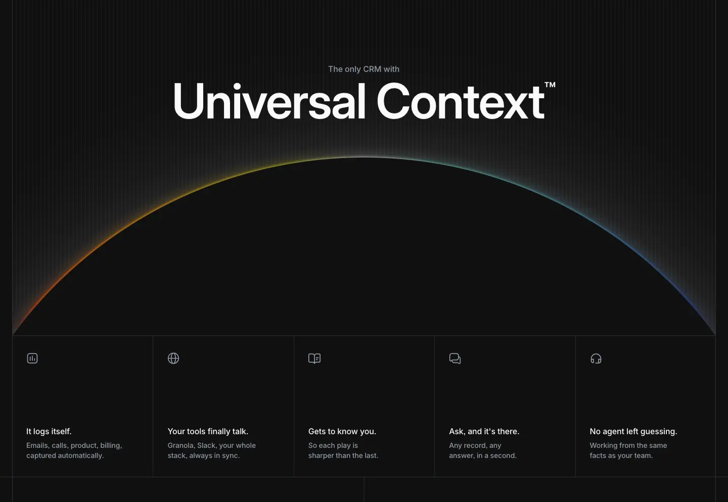
A #101010 band with a 96px trademarked name, a rim-lit horizon, and a 5-cell benefit row with line icons. It is reused across product pages.
9 · Icon marquee

A centred heading, then a row of ≈48px app-icon tiles with edge fades. Used for the integrations story.
10 · Pinned serif testimonial
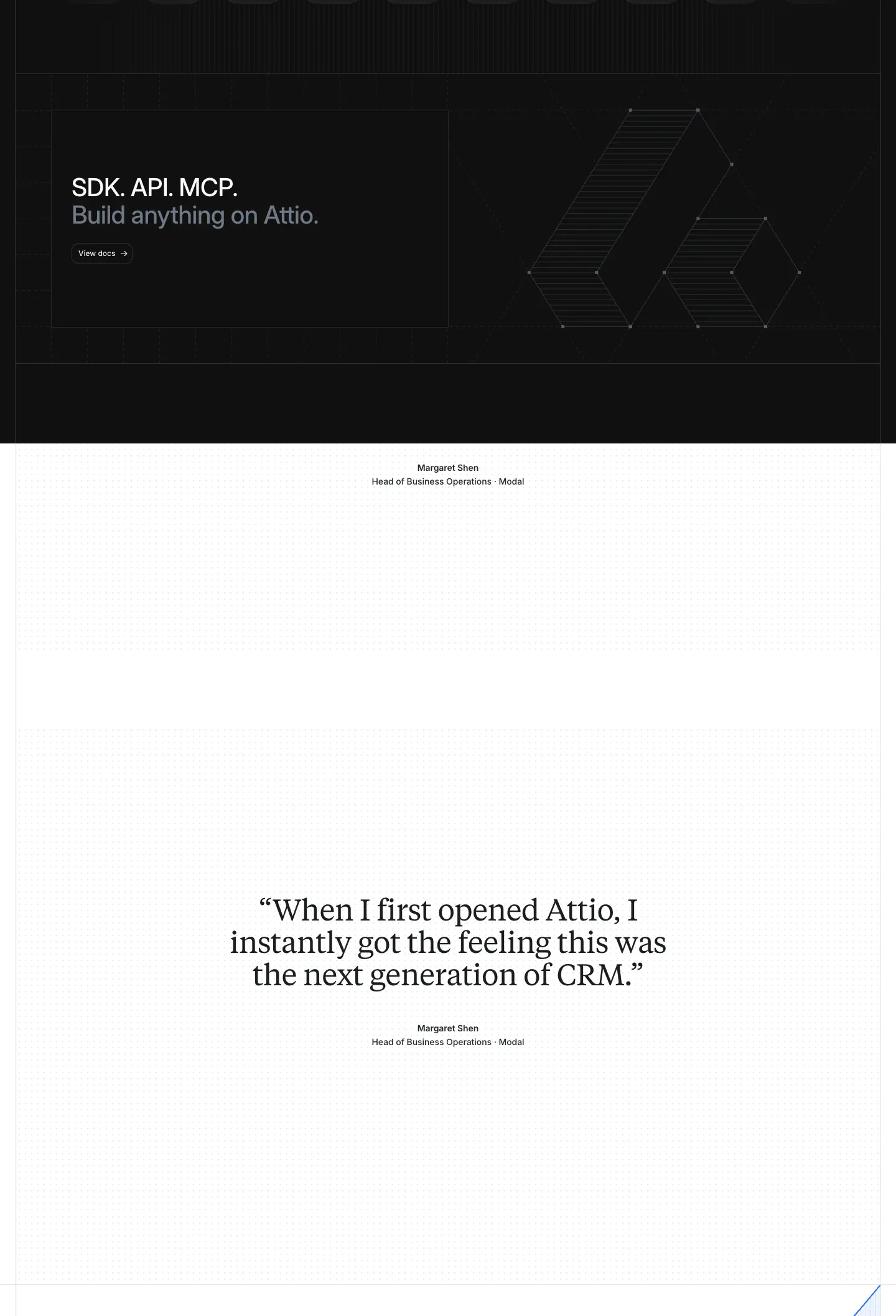
A Tiempos quote at 40–48px, centred, revealed word by word on scroll, with the name and role below. It gets ≈2,000px of scroll distance.
11 · Inline quote (in a grid)
A Tiempos quote at ≈20–24px placed between rows of a feature grid (/platform/ai), or next to a pen or dithered portrait (/customers, /partners, /platform/developers).
12 · Stats with rules
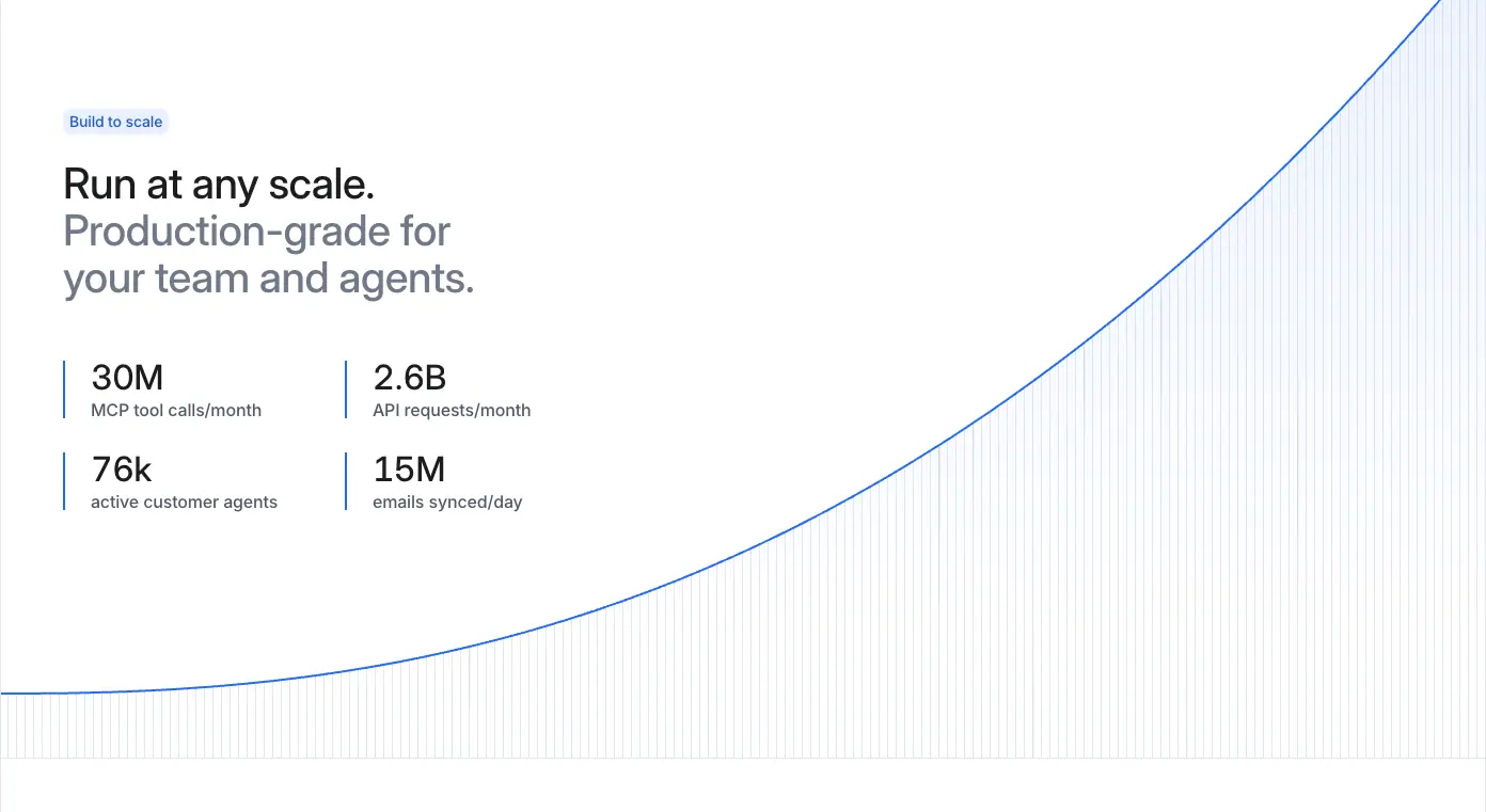
A 2 × 2 grid of stats, each with a 1px blue left rule, over a single growth curve. The numbers are Inter Display 32/32 weight 500; story pages use 56/60 weight 600 in ruled cells.
13 · Logo grid (ruled) / logo wall (unruled)

- Ruled 2 × 5 cells on home and workflows, with ↗ on linked cells.
- Unruled 2 × 6 on customers, product pages and startups.
14 · Story tabs + split card
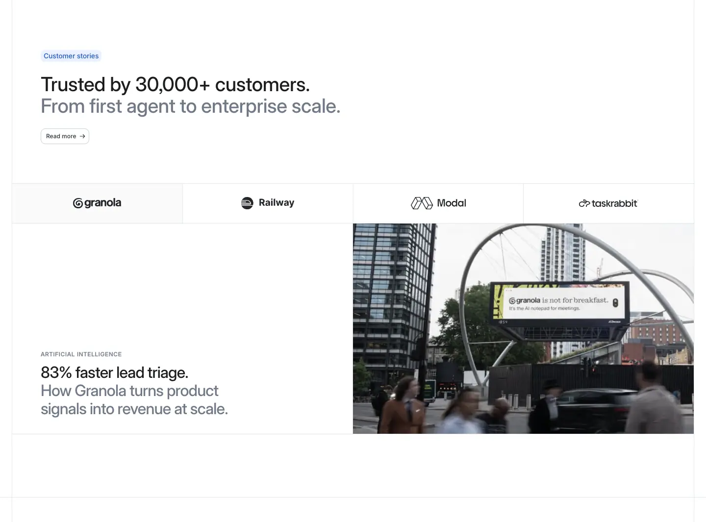
A tab strip of customer logos above a split card: text (caps category + two-tone metric headline) on one side, a photo on the other.
15 · Zig-zag story rows
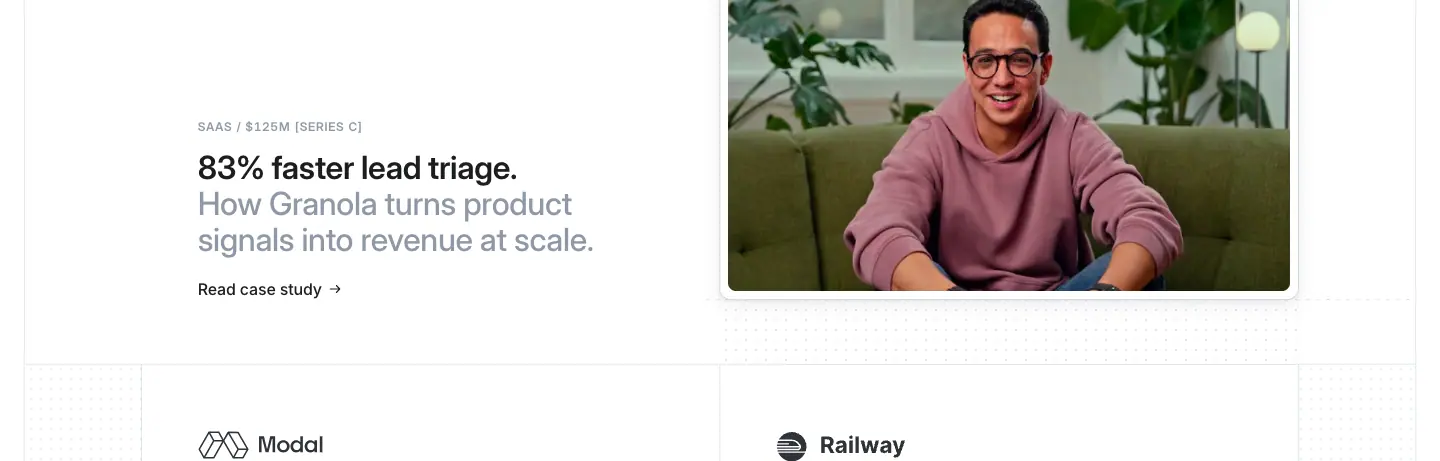
460px-tall rows alternating text-left and image-left, with a logo strip under each.
16 · Changelog strip
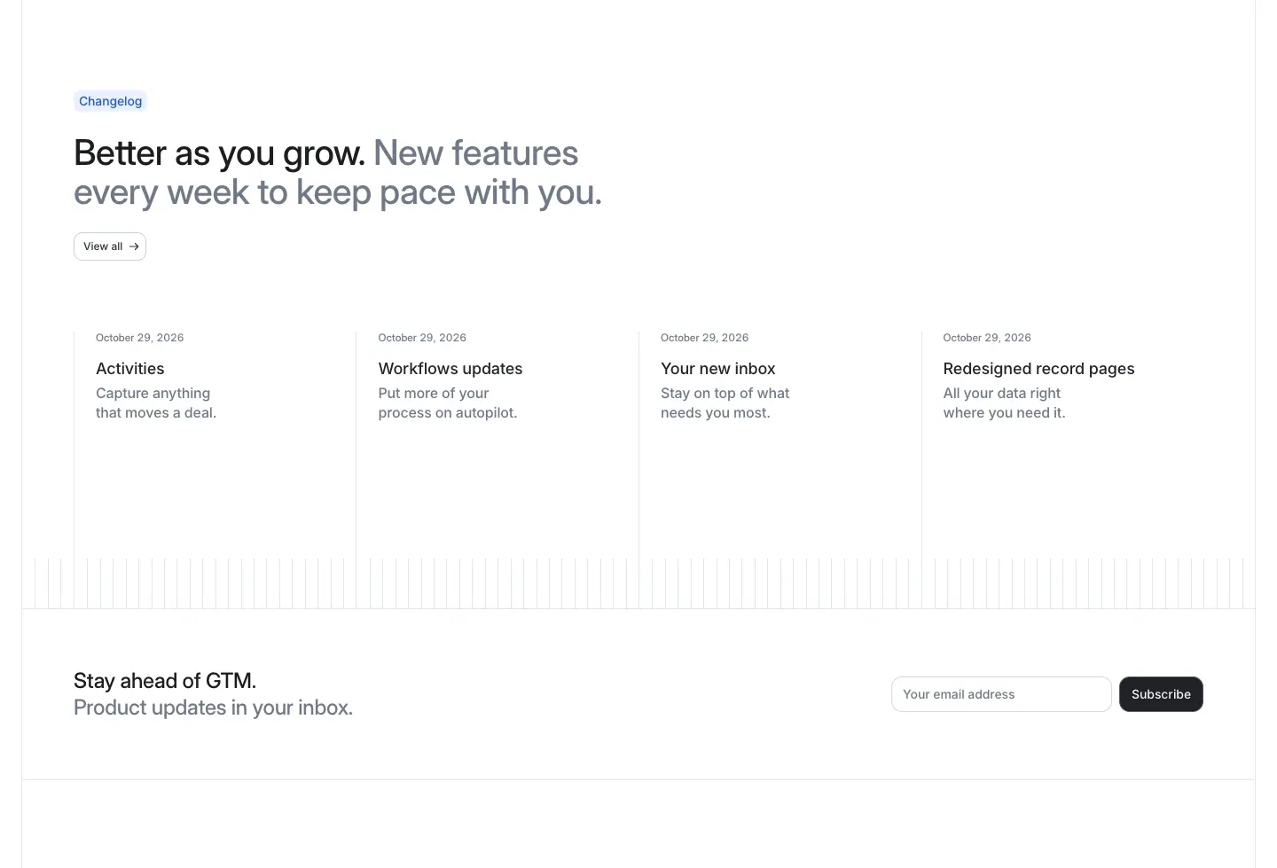
Four dated cards on a stripe floor, then a newsletter row.
17 · Cross-link grid
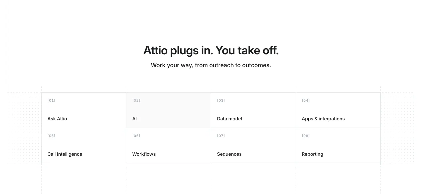
An 8-cell [01]–[08] grid linking to sibling product pages. The current page's cell is filled.
18 · Compare table
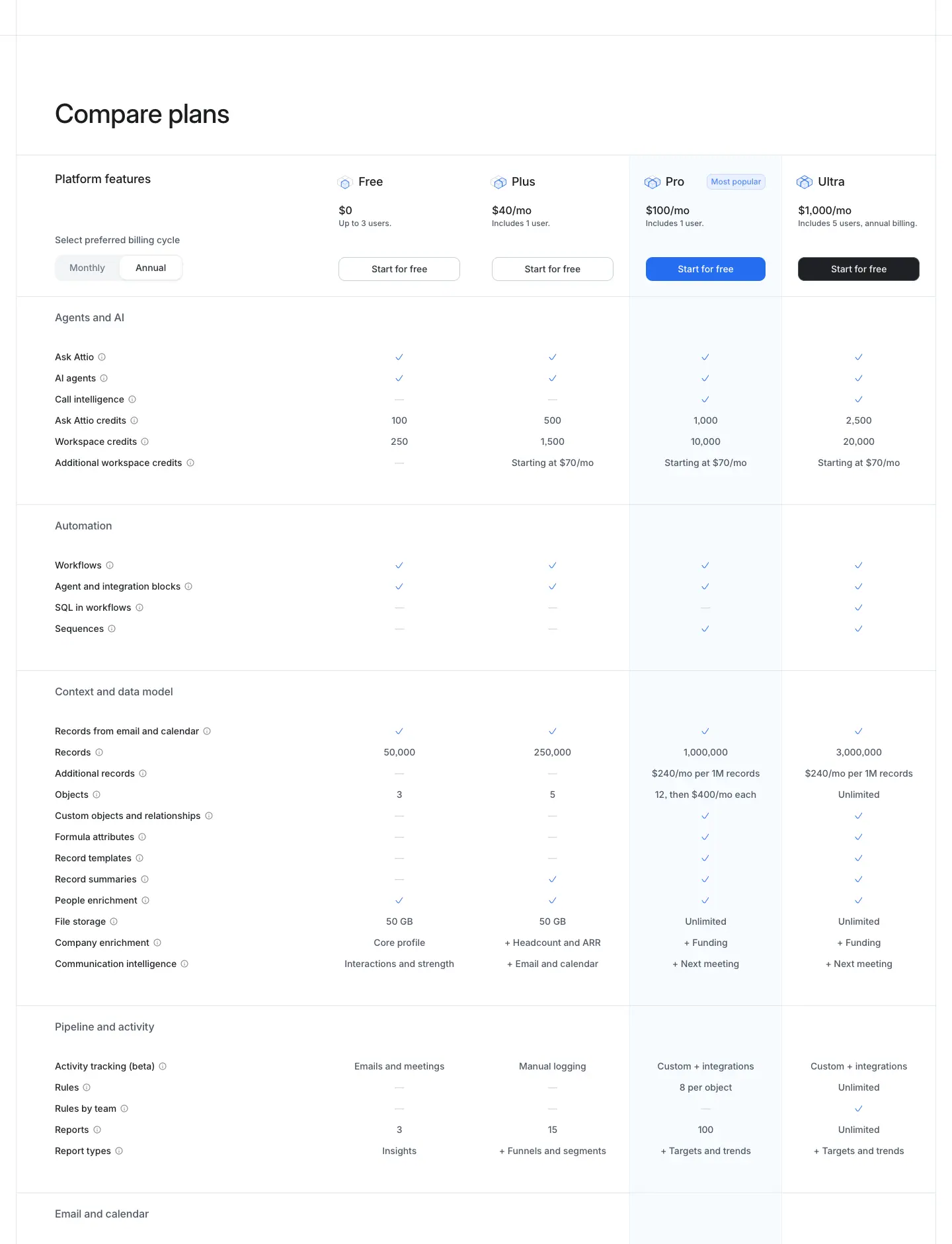
Category-grouped rows, 4 plan columns, a tinted "Most popular" column and a sticky header.
19 · FAQ split
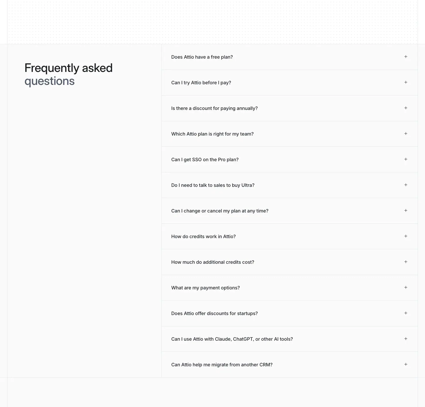
Heading on the left (522px), an accordion list on the right with hairline dividers and + icons.
20 · Form beside offer
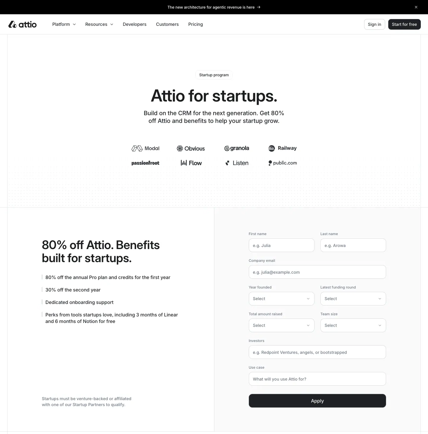
Left: the offer and a benefit list. Right: a form on a #fafafb panel with a full-width black submit button. Used on /startups and career posts.
21 · Mosaic close
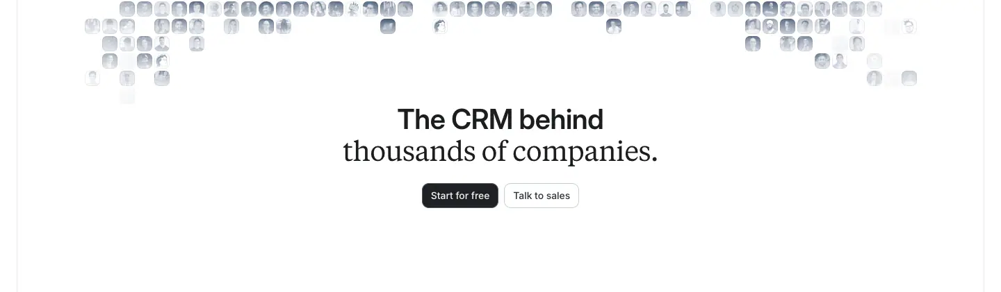
A dithered avatar mosaic with a centred mixed-font heading and two CTAs.
22 · Closing CTA band
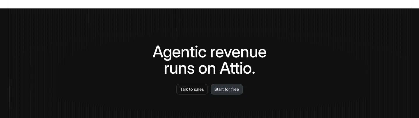
A dark gradient band with a 56/56 weight 500 white headline and two buttons. Present on every marketing page. Product pages can customise the line ("Ask more from CRM. Ask Attio.").
23 · Rail + list index
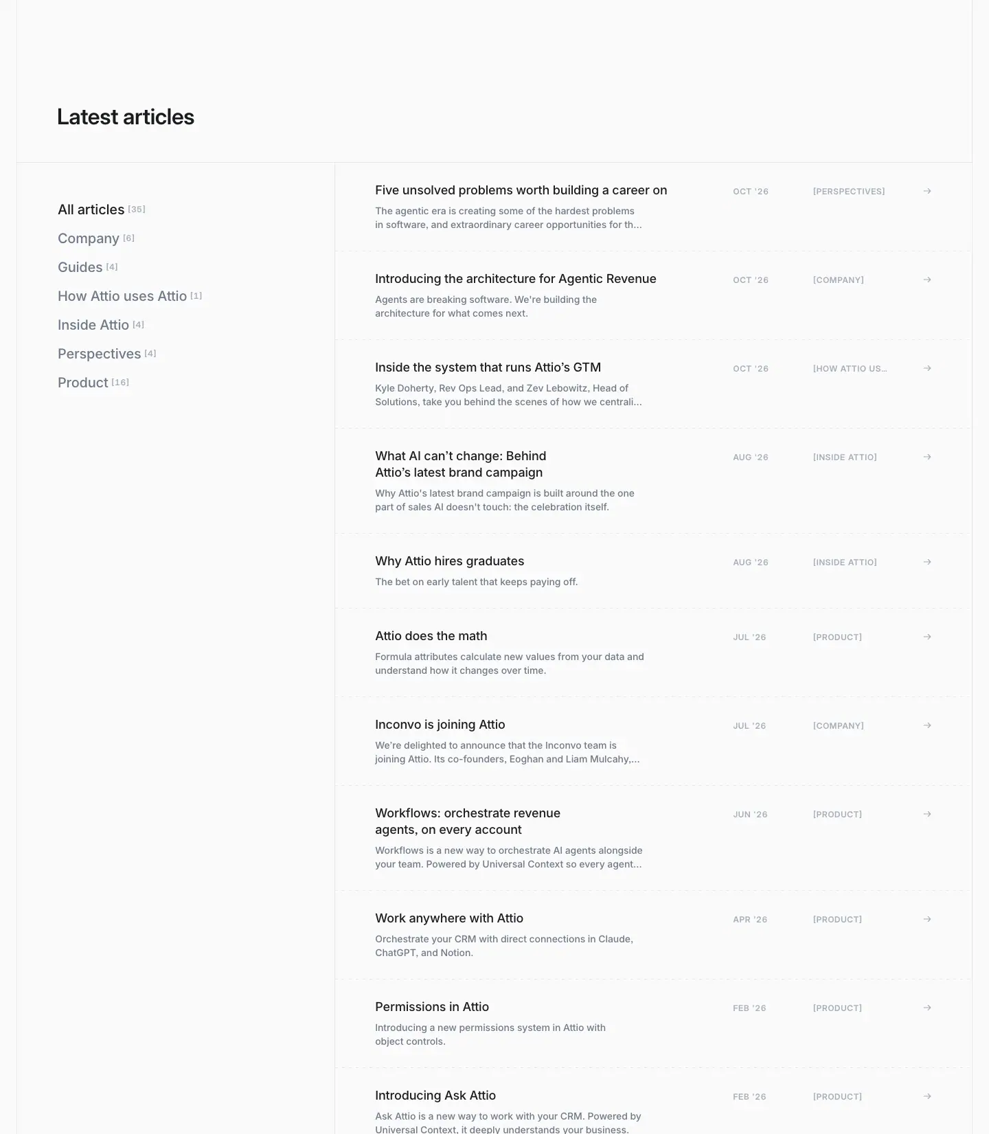
A category rail with counts on the left, and a hairline-divided list of title / summary / date / [TAG] / → on the right. Used by the blog, engineering blog, apps directory, help center and changelog. One pattern for every collection.
24 · Document layout
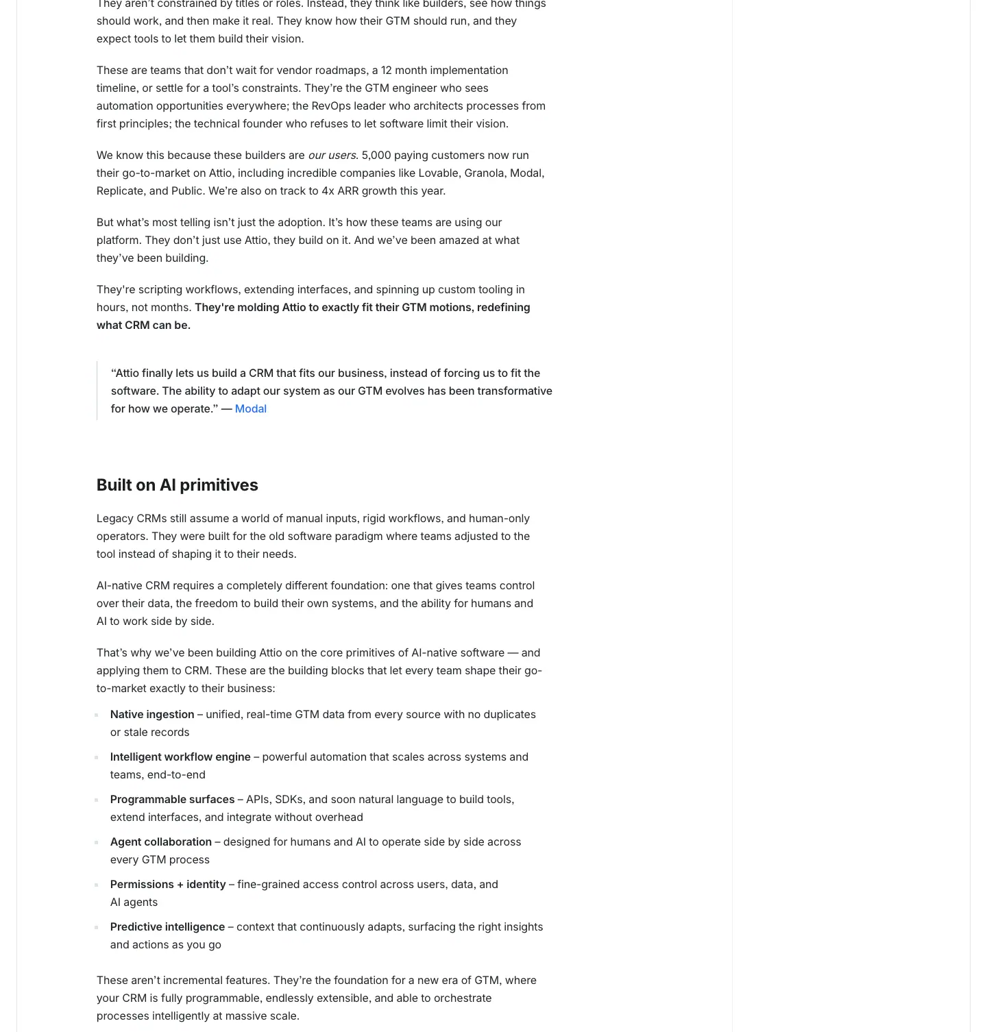
A meta row, a 56px H1, a 656–811px reading column, a sticky TOC on the right, Inter 24/30 weight 700 subheads, and 16/26 weight 400 body.
25 · Blueprint cells (dark)
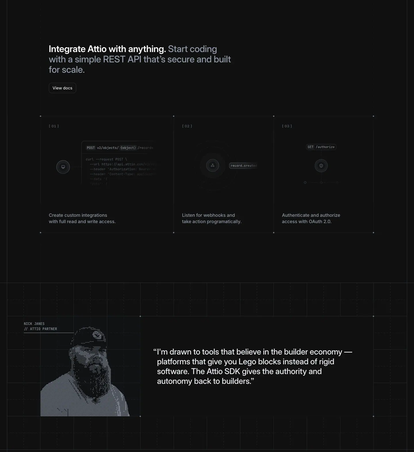
Ruled cells on #101010 with "+" crosshairs at the corners, grey line art, mono captions and dithered portraits.
07 · Copywriting and voice
All quotes below are copied from the live pages on 2026-11-21. The data/<page>.json files hold every heading with its position.
The voice in one line
Short declarative claims, then a concrete proof, delivered calmly. Attio talks like a confident operator, not a hype machine. No exclamation marks appear in any captured headline. "AI" is rarely the subject of a sentence; agents are, and they do specific jobs.
Pattern 1: claim. proof. (the two-tone sentence)
Every home section heading is two sentences in one <h2>. The first is the claim, in ink. The second is the proof, in grey.
Claim (#1c1d1f) |
Proof (#6f7988) |
| The intelligent system that never sleeps. |
Picks up leads at 2am. Catches renewals before they slip. Hands you the answer before you ask. |
| Your team, amplified. |
Agents prospect and reach out when buyers are looking, building a pipeline of deals ready to win. |
| Speed to lead, every time. |
New leads get enriched, scored, and routed to the right rep before they ever cool off. |
| Run every motion, your way. |
Pipeline built for how you sell, while agents brief the meetings and keep deals moving. |
| For the people who own the number. |
Ask any revenue question. From the weekly forecast to performance by rep, get the answer in seconds. |
| Keep more. Grow more. |
Agents track the whole book, so you save what's slipping and grow what's rising. |
| Live from day one. |
Connect your inbox and calendar. Attio learns your business and builds itself around it, before your first agent even gets to work. |
| All of the signals, none of the noise. |
Ready to act on. |
| SDK. API. MCP. |
Build anything on Attio. |
| Run at any scale. |
Production-grade for your team and agents. |
| Trusted by 30,000+ customers. |
From first agent to enterprise scale. |
| Better as you grow. |
New features every week to keep pace with you. |
Rules you can lift:
1. The claim is 2–7 words and ends with a full stop. It reads as a slogan on its own.
2. The proof uses specific nouns and times: "2am", "renewals", "weekly forecast", "performance by rep". These are things a sales leader recognises from their own week.
3. The proof often uses a triple: "Picks up leads… Catches renewals… Hands you the answer…" or "enriched, scored, and routed".
4. Grey does the work of the subheading, so there is never a separate subtitle line under a two-tone heading.
Pattern 2: rhythm fragments
These are clipped, parallel fragments, often in threes:
- "Dream. Code. Ship." (developers H1)
- "SDK. API. MCP."
- "Keep more. Grow more."
- "Hire the best rep. Again. Again. And again." (workflows)
Why. Full stops between single words set a beat and read as certainty. Fragments suit a technical audience that skims.
Pattern 3: pairs with a turn
The second half flips the subject from the product to the reader:
- "Agents dig. You close."
- "The move's ready. You make the call."
- "Attio plugs in. You take off."
- "Free your reps to sell."
Why. Agent-led products raise the question "what is left for me?". Every pair answers it: the agent does the grunt work, and the human keeps the decision. That is a deliberate positioning line.
Pattern 4: noun + verb product names
Product names are capitalised nouns, and features stay lowercase. The brand page says so: "Capitalize the names of Attio products, such as Call Intelligence, Workflows, and Ask Attio. Keep features within a product lowercase, such as custom objects, people object, and permissions."
The section headings turn these names into commands:
- "Ask Attio."
- "Cue the agents."
- "Open the number."
- "CRM, meet MCP."
Headline lengths (measured)
| Level |
Example |
Words |
| Home H1 |
Welcome to agentic revenue. |
4 |
| Product H1/H2 |
Every rep, infinitely multiplied. · Revenue agents at your team's command. · The live story behind every number. |
4–6 |
| Pricing H1 |
Revenue around the clock. |
4 |
| About H1 |
We help teams raise the ceiling on what's possible. |
9 |
| Customers H1 |
The fastest-growing companies run on Attio. |
6 |
| Closing CTA (every page) |
Agentic revenue runs on Attio. |
5 |
The closing line repeats on every page. The home H1 opens with "agentic revenue" and every page closes with it. The category name, "agentic revenue", is said at least twice per page.
Customer-story headlines: number first
From /customers:
- "83% faster lead triage. How Granola turns product signals into revenue at scale."
- "25% revenue boost. How Passionfroot built a creator-first CRM which scales."
- "4X faster deals. How Taskrabbit is scaling partnerships with Attio."
- "Complete GTM visibility. Why Snackpass switched from Salesforce to Attio."
The formula is outcome metric (600 weight) + "How X did Y" (500). The same two-tone logic is used, but done with weight instead of colour.
Microcopy
| Element |
Copy |
Note |
| Primary CTA |
"Start for free" |
Same three words in the nav, hero and closing band, never varied |
| Secondary CTA |
"Talk to sales" |
|
| Link buttons |
"See more", "View docs", "Read more", "View all", "Explore the ecosystem" |
Verb + object, with a → arrow |
| Announcement bar |
"The new architecture for agentic revenue is here →" |
|
| Eyebrow tags |
"Platform", "Self-building", "Signals", "Connectivity", "Build to scale", "Customer stories", "Changelog" |
One or two words, sentence case |
| Newsletter |
"Stay ahead of GTM. / Product updates in your inbox." |
Two-tone again, and "Subscribe" |
| Product mock text |
"Good morning, Alex", "How do I win my deal with GreenLeaf?", "Prep for next meeting", "Recap last call" |
Real-sounding prompts show what the product does without a feature list |
Vocabulary
Words that recur: agentic, agents, revenue, pipeline, deals, context, signals, GTM, motion, the number, book (of business), reps. These are the vocabulary of a revenue leader, not of a developer or marketer.
Words Attio avoids in headlines: AI-powered, revolutionary, seamless, all-in-one. "AI" appears in eyebrow labels and on the platform/ai URL, but headlines describe what the agent does.
08 · Components
Measured values from data/<page>.json → btns and data/home.hover.json. The button state tokens are copied from the site CSS.
Announcement bar
- 48px tall,
#000000, full width.
- Centred text at 13/20, weight 500, white: "The new architecture for agentic revenue is here →".
- A close ✕ at the right edge.
Navigation
| Part |
Value |
| Header block |
116px total (48 bar + 68 nav). Background #ffffff/0.95, bottom border 1px solid #e4e7ec. Stays in view on scroll |
| Logo |
Wordmark, ≈106px wide, at x≈24 |
| Links |
"Platform ▾", "Resources ▾", "Developers", "Customers", "Pricing". Inter 15/22, weight 500, #2e3238. Each is a 36px button with 10px radius, padding 0 12px (0 8px 0 12px with a chevron) |
| Link hover |
Colour and fill transition at 0.05s with cubic-bezier(.2,0,0,1), so it is effectively instant |
| Mega menu |
Radix NavigationMenu (inferred from the navigation-enter-* and --radix-* names in the CSS). Panels slide ±200px with an 8px blur (navigation-enter-from-right) when moving between Platform and Resources |
| Platform menu |
Three columns: Context (Universal Context, Data Model, Enrichment, Call Intelligence, Reporting & Forecasts), Orchestration (Ask Attio, Workflows, Custom Agents, Web Agent, Sequences), Ecosystem (Apps, MCP, Developer Platform). Each item has a one-line grey description, for example "Sync and structure your data" |
| Right side |
"Sign in" (outline) + "Start for free" (primary) |
| Dark pages |
On /platform/developers and /engineering, "Sign in" becomes #101010 fill, #edeff3 text and a #2e3238 border. "Start for free" becomes #2e3238 fill with a #505967/50% border |
| Mobile |
Wordmark + ☰ button |
Buttons
| Variant |
Fill |
Text |
Border |
Size |
Hover (from CSS) |
| Primary ("Start for free") |
#202124, painted as radial-gradient(at 50% -10%, from, to) |
#f3f4f6 14/20, weight 500 |
#505967 |
36px, radius 10, padding 0 12px |
Gradient "from" stop moves to #505967 (a light from the top), text becomes #fff. 0.3s cubic-bezier(.2,0,0,1) on the custom properties |
| Outline ("Talk to sales", "Sign in") |
#ffffff |
#2e3238 |
#cad0d9 |
36px, radius 10 |
Border darkens to #6f7988 (black-700); active fill #f3f4f6 |
| Small outline + arrow ("See more →", "Read more →") |
#ffffff, or #101010 on dark |
#2e3238 / #edeff3, 12/18 |
#cad0d9 / #2e3238 |
32px, radius 10, padding 0 6px 0 10px |
Same as outline |
| Ghost |
transparent |
#2e3238 |
none |
— |
Fill #f3f4f6 |
| Blue (pricing Pro only) |
#266df0 |
#ffffff |
blue |
36px, 260px wide |
— |
| Dark-band button |
#2e3238 |
#edeff3 |
rgba(80,89,103,.5) |
36px |
— |
| Segmented toggle (Monthly / Annual) |
transparent, active pill |
inactive #6f7988, active #2e3238 |
none |
94 × 36px, radius 10 |
top slide 0.25s |
Why animate gradient stops instead of the background colour. A plain colour change looks flat. By registering --button-primary-bg-from and --button-primary-bg-to as animatable properties, the hover reads as a soft light rising from the top edge of the button, a subtle physical cue. The CSS also ships a solid background-color fallback (:root .button-primary{background-image:none…}) for browsers without @property.
Pills and tags
| Component |
Style |
| Eyebrow pill (sections) |
Inter 14/20, weight 500. Light: #245bc2 on #e8f0ff. Dark: #c8dcff on #1a2233. Full radius, ≈24px tall |
Product pill (product heroes, the <h1>) |
Inter 13/18.2, weight 500, #232529, outlined, full radius |
| News pill (home hero) |
30px, 13/16, hairline #e4e7ec border, ends with "›" |
| "New" badge (footer) |
10px, white on blue, ≈14px tall |
| Changelog tag |
6px coloured dot (#ab92f1 / #72a4fb / #00b5e6) + 14/20 #a4adba label |
| Status badge (mocks) |
"✓ Completed" / "Triggered" in green on a pale green tint, on the edge of workflow nodes |
| Caps label |
Inter Display 12/14, weight 600, +0.72px, uppercase. Forms: plain ("ARTIFICIAL INTELLIGENCE"), bracketed ("[PRODUCT]", "[01]"), slashed ("CUSTOMERS / GRANOLA") |
Inputs and forms
- Newsletter field: ≈240 × 40px, 10px radius, hairline
#cad0d9 border, 14px placeholder #6f7988. A 40px black "Subscribe" button sits next to it.
- Search fields (help, apps): 36px, radius 10, a search icon, and an
⌘K-style hint in the help sidebar.
- Forms (startups, careers): paired fields with labels above (12–14px). The panel is
#fafafb; the submit button is full width, black, 36–40px.
Cards and cells
- Grid cell: no radius, no shadow. Hairline borders shared with neighbours (
#e4e7ec), padding ≈32–58px.
- Product mock card: radius 8–12, white, with the navy-tinted shadow stack
0 0 1px 1px #00163e/.01, 0 4px 12px -1px #00163e/.04, 0 1px 3px -1px #00163e/.18.
- Changelog card: 319 × 312px cell, a date at 12/14, a title at 18/24, a 2-line summary.
- Plan card: ≈322px wide, radius 20 (pricing radii include 20px ×4), padding ≈32px. The Pro card has a blue tint and border.
- App row (directory): a 28px icon + name + verified mark + "By maker" + a one-line description.
Accordion
- Radix accordion. Height is animated with
slideDown/slideUp over 0.3s cubic-bezier(.65,0,.35,1).
- Rows are 16/22, weight 500, with a + icon and hairline separators. FAQ rows are ≈87px apart.
Footer
- Background:
linear-gradient(-30.12deg, #1c1d1f 25.6%, #2e3238 163%).
- Columns: six groups — Platform, Company, Import from, Attio for, Apps, Resources. The two-row layout starts at x=488. Labels are 14/20, weight 500,
#505967. Links are 14/20, weight 400, #b5bdc9, with a 0.15s colour transition. External links carry ↗.
- Bottom row: social icons (LinkedIn, X, Dribbble, YouTube) and "© 2026 Attio Ltd. All rights reserved.", followed by Services Agreement, Privacy Policy, LLMs and Cookie settings in 12/18
#505967.
Note: the "LLMs" footer link. Attio publishes a machine-readable page for language models. This matches the robots.txt that explicitly allows GPTBot, ClaudeBot and PerplexityBot, and the "Open in ChatGPT / Claude" buttons on guides.
09 · Art direction
Attio's imagery follows one rule: monochrome hairline drawing for ideas, real product for features, real people only where people are the subject. Everything below was seen on the 32 captured pages. Crops are in images/assets/, and doc 10 lists every asset type.
The five image families
| Family |
Where |
Medium |
Colour |
| 1. Product UI |
Home, product pages, landing pages, app pages |
Live HTML (home) or 2× PNG from Storyblok (other pages) |
Product greys + product blue + status colours |
| 2. Hairline diagrams |
Universal Context, Signals, about orbit, reporting radar, blog covers, partner cubes, developer logomark |
<canvas> or static images, 1px lines |
Grey on white, or white/grey on #101010 |
| 3. Data-point textures |
AI dot cloud, careers square cloud, avatar mosaics, PR grid, changelog ruler, stripe floors |
Many small identical marks |
Grey, or pastel rainbow for AI |
| 4. Rendered portraits |
Developer partners (dithered), customer and partner quotes (pen line), team (grayscale circles) |
Photo processed into ink or dither |
Black / white |
| 5. Real photography |
About (whole team), founders, careers office grid, customer stories (teams, OOH billboards), press kit |
Colour photos |
Natural |
1 · Product UI as illustration
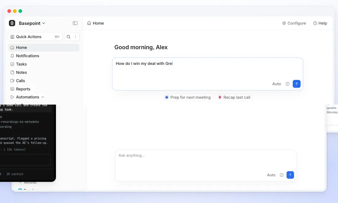
Rules seen
- Realistic, specific fake data. Companies (Basepoint, GreenLeaf, Cortexa, Lumio AI, Verda Labs), people with roles (Sarah Johnson, Head of IT), money (USD $54,000), dates (Aug 28, 2026), scores (ICP 98), and outcomes (✓ Completed, Triggered).
- Always in a finished or working state. Workflows show every node completed, emails are fully drafted, charts have data, meetings are struck through as done.
- Sharp at any zoom. Home mocks are HTML (selectable 14px Inter). Product pages use 2,096–3,840px source PNGs served via Next/Image (w=1920–3840).
- Context crops. A table is cut off at the right edge, and a Kanban shows four columns with the fifth fading. These say "there is more", so the mock reads as a real screen, not a designed card.
Why. For a CRM, believable data is the art. A buyer pictures their own pipeline in the mock.
2 · Hairline diagrams: one line weight for every idea
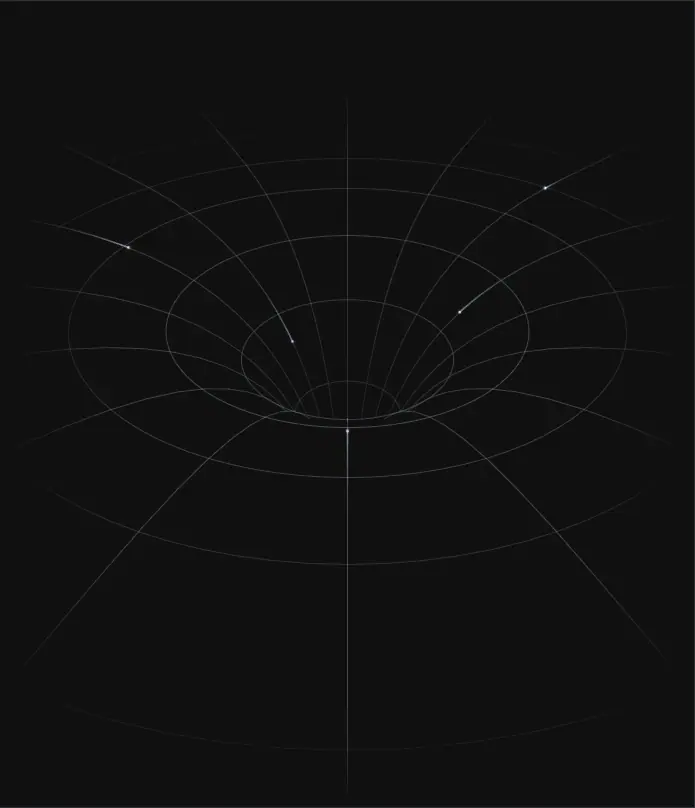
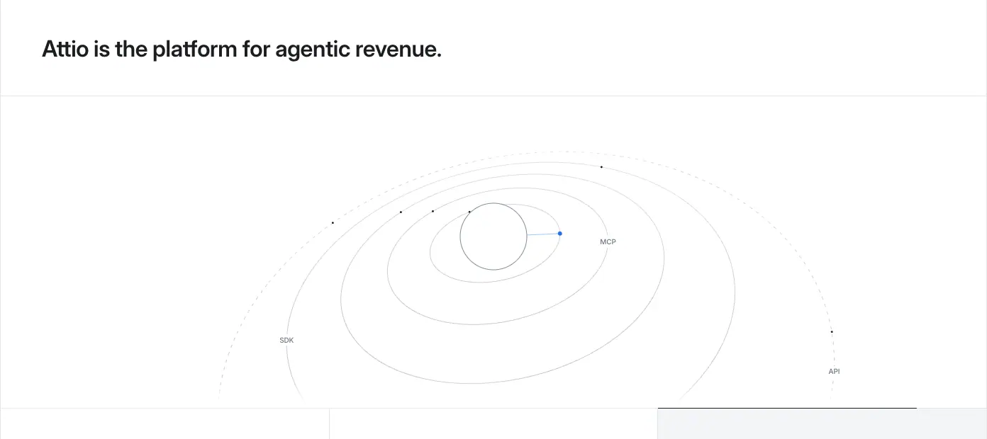
Rules seen
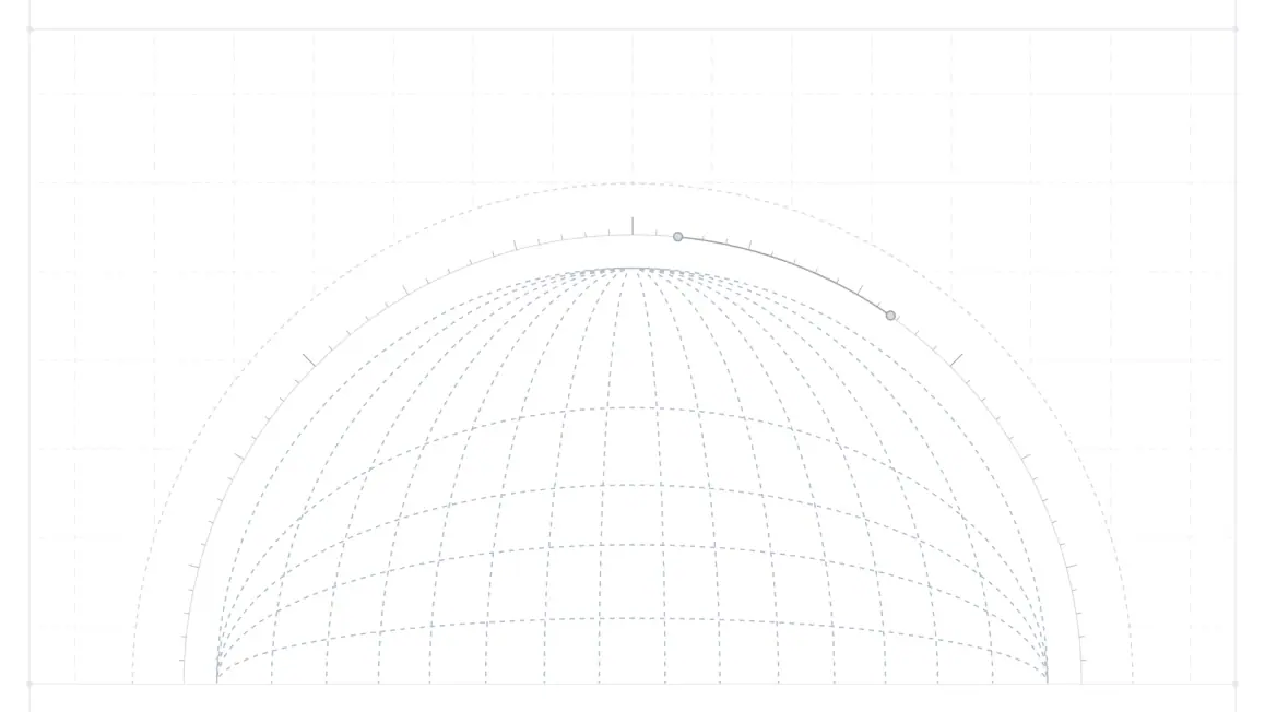
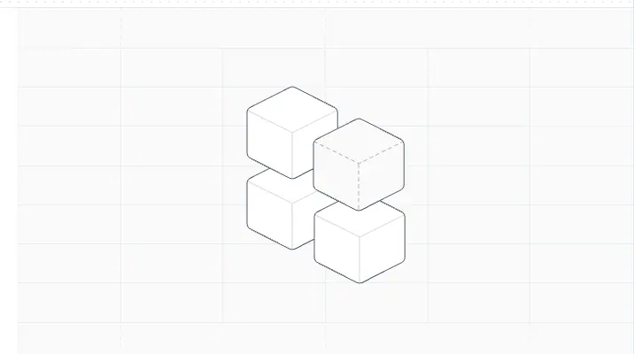
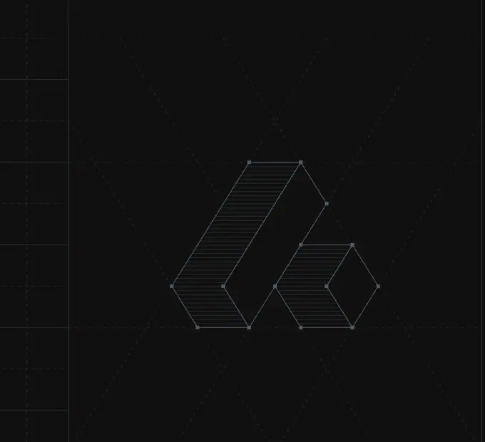
- 1px strokes only, never fills. Ellipses (orbit, wormhole), meridians (globe, horizon), isometric edges (cubes, logomark).
- Small dots mark nodes and particles. The orbit has labelled dots, the logomark has a dot at each vertex, and the wormhole has light streaks.
- Light sections: strokes in #cad0d9–#b5bdc9. Dark sections: strokes in white at low opacity.
- One exception: the Universal Context horizon. It has a lit rim in a conic gradient, teal #6cbdb0 → navy #161e69 → red #bb2a1e. It is the brand's "hero moment" and the only gradient-lit object on the site.
- The logomark as a construction drawing. On /platform/developers and the home SDK band, the Attio mark is hatched with parallel lines inside its outline, as if cross-sectioned.
Why. The abstract ideas (context, signals, ecosystem, architecture) get the visual language of technical drawing. That signals "engineered" without stock 3D renders or gradients. And since every diagram uses the same stroke, they read as one illustrator's hand.
3 · Data-point textures: "many" drawn literally
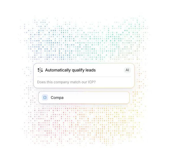
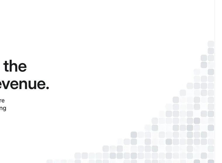
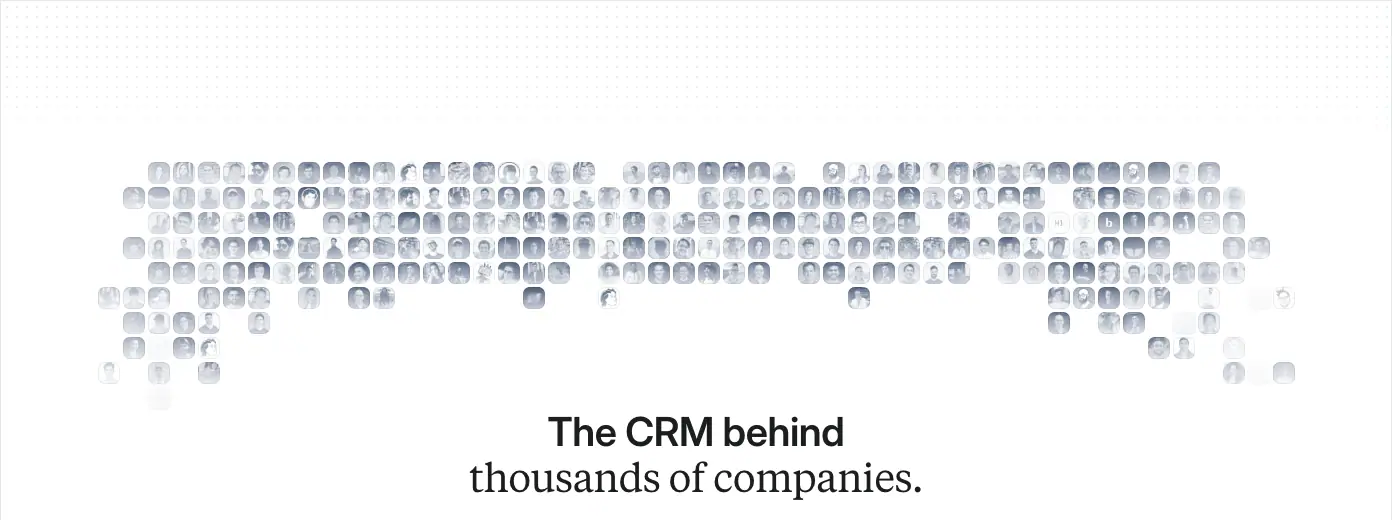
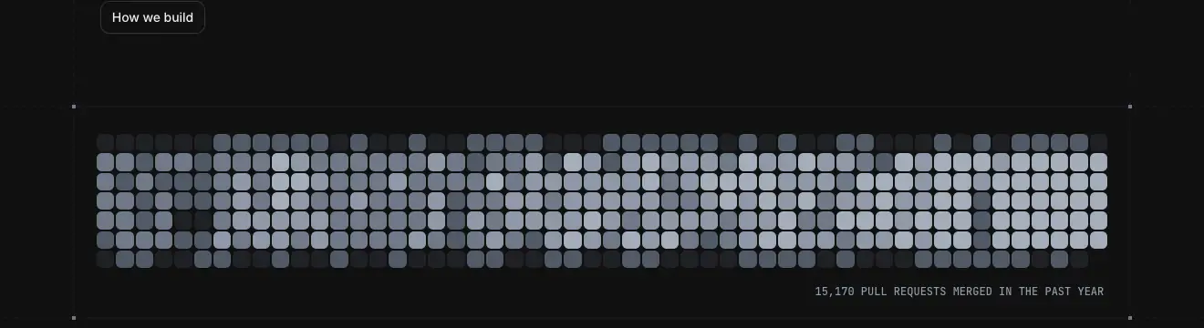

Rules seen
- Small identical units in a grid, density shows quantity. Dots for AI, squares for careers, faces for customers, rounded squares for pull requests, ticks for releases.
- The AI cloud is the only one in colour: pastel pink, yellow, mint and blue dots, denser at the centre and fading out. On /platform/ai it is a 580 × 580 <canvas>, so it can animate.
- Edges fade out. Every texture dissolves at its border rather than ending in a box.
Why. "Thousands of customers", "15,170 pull requests", "every signal": volume claims get shown as volume. It is the brand's data-native version of a decorative pattern.
4 · Portraits rendered as drawings
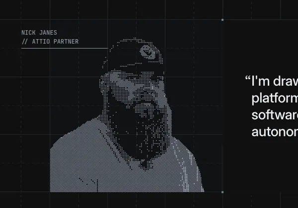
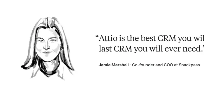
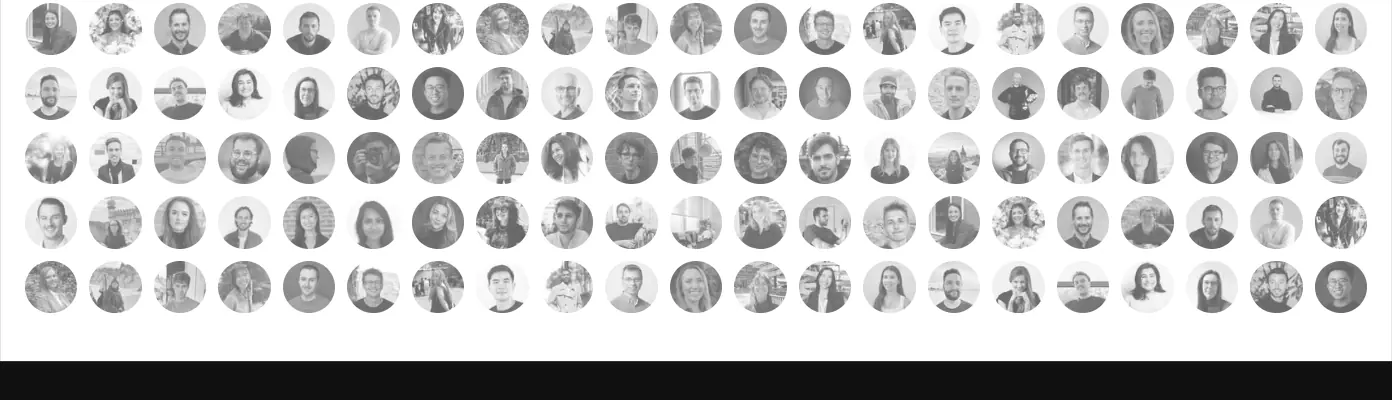
| Rendering |
Who |
Page |
| Dither / halftone (pixel blocks, grey on black) |
Developer partners: "NICK JANES // ATTIO PARTNER", Will Stenzel |
/platform/developers |
| Pen line drawing (black ink on white) |
Customer and partner quote givers: Jamie Marshall (Snackpass), expert partners |
/customers, /partners |
| Grayscale circular photo |
Employees |
/about, careers |
| Colour photo |
Founders, team, office |
/about, /careers, /brand |
Why. Processing portraits keeps faces inside the monochrome system. The technique also tells you the audience: dither for engineers (pixel or terminal), pen for business quotes (editorial, like a newspaper illustration).
5 · Real photography, used sparingly
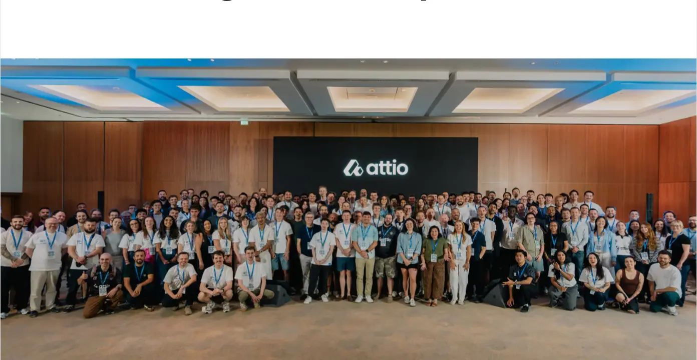
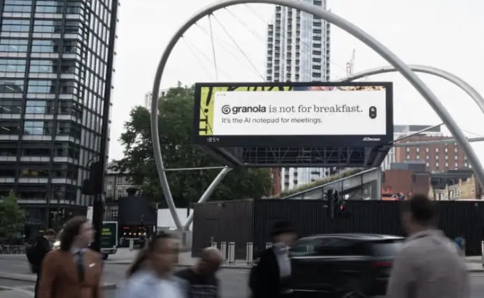
- About hero: the whole company in one hall, natural colour.
- Customer stories: teams in their own offices, and out-of-home (OOH) campaign shots, such as a Granola billboard on a London street.
- Careers: a 3 × 2 grid of office candids.
Why. Photography is evidence: these are real customers and a real team. The site never uses stock photos or posed "diverse team at laptop" images.
Iconography
- Line icons: ≈16–20px, 1.5px-ish stroke, grey. They appear in Universal Context cells, values, MCP cells and help entry cards. Values icons sit in hairline circles and diamonds.
- App icons: full colour only on
/apps and integration rows. On dark sections they are monochrome white glyphs on #1c1d1f-ish rounded tiles (≈48px).
- Customer logos: always flattened to one colour (near-black on light). Never shown in brand colour, except on
/apps.
What Attio does not use
The 32 captured pages contain none of the following:
- stock photography
- 3D renders
- emoji
- gradient blobs or mesh gradients (the horizon and hero wash are the only gradients)
- glassmorphism
- drop-shadowed card stacks
- illustrated mascots
10 · Brand assets and graphics inventory
Every distinct graphic type on attio.com, with where it appears, how it is made, and how to recreate the type for your own brand. Crops are PNG screenshots of the rendered page (images/assets/, with boxes in images/assets/index.json). Official logo files are only linked, from Attio's brand page; they are not redistributed here.
Logo system (from attio.com/brand)

| Asset |
Rule (quoted or measured) |
Official file |
| Wordmark (lockup): logomark + "attio" in lowercase |
"Use it by default wherever the layout allows. Do not use the Attio wordmark without the logo, and do not typeset the name in place of the wordmark." Rendered ≈106px wide in the 68px nav row |
attio.com/brand/v1/attio-lockup.svg |
| Logomark: two slanted, rounded strokes forming an abstract "A" |
"Use it where space is limited… avatars, app icons, favicons, or logo grids. Keep clear space around it, and do not warp, stretch, recolor, or redraw." |
attio.com/brand/v1/attio-logomark.svg |
| Logo pack |
"SVG and PNG files in both light and dark variants" |
a.storyblok.com/f/234930/8a6f825750/attio-logo-pack.zip |
| Press photos |
"Images of our team and out-of-home campaigns, ready for editorial use" |
a.storyblok.com/f/234930/f502925ba2/attio-press-photos.zip |
| Name |
One word, capital A, pronounced "AT-ee-oh". Product names capitalised, features lowercase |
— |
Logo colours seen: near-black #1c1d1f on light, white on dark. No colour version appears anywhere on the site.
The logomark as a graphic device. Beyond the logo itself, the mark is redrawn as a hatched isometric wireframe (developers hero, home SDK band). Attio does this itself; it is not a licence to redraw the mark. The brand page forbids third parties from redrawing it.
Graphic inventory
| # |
Asset |
Example |
Pages |
How it is made |
How to make your own version |
| 1 |
Live product mock |
|
home |
HTML/CSS with the product's real type tokens (Inter 14/20, weight 500, #242629) |
Build mocks with your app's component library; render fake but specific data |
| 2 |
Product screenshot tiles |
|
product pages |
2× PNG exports (2,096–3,840px) from the design tool, on #fafafb panels |
Export at 2–3×; crop to one task; place on a neutral panel with no shadow |
| 3 |
Workflow graph |
|
home, workflows |
Node cards + 1px connectors + green "✓ Completed" badges |
Node = white card with a 1px border and 8–10px radius; status badges sit on the top-right edge |
| 4 |
Eyebrow pill |
 |
home sections |
14/20, weight 500, #245bc2 on #e8f0ff; dark: #c8dcff on #1a2233 |
One accent tint + its 100-step background |
| 5 |
Logo grid |
|
home, workflows, customers |
2 × 5 or 2 × 6 cells with 1px #e4e7ec borders, monochrome logos, ↗ on linked cells |
Convert all logos to one ink colour; equalise optical size per cell |
| 6 |
Universal Context horizon |
|
home, workflows |
Black disc + conic-gradient rim light on #101010, under 96px type |
Use a conic-gradient rim masked by a large circle; keep everything else black |
| 7 |
Wormhole / gravity well |
|
home (Signals) |
<canvas> 695 × 808, perspective ellipses + particle streaks |
Canvas 2D: concentric ellipses with shrinking radius and rising y, plus moving particles |
| 8 |
App icon marquee |
|
home (Connectivity) |
≈48px rounded tiles, white glyphs, edge fade |
Monochrome icon set on dark tiles; mask-image linear fade at both edges |
| 9 |
Growth curve + stats |
|
home |
One blue exponential line over vertical hairlines; 4 stats with blue left rules |
SVG path over a repeating-linear-gradient stripe field |
| 10 |
Stripe floor |
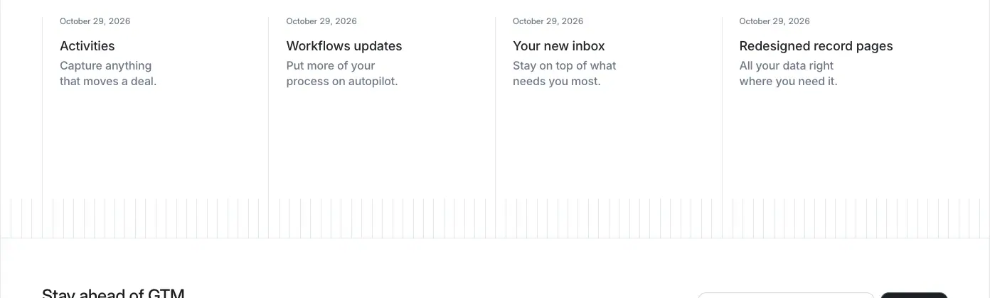 |
home, workflows, changelog |
repeating-linear-gradient 1px lines every 8px, at #fff/0.035 on dark and grey on light |
Pure CSS, no image |
| 11 |
AI dot cloud |
|
/platform/ai |
580 × 580 <canvas>, pastel multi-colour dots in a grid, density falloff |
Grid of dots; colour from a smooth hue noise; alpha from distance to centre |
| 12 |
Halftone square cloud |
|
/careers |
Grey squares of varying size fading from a corner |
Same as 11 in monochrome, using squares |
| 13 |
Wireframe logomark |
|
/platform/developers, home SDK |
Mark outline + parallel hatch lines + vertex dots, on a blueprint grid |
Only for your own mark: extrude the outline isometrically and hatch the faces |
| 14 |
Dithered portrait |
|
/platform/developers |
Photo → ordered-dither / pixel halftone, grey on black, with a mono caption "NAME // ROLE" |
Image filter (Bayer dither) at ≈4px cells; mono uppercase caption |
| 15 |
PR contribution grid |
|
/platform/developers, /engineering/blog |
Rounded grey squares in 5 shades, contribution-graph style |
Generate from real activity data; 5 grey steps |
| 16 |
ASCII masthead |
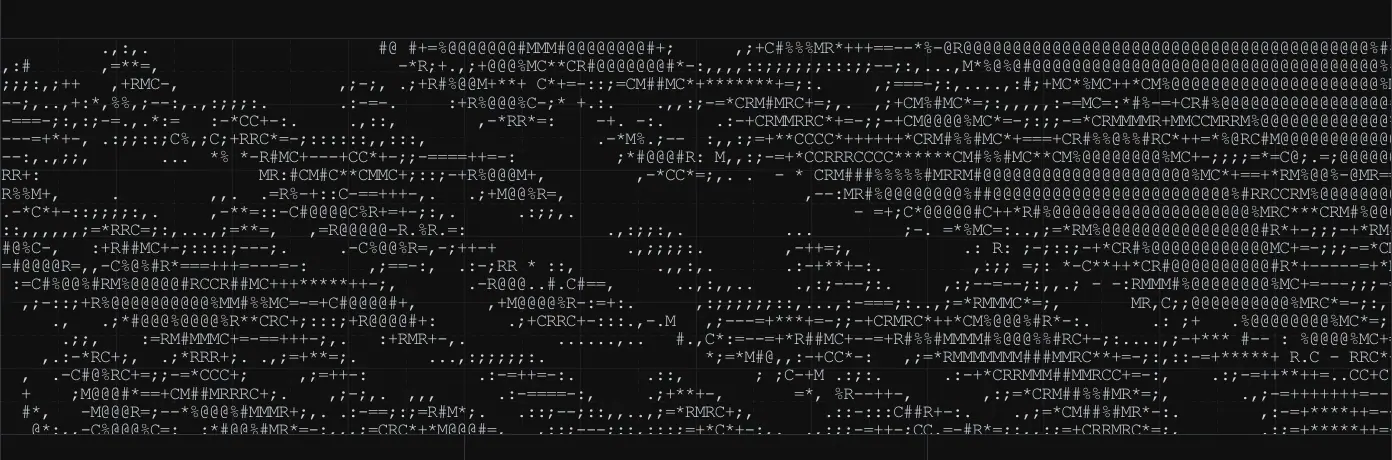 |
/engineering/blog |
Text characters @#%*+=-:. in JetBrains Mono forming an image |
Image → ASCII by luminance ramp; render as real text |
| 17 |
Wireframe globe cover |
|
/blog (featured cover) |
Line-drawn hemisphere with meridians and measurement ticks |
Draw 3D wireframes with 1px grey strokes on a fine grid |
| 18 |
Pen-line portrait |
|
/customers, /partners |
Black ink line drawing of the quote giver, 240 × 240px |
Commission one illustrator, or use a line-art filter consistently |
| 19 |
Dithered avatar mosaic |
|
/customers, story pages |
Hundreds of tiny dithered face tiles fading to the centre |
Grid of 24px tiles, dithered, alpha falling toward the headline |
| 20 |
Isometric cubes |
|
/partners |
Stacked hairline cubes, a different stack per programme |
Isometric line art, 1px grey, no fills |
| 21 |
Year ruler |
|
/changelog |
Vertical ticks, dense and dark near the active year |
Ticks per release; opacity by distance from the selection |
| 22 |
Orbit diagram |
|
/about |
Concentric ellipses with labelled dots |
SVG ellipses at 1px |
| 23 |
Team photo |
|
/about |
Colour group photo, full width |
Real photography only |
| 24 |
Grayscale headshot grid |
|
/about |
≈18 × 5 circular grayscale headshots |
filter: grayscale(1) on circles |
| 25 |
OOH campaign photo |
|
home, customer stories |
Real billboard photo in a city street |
Photograph your real campaigns |
Typefaces (assets you must licence or substitute)
| Family |
Licence |
Free substitute |
| Inter + Inter Display |
OFL (free) |
— |
| Tiempos Text (Klim) |
Commercial |
Source Serif 4, Newsreader |
| JetBrains Mono |
OFL (free) |
— |
Copying responsibly
- Never use Attio's logomark, wordmark, product screenshots, portraits or photos in your own product. They are Attio's.
- The techniques in the inventory are general. Use them with your own mark, your own data and your own people.
11 · Motion and interaction
Sources:
- getComputedStyle over every element on 6 pages (data/<page>.probe.json → transitions, animations, grouped and counted).
- The @keyframes in the CSS (data/css-tokens.json → keyframes).
- Resting styles of the nav and buttons (data/home.hover.json).
Limits. Hover states were read from the CSS rules, not filmed. Scroll-driven effects were seen in the stitched captures, not timed.
Easing tokens (from the CSS)
| Token |
Curve |
Character |
--ease-out |
cubic-bezier(0, 0, 0, 1) |
Very strong ease-out: it reaches the target almost at once, then settles |
--ease-in-out / --ease-emphasized-in-out |
cubic-bezier(.2, 0, 0, 1) |
Material-style "emphasized": quick start, long soft landing. The house curve |
--ease-out-cubic |
cubic-bezier(.33, 1, .68, 1) |
Standard out-cubic, for transforms |
--ease-in-out-cubic |
cubic-bezier(.65, 0, .35, 1) |
Symmetric, for size changes (height, background-size) |
--ease-in-cubic |
cubic-bezier(.32, 0, .67, 0) |
Exits |
--ease-reveal |
cubic-bezier(0, 0, .58, 1) |
Reveals |
What is actually running (home, counted)
| Property |
Duration |
Curve |
Count |
What it is |
colours (color, background-color, border-color…) |
0.2s |
ease-out (0,0,0,1) |
47 |
Default link and colour hover |
background-size |
0.4s |
in-out-cubic |
40 |
Underline / fill wipes on links |
color |
0.15s |
ease-out |
37 |
Footer and text links |
opacity, transform |
0.3s |
ease |
36 |
Reveal-on-scroll items |
| colours |
0.05s |
emphasized |
31 |
Nav items: an almost instant hover |
opacity, translate |
0.05s |
emphasized |
31 |
Nav dropdown items |
| colours |
0.3s |
emphasized |
26 |
Buttons and tabs |
| colours |
0.5s |
ease-out / in-cubic |
19 / 17 |
Scroll-spy rail labels and testimonial words fading between grey and ink |
color, border-color, --button-primary-bg-from/to |
0.3s |
emphasized |
8 |
Primary button: the radial-gradient stops are animated as registered custom properties |
transform… |
1s |
out-cubic |
7 |
Large mock movements (cards sliding in) |
height |
0.3s |
in-out-cubic |
21 (pricing) |
FAQ accordion open/close |
top |
0.25s |
emphasized |
8 (pricing) |
The Monthly/Annual price roll (stacked numbers slide vertically) |
Reading the table.
- Hover is fast. Nav hover takes 50ms, link colour 150–200ms, and buttons 300ms with a strong ease-out, so the change is visible within ≈60ms.
- Reveals are slow and soft. 300ms–1s, using the emphasized curve.
- Nothing bounces. No spring or overshoot curve (y > 1) is used, apart from --ease-out-cubic on transforms, whose y1 = 1 reaches the target without overshoot.
Keyframes (global CSS)
| Name |
What it does |
Used for |
navigation-enter-from-right / -left, navigation-exit-to-right / -left |
translate(±200px) + blur(8px) + opacity 0 → 1 |
Mega-menu panels slide between "Platform" and "Resources" with a blur |
dialog-scale-in / -out |
scale(.96) + opacity |
Modals (video, sign-up) |
enter / exit |
Tailwind-animate, variable translate, scale and opacity, 0.5s ease |
Dropdowns and popovers (6 running on home) |
slideDown / slideUp |
height 0 ↔ --radix-accordion-content-height |
Radix accordions (FAQ, Signals list) |
infra-reveal-to-right |
clip-path: inset(0 100% 0 0) → inset(0) |
Wipes a line or diagram in from the left (architecture art) |
infra-fade-in, scroll-edge-reveal |
opacity → 1 |
Edge fades on scroll containers |
search-shine |
translateX −100% → 200% |
Shimmer across the search / AI input |
productivity-intro-width / -height |
Lines grow to 100vw or a set height while fading from .8 to .3 |
Grid-line "drawing" intro on product pages |
caret-blink |
opacity 1 → 0 |
The typing caret in AI prompt mocks |
spin, ping, pulse |
Tailwind defaults |
Loaders, live dots |
Page-specific animations (running when probed)
| Page |
Animation |
Duration |
Loop |
| home |
pipeline-radar-ring-outer / -inner |
3.6s ease-in-out |
infinite: the radar rings around the "Agents dig" logomark |
| home |
pipeline-radar-bob ×4 |
3.8s, 4.15s, 4.5s, 4.85s |
infinite: the 4 floating chips (ICP: 98, New Exec, Warm intro, $5B Series H). Each is 0.35s longer than the last, so they never sync |
| home |
signal-roller-roll |
24s linear |
infinite: the rolling signal list |
| home |
spin ×4 |
1s linear |
infinite: "Thinking" spinners in AI mocks |
| /platform/ai |
ai-hero-box-gradient-spin |
30s linear |
infinite: a slow rotating gradient border on the hero AI card |
| home |
<canvas> 695 × 808 |
JS-driven |
the Signals wormhole particles |
| /platform/ai |
<canvas> 580 × 580 |
JS-driven |
the AI dot cloud |
Why the staggered bob durations. With equal durations, four floating chips move in lockstep and look mechanical. Steps of 0.35s keep them in a slowly changing, organic arrangement that never repeats exactly within a viewing.
Scroll-driven behaviour (seen in the stitched captures)
- Sticky scroll-spy rail (home). The chapter list stays pinned while ≈6,000px of feature cells scroll past. The active label turns from
#d3d8df to #1c1d1f.
- Word-by-word testimonial reveal (home, pricing, workflows). Each word of the Tiempos quote is its own
<span> that starts at #a4adba and turns ink as you scroll. The section is ≈2,100px tall to give the reveal scroll distance.
- Paragraph highlight (about, "Our story"). The current paragraph is ink and the others are
#a4adba.
- Sticky TOC with an active item (blog, engineering posts).
- Sticky plan header (pricing compare table).
- Auto-advancing tabs (home Signals accordion, customer story tabs). The open item shows a progress hairline. Inferred from the hairline; not timed.
Reduced motion
The CSS ships @media (prefers-reduced-motion: reduce) and (prefers-reduced-motion: no-preference) blocks. Hover styles are scoped to (hover: hover) and (pointer: fine), so touch devices never get stuck hover states.
Recipe
:root{
  --ease-out: cubic-bezier(0,0,0,1);
  --ease-emph: cubic-bezier(.2,0,0,1);
}
.btn{ transition: color .3s var(--ease-emph), border-color .3s var(--ease-emph), background-color .3s var(--ease-emph); }
.nav-link{ transition: color .05s var(--ease-emph), background-color .05s var(--ease-emph); }
.reveal{ opacity:0; translate:0 12px; transition: opacity .3s ease, translate .3s ease; }
.reveal.in{ opacity:1; translate:0 0; }
@keyframes nav-in-right{ from{opacity:0; filter:blur(8px); transform:translateX(200px)} to{opacity:1; filter:none; transform:none} }
@keyframes bob{ 50%{ transform: translateY(-6px) } }
.chip:nth-child(1){animation:bob 3.8s ease-in-out infinite}
.chip:nth-child(2){animation:bob 4.15s ease-in-out infinite}
.chip:nth-child(3){animation:bob 4.5s ease-in-out infinite}
.chip:nth-child(4){animation:bob 4.85s ease-in-out infinite}
@media (prefers-reduced-motion: reduce){ *{animation:none!important; transition-duration:0s!important} }
The bob amplitude (−6px) in the recipe is an assumption. The pipeline-radar keyframe bodies live in a page chunk that was not downloaded.
12 · Glossary
The terms you need to brief, build or critique a page like attio.com. Each term is followed by how Attio uses it.
Layout
| Term |
Meaning |
On attio.com |
| Ruled grid / visible grid |
A layout whose container and cell edges are drawn as 1px lines |
The 1,392px frame with rules at x=24 / 1416 and between sections |
| Container / max-width |
The widest the content can grow |
1,440px with 24px side padding |
| Content edge / margin |
Where text starts inside the container |
x=83 (marketing), x=141 (documents) |
| Rail |
A narrow fixed-width column beside content |
289px chapter rail, help sidebar, blog filters |
| Sticky |
Stays fixed while its parent scrolls |
Feature rail, TOC, pricing table header |
| Scroll-spy |
A nav that highlights the section currently in view |
Home chapter rail, blog TOC |
| Bento grid |
A grid of unequal cells packed like a bento box |
/platform/reporting (804 + 457px rows) |
| Cell |
One box of a grid |
Every feature block |
| Zig-zag / alternating rows |
Image and text swap sides each row |
Customer stories |
| Full-bleed |
Spans the full viewport width |
The about team photo, dark bands |
| Measure |
Line length of body text |
656px (≈75 characters) |
| Breakpoint |
A width where the layout changes |
992px (--breakpoint-lg) |
Type
| Term |
Meaning |
On attio.com |
| Optical size / display cut |
A font version drawn for large sizes |
Inter Display for headings |
| Tracking / letter-spacing |
Space added between all letters |
−0.025em at 80px, +0.06em on caps |
| Leading / line height |
Distance between baselines |
0.95 at 64px, 1.625 for articles |
| Two-tone heading |
One heading, two colours: claim + explanation |
#1c1d1f + #6f7988 |
| Mixed-font heading |
One heading, two typefaces |
"The CRM behind thousands of companies." (Inter + Tiempos) |
| Eyebrow / kicker |
A small label above a heading |
Blue pills "Platform", "Signals" |
| Overline / meta caps |
Small uppercase spaced text |
"TABLE OF CONTENTS", "[PRODUCT]" |
| Lede / lead |
The intro paragraph under a headline |
18–20px grey or ink |
| Pull quote |
A quote set larger than body text |
Tiempos testimonials |
| Run-in head |
A bold phrase starting a paragraph |
"Native ingestion – unified…" |
| Metric-matched fallback |
A local font scaled to match the web font's metrics |
inter Fallback = Arial at size-adjust:107.89% |
Colour
| Term |
Meaning |
On attio.com |
| Neutral ramp |
A scale of greys |
black-0…900, white-100…900 |
| Cool / tinted greys |
Greys with a slight hue |
Blue-leaning: #6f7988 |
| Accent |
The single saturated colour |
Blue #266df0 |
| Semantic / status colours |
Colours with meaning |
Green completed, red at risk, yellow watch |
| Contrast ratio |
WCAG luminance ratio; 4.5:1 = AA body |
#6f7988 on white = 4.41 |
| Tinted shadow |
A shadow coloured with the palette hue |
#00163e-tinted card shadows |
| Rim light |
A glow along the edge of a shape |
The Universal Context horizon |
| Conic gradient |
A gradient around a centre point |
The horizon rim |
Imagery
| Term |
Meaning |
On attio.com |
| Product shot / UI mock |
A rendering of the product interface |
Home window, workflow graphs |
| Live (HTML) mock |
A mock built in code, not an image |
All home mocks |
| Hairline / line art |
Illustration in 1px strokes |
Orbit, globe, cubes, wormhole |
| Isometric |
3D drawn without perspective at 30° angles |
Partner cubes, wireframe logomark |
| Halftone |
An image made of dots of varying size |
Careers square cloud, AI dot cloud |
| Dither / ordered dither |
Tones made from patterns of pixels |
Developer partner portraits, avatar mosaic |
| ASCII art |
Images made of text characters |
Engineering blog masthead |
| Pen portrait / line portrait |
A hand-drawn ink face |
Customer and partner quotes |
| OOH (out-of-home) |
Billboards and street advertising |
Customer-story photos |
| Logo wall / logo grid |
A set of customer logos as social proof |
Ruled 2 × 5 grid |
| Marquee |
A strip that scrolls horizontally on its own |
App icons, agent catalogue |
| Stripe texture |
Repeating 1px lines as a surface pattern |
repeating-linear-gradient floors |
Motion
| Term |
Meaning |
On attio.com |
| Easing curve |
How speed changes over a transition |
cubic-bezier(.2,0,0,1) house curve |
| Ease-out |
Fast start, slow end, for entering and hover |
cubic-bezier(0,0,0,1) |
| Scroll-driven / scroll-linked |
Animation progress tied to scroll position |
Word-by-word quote reveal |
| Reveal on scroll |
Elements fade or slide in when they enter view |
opacity, transform .3s |
| Stagger |
Offsetting start times or durations |
Radar chips at 3.8 / 4.15 / 4.5 / 4.85s |
| Pinning |
Keeping a section fixed while scrolling through it |
Testimonial section |
| Mega menu |
A large dropdown nav panel |
Platform / Resources |
| Reduced motion |
The OS setting to minimise animation |
prefers-reduced-motion blocks |
Conversion
| Term |
Meaning |
On attio.com |
| Primary / secondary CTA |
Main and alternative actions |
"Start for free" / "Talk to sales" |
| Self-serve vs sales-led |
Sign-up flow vs talking to sales |
Both offered side by side |
| Social proof |
Evidence others use it |
Logo walls, stats, quotes |
| Announcement bar |
A sitewide promo strip |
Black 48px bar |
| Closing CTA |
A final ask at the end of a page |
"Agentic revenue runs on Attio." |
| Comparison table |
Plan features side by side |
/pricing |
| Programmatic SEO pages |
Many template pages for search |
313 app pages, 54 + 171 landing pages, /f/ guides |
13 · Build recipe
A starting point for building a page with Attio's system (not its content or brand marks). Every value below is a measured or declared Attio value. Swap the accent and the fonts for your own brand.
1 · Tokens
:root{
  /* neutrals: two ramps, blue-tinted */
  --black-0:#000; --black-50:#101010; --black-100:#1c1d1f; --black-200:#202124; --black-300:#232529;
  --black-400:#2e3238; --black-500:#383e47; --black-600:#505967; --black-700:#6f7988; --black-800:#8f99a8; --black-900:#a4adba;
  --white-100:#fff; --white-200:#fafafb; --white-300:#f3f4f6; --white-400:#edeff3; --white-500:#e4e7ec;
  --white-600:#dee2e7; --white-700:#d3d8df; --white-800:#cad0d9; --white-900:#b5bdc9;
  /* accent */
  --blue-100:#e8f0ff; --blue-200:#c8dcff; --blue-500:#266df0; --blue-600:#245bc2; --blue-800:#1a2233;
  /* status (product art only) */
  --green-500:#0fc27b; --red-500:#ff5b59; --yellow-500:#f5b900;

  /* roles */
  --bg:var(--white-100); --panel:var(--white-200); --rule:var(--white-500);
  --ink:var(--black-100); --ink-2:var(--black-400); --muted:var(--black-700); --faint:var(--black-900);

  /* type */
  --font-sans:"Inter","Inter Fallback",system-ui,sans-serif;
  --font-display:"Inter Display","Inter",system-ui,sans-serif;
  --font-serif:"Tiempos Text","Source Serif 4",Georgia,serif;
  --font-mono:"JetBrains Mono",ui-monospace,monospace;

  /* shape */
  --radius-btn:10px; --radius-card:12px; --radius-sm:8px;
  --shadow-card:0 0 1px 1px rgb(0 22 62/.01),0 4px 12px -1px rgb(0 22 62/.04),0 1px 3px -1px rgb(0 22 62/.18);

  /* motion */
  --ease-out:cubic-bezier(0,0,0,1); --ease-emph:cubic-bezier(.2,0,0,1); --ease-io:cubic-bezier(.65,0,.35,1);

  /* layout */
  --container:1440px; --gutter:24px; --edge-marketing:59px; --edge-doc:117px;
}
.dark{ --bg:var(--black-50); --ink:var(--white-200); --muted:var(--black-800); --rule:rgb(255 255 255/.08); }
2 · Base
body{ background:var(--bg); color:var(--ink); font:500 16px/22px var(--font-sans); letter-spacing:-.01em; -webkit-font-smoothing:antialiased; }
.frame{ max-width:var(--container); margin:0 auto; padding:0 var(--gutter); }
.frame > .ruled{ border-inline:1px solid var(--rule); }
section + section{ border-top:1px solid var(--rule); }
3 · Headings
.h1{ font:600 56px/60px var(--font-display); letter-spacing:-.015em; text-wrap:balance; }
.h1--home{ font-size:64px; line-height:.95; letter-spacing:-.02em; }
.h2-two-tone{ font:500 40px/44px var(--font-display); letter-spacing:-.01em; text-wrap:balance; }
.h2-two-tone .muted{ color:var(--muted); }
.h2-product{ font:600 32px/36px var(--font-display); letter-spacing:-.01em; }
.eyebrow{ display:inline-flex; padding:2px 8px; border-radius:999px; font:500 14px/20px var(--font-sans); color:var(--blue-600); background:var(--blue-100); }
.dark .eyebrow{ color:var(--blue-200); background:var(--blue-800); }
.meta{ font:600 12px/14px var(--font-display); letter-spacing:.06em; text-transform:uppercase; color:var(--faint); }
<span class="eyebrow">Platform</span>
<h2 class="h2-two-tone">The intelligent system that never sleeps. <span class="muted">Picks up leads at 2am. Catches renewals before they slip.</span></h2>
4 · Buttons
@property --from{ syntax:'<color>'; inherits:false; initial-value:#202124; }
.btn{ height:36px; padding:0 12px; border-radius:var(--radius-btn); border:1px solid; font:500 14px/20px var(--font-sans); letter-spacing:-.005em;
      transition:color .3s var(--ease-emph), border-color .3s var(--ease-emph), background-color .3s var(--ease-emph), --from .3s var(--ease-emph); }
.btn--primary{ --from:var(--black-200); background:radial-gradient(at 50% -10%, var(--from), var(--black-200)); color:var(--white-300); border-color:var(--black-600); }
.btn--primary:hover{ --from:var(--black-600); color:#fff; }
.btn--outline{ background:#fff; color:var(--black-400); border-color:var(--white-800); }
.btn--outline:hover{ border-color:var(--black-700); }
.btn--sm{ height:32px; padding:0 6px 0 10px; font-size:12px; line-height:18px; }
@media (hover:none){ .btn:hover{ /* no hover on touch */ } }
5 · Section skeletons
<!-- Scroll-spy feature rail -->
<section class="frame"><div class="ruled grid" style="grid-template-columns:289px 1fr">
  <nav class="sticky" style="top:140px"> <a aria-current="true">Build pipeline</a> <a>Convert leads</a> … </nav>
  <div>
    <article class="cell"><h3 class="h3-two-tone">Your team, amplified. <span class="muted">Agents prospect…</span></h3></article>
    <figure class="cell panel"><!-- product mock --></figure>
    <div class="grid-2"><div class="cell">…</div><div class="cell">…</div></div>
  </div>
</div></section>
.cell{ padding:40px 58px; border-bottom:1px solid var(--rule); }
.panel{ background:var(--panel); }
.grid-2{ display:grid; grid-template-columns:1fr 1fr; } .grid-2 > * + *{ border-left:1px solid var(--rule); }
nav.sticky a{ display:block; font:500 18px/30px var(--font-sans); color:var(--white-700); }
nav.sticky a[aria-current]{ color:var(--ink); }
The 40px × 58px cell padding is an approximation from the screenshots, not a measured value.
6 · Signature effects
/* Stripe floor */
.stripes{ background:repeating-linear-gradient(to right, rgb(255 255 255/.035) 0 1px, transparent 1px 8px); }
/* Hero wash */
.hero-wash{ background:radial-gradient(90% 80% at 50% 100%, #e6ecff 0%, #bccbff 45%, #86a0ee 100%); mask:radial-gradient(70% 106% at 50% 0%, transparent 32%, #000 64%); }
/* Scroll-lit words */
.quote span{ color:var(--faint); transition:color .5s var(--ease-out); } .quote span.lit{ color:var(--ink); }
// light words as they pass 60% of the viewport
const words=[...document.querySelectorAll('.quote span')];
addEventListener('scroll',()=>{const y=innerHeight*.6; for(const w of words) w.classList.toggle('lit', w.getBoundingClientRect().top < y);},{passive:true});
7 · Checklist to get the Attio feel
- Draw your grid: rule the container and every section edge with 1px cool-grey lines.
- Set weight 500 for all UI and marketing text. Use 600 only for H1s and 400 only for long-form reading and footer links.
- Write every section heading as claim + muted proof.
- Keep the chrome monochrome. Let product screenshots carry the colour. Use your accent for links, eyebrows and one "recommended" button.
- Draw ideas in 1px line art. Show quantities as textures of many small marks.
- Use one serif, only for human quotes.
- Make hover near-instant (50–300ms, strong ease-out) and reveals soft (300ms–1s).
- Give long collections one rail + list pattern.
- Use realistic, specific fake data in every mock.
- Close every page with the same one-line promise.
Home · attio.com/
- Captured: 2026-11-21 at 1440 × 900, stitched from 20 viewport tiles.
- Page height: 17,627px.
- Title: "Attio: The CRM for agentic revenue".
- Data:
data/home.json, data/home.probe.json.
Section map
| # |
y (px) |
Section |
Background |
| 0 |
0 |
Announcement bar + nav + hero |
white, blue wash below |
| 1 |
580 |
Product window |
blue radial wash |
| 2 |
1,300 |
Logo grid (10 logos, 2 × 5) |
white |
| 3 |
1,567 |
Two-tone intro "The intelligent system that never sleeps." |
white |
| 4 |
1,980–8,176 |
Tabbed feature rail, 5 chapters |
#fafafb cells |
| 5 |
8,176 |
"Live from day one." centred + record page mock |
white |
| 6 |
9,250 |
"Universal Context™" horizon |
#101010 |
| 7 |
10,242 |
Signals (canvas wormhole) |
#101010 |
| 8 |
10,950 |
Connectivity: icon marquee |
#101010 |
| 9 |
11,550 |
SDK band + pinned testimonial |
#101010 → white |
| 10 |
13,663 |
"Run at any scale." stats + growth curve |
white |
| 11 |
14,424 |
Customer stories tabs |
white |
| 12 |
15,489 |
Changelog strip + newsletter |
white |
| 13 |
16,468 |
Closing CTA |
dark gradient |
| 14 |
16,875 |
Footer |
dark gradient |
0 · Announcement bar, nav and hero
What it is
- Announcement bar: 48px tall, #000. 13px/500 white text "The new architecture for agentic revenue is here →", with a close ✕ at the right.
- Nav: 68px row (under the 48px announcement bar) with a 1px bottom hairline #e4e7ec. Logo at left. Links "Platform ▾ / Resources ▾ / Developers / Customers / Pricing" in Inter 15/22, weight 500, #2e3238. Each link is a 36px-tall button with 10px radius and a transparent border, so its hover fill has a shape ready.
- Nav actions: "Sign in" (outline) and "Start for free" (solid #202124) at the right.
- Hero: centred, in this order:
- a 30px pill "GTM lessons from Elena Verna and more ›" (13px/500, hairline border #e4e7ec);
- H1 "Welcome to agentic revenue." at 64/60.8, weight 600, −1.28px;
- lead copy at 18/23.4, weight 500, #6f7988, 486px wide;
- two buttons, 36px tall with 10px radius: "Talk to sales" (outline) and "Start for free" (solid).
Why
- One-line H1. At 64px with 0.95 line height and −0.02em tracking, "Welcome to agentic revenue." fits on one line (805px). The category name is the headline. Attio is trying to own the phrase, not describe features.
- Grey lead. The lead is grey (#6f7988) so the H1 is the only ink on screen, and the eye takes the H1 first.
- Pill above the H1. It works as a news slot. It is swapped for campaigns, and here it promotes content, not a feature.
- Secondary CTA on the left. "Talk to sales" is on the left and "Start for free" on the right. The reading order ends on the primary action, and the right-hand position matches the nav CTA directly above it.
1 · Product window
What it is
- The window: ≈1,080 × 620px. Traffic-light dots, then the full app: a "Basepoint" workspace sidebar (Home, Notifications, Tasks, Notes, Calls, Reports, Automations, Favorites, Records) and a home panel.
- The home panel:
- "Good morning, Alex" at 20/24, weight 600;
- a prompt box reading "How do I win my deal with GreenLeaf?" with an "Auto" model chip and a blue send button #266df0;
- suggestion chips "Prep for next meeting" and "Recap last call";
- a Meetings list. Two meetings are already struck through and the GreenLeaf meeting is expanded.
- The backdrop: radial-gradient(90% 80% at 50% 100%, #e6ecff, #bccbff 45%, #86a0ee), masked to white at the top. The blue light rises from below the window.
Why
- The prompt sits where a hero image would. The first thing you "read" in the product is a question a salesperson really asks. That sells the agent positioning faster than a feature list could.
- The window is HTML. The text is real 14px/500 Inter at #242629, the same as the app. It stays sharp on any screen, and the struck-through meetings and the expanded card can animate in.
- The blue wash is the only gradient in the hero. It frames the product, not the type.
2 · Logo grid

What it is
- A 2 × 5 grid of customer wordmarks: Granola, turbopuffer, parallel, Modal, Wispr Flow, Railway, Listen, taskrabbit, AIUC, WORDSMITH.
- Each cell is ≈278 × 96px with 1px #e4e7ec borders.
- All logos are flattened to near-black. Some cells carry a small ↗ arrow in the top-right corner, which marks a linked case study.
Why
- Ruled cells, not a floating row. This matches the spreadsheet grid that runs through the whole site (principle 5).
- The ↗ arrow. It tells you which logos have a story without adding a "Read case study" label.
- Monochrome logos. They keep the page free of brand colours other than Attio's.
3 · Intro statement
What it is
- A blue eyebrow pill reading "Platform": 14/20, weight 500, #245bc2 on #e8f0ff, set left.
- Below it, the two-tone H2 at 40/44, weight 500, 896px wide: "The intelligent system that never sleeps." in ink, then "Picks up leads at 2am…" in #6f7988.
Why
- The pattern the whole page repeats. This sets up eyebrow → two-tone statement. Left-aligned text at the 83px content edge lines up with the grid rails below it.
4 · Tabbed feature rail (the core of the page)
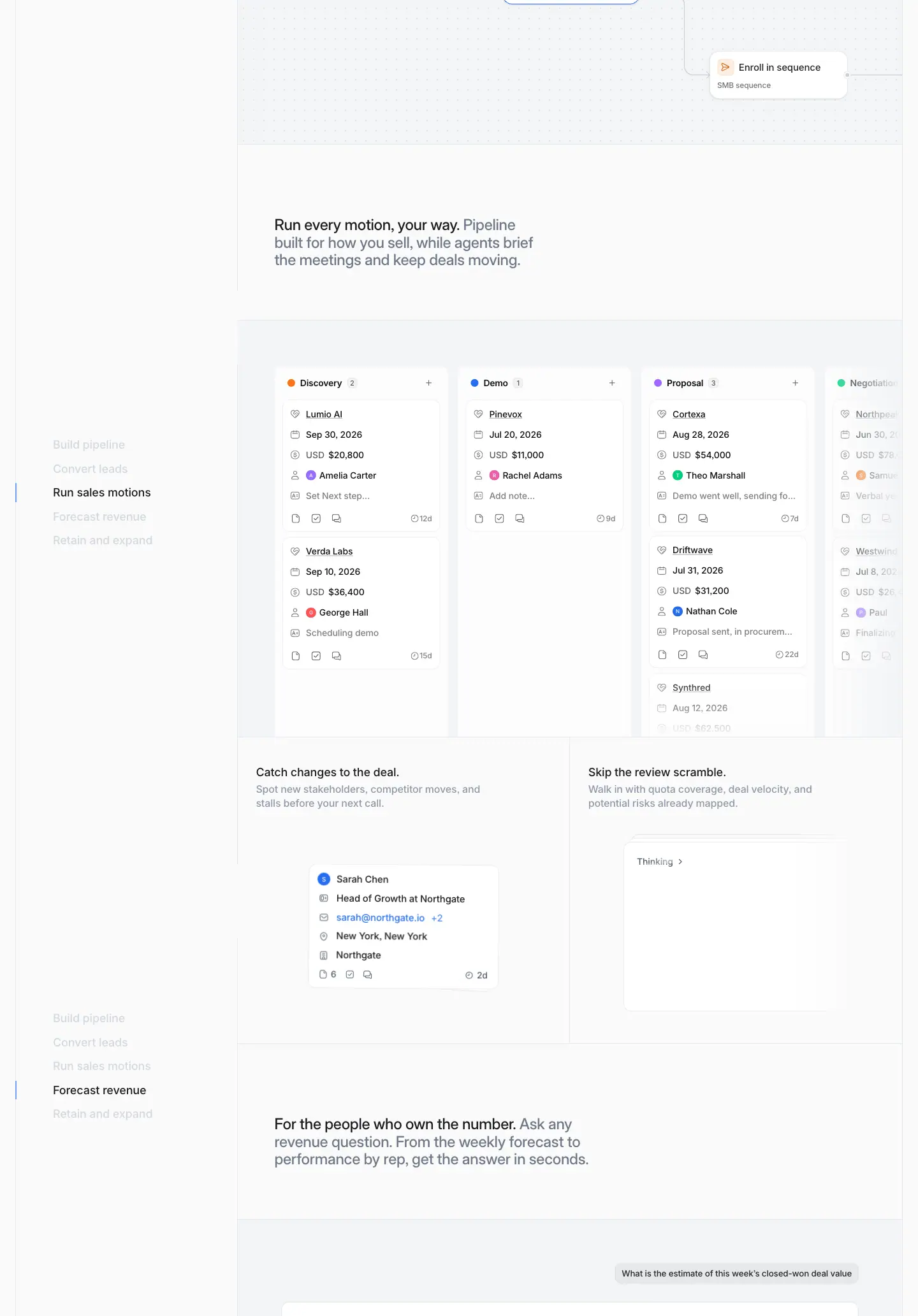
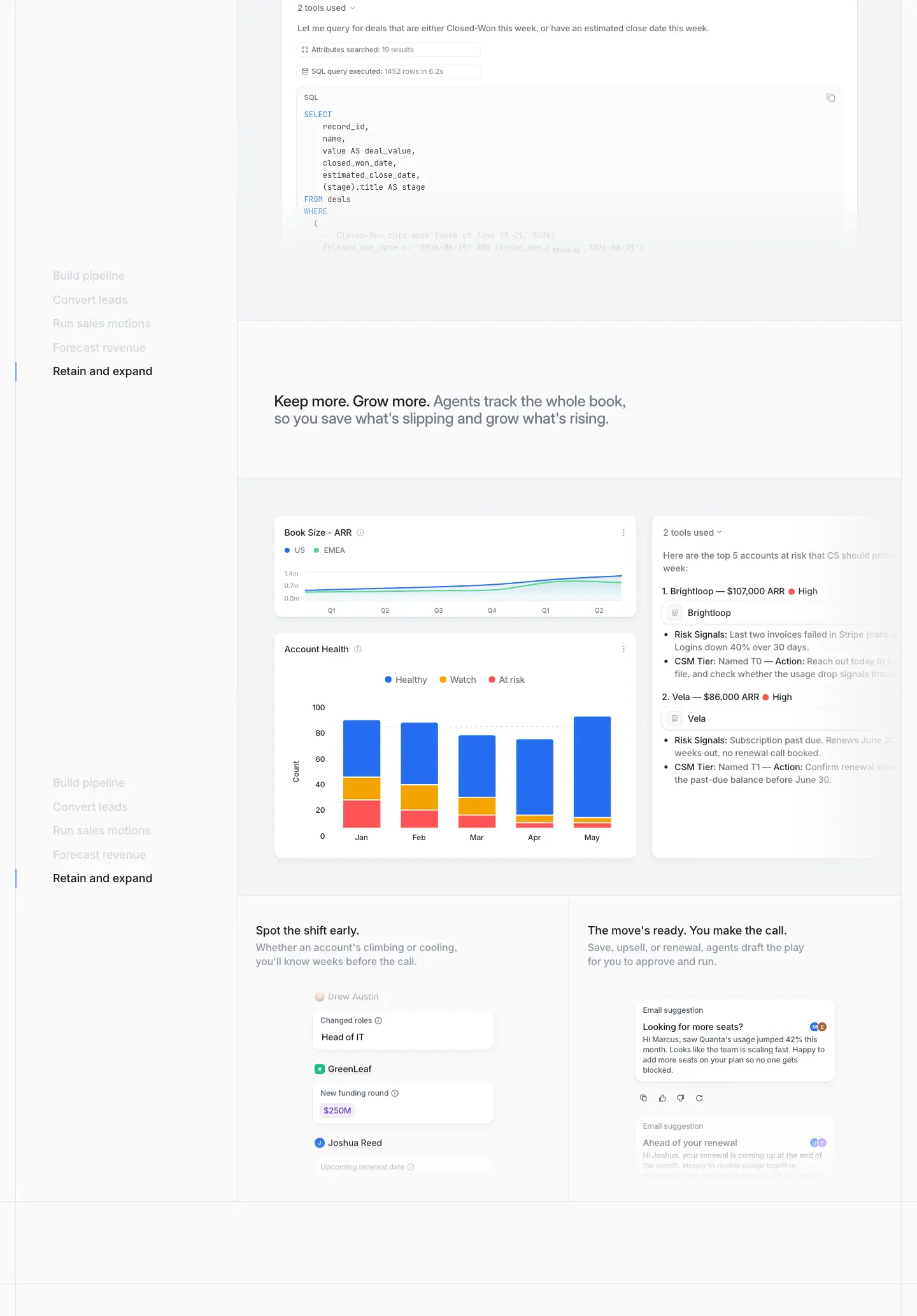
What it is
- The left rail: a 289px column listing five chapters, each 30px tall with 18px/500 text: Build pipeline, Convert leads, Run sales motions, Forecast revenue, Retain and expand.
- Active chapter: #1c1d1f with a short vertical tick at the left. Inactive chapters are #d3d8df. The rail is sticky and acts as a scroll-spy: the active chapter changes as you scroll (see the three crops).
- The right side: a vertical sequence of grid cells. Each cell has:
- a two-tone H3 at 24/27.6, weight 500, 560px wide, starting at x=430: "Your team, amplified. Agents prospect…";
- a full-width #fafafb panel holding a product mock. Mocks include a "Companies to work" table with green ICP scores (#007d53 on #e0fced), a "Send follow up email" composer, a workflow graph (Trigger → Web agent → Custom agent → If → Enroll in sequence, each node badged "✓ Completed"), a Kanban pipeline (Discovery · Demo · Proposal · Negotiation), a SQL tool-call trace, and ARR and account-health charts;
- a 2-up row of smaller cells, each with an 18/22 H4 and 16/22 #8f99a8 body. Examples: "Free your reps to sell." and "Agents dig. You close.".
Why
- A scroll-spy rail turns a 6,000px section into chapters. The reader always knows where they are and how much is left. The structure is the buyer journey (pipeline → conversion → motions → forecast → retention), so the page maps to the revenue team's funnel.
- Every chapter repeats statement → big mock → two small proofs. The fixed rhythm lets the reader skim the H3s alone and get the full pitch.
- Mocks sit on #fafafb, not white. That separates "product" from "page" without shadows or borders.
- Realistic fake companies. OpenAI, Harvey, Browserbase, Cursor and Notion appear with plausible scores and owners. The table reads as real usage, and the names double as social proof of the target market (AI-native startups).
5 · Live from day one
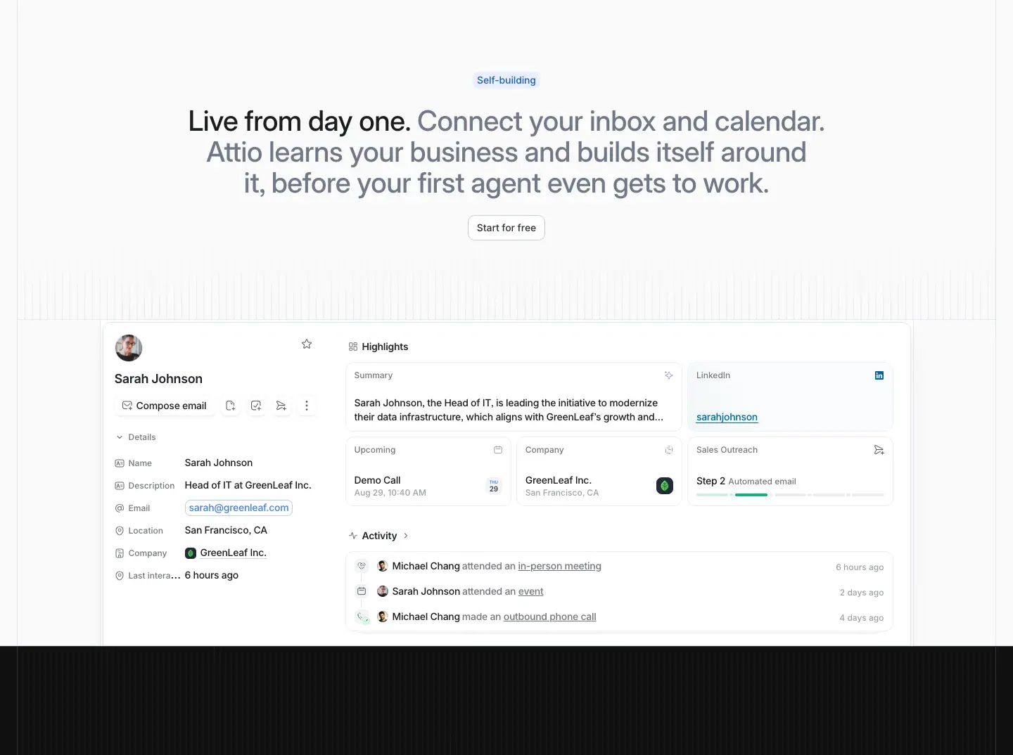
What it is
- A "Self-building" eyebrow, a centred two-tone H2 (926px), and an outline "Start for free" button.
- Below, a person record page for "Sarah Johnson":
- avatar, Compose email, and Details (Name, Description, Email, Location, Company, Last interaction);
- a Highlights grid: Summary, LinkedIn, Upcoming, Company, Sales Outreach "Step 2";
- an Activity list.
- A faint vertical stripe texture (#ffffff/0.78 1px lines) runs behind the mock.
Why
- It answers "how much setup?" before the buyer asks. A fully populated record appears straight after connecting inbox and calendar. This is the onboarding promise, shown.
- The mock sits on the boundary. Its bottom edge touches the dark section that follows, a visual handoff from the "light" product story to the "dark" platform story.
6 · Universal Context™
What it is
- "The only CRM with" at 16/22, weight 500, #8f99a8. Under it, "Universal Context™" at 96/96, weight 600, −2.3px, in #fafafb.
- A planet-edge horizon: a black disc whose rim is lit by a conic gradient. The rim runs teal #6cbdb0 → navy #161e69 → red #bb2a1e.
- Below the horizon, 5 equal cells with thin line icons:
- "It logs itself."
- "Your tools finally talk."
- "Gets to know you."
- "Ask, and it's there."
- "No agent left guessing."
- Each is 16/22.4 #fafafb with 14/20.3 #8f99a8 body.
Why
- The biggest type on the page names a trademarked concept. It is set as a product launch moment. The dark band and the "sunrise" horizon borrow the visual language of keynote reveals.
- Five one-line benefits. They decode the abstract term straight away, so the big name is never left unexplained.
7 · Signals
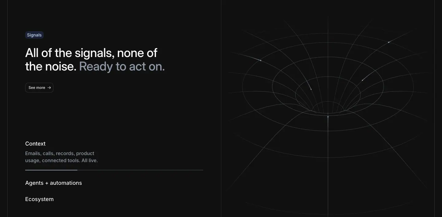
What it is
- Left: a "Signals" eyebrow (#c8dcff on #1a2233), the two-tone H2 "All of the signals, none of the noise. Ready to act on.", and a 32px outline button "See more →" (#101010 fill, #edeff3 text, #2e3238 border).
- Below the heading: an accordion list: Context (open, with body text and a progress hairline), Agents + automations, Ecosystem.
- Right: a 695 × 808px <canvas> that draws a wireframe gravity well. Thin ellipses funnel into a point, with particles streaking in.
Why
- The wormhole is a literal metaphor for signals being pulled into one place. It is the only canvas on the page, kept for the most abstract idea.
- The open item has a hairline under it that looks like a progress bar. That suggests the accordion advances on its own. This is inferred from the static capture; it was not timed.
8 · Connectivity
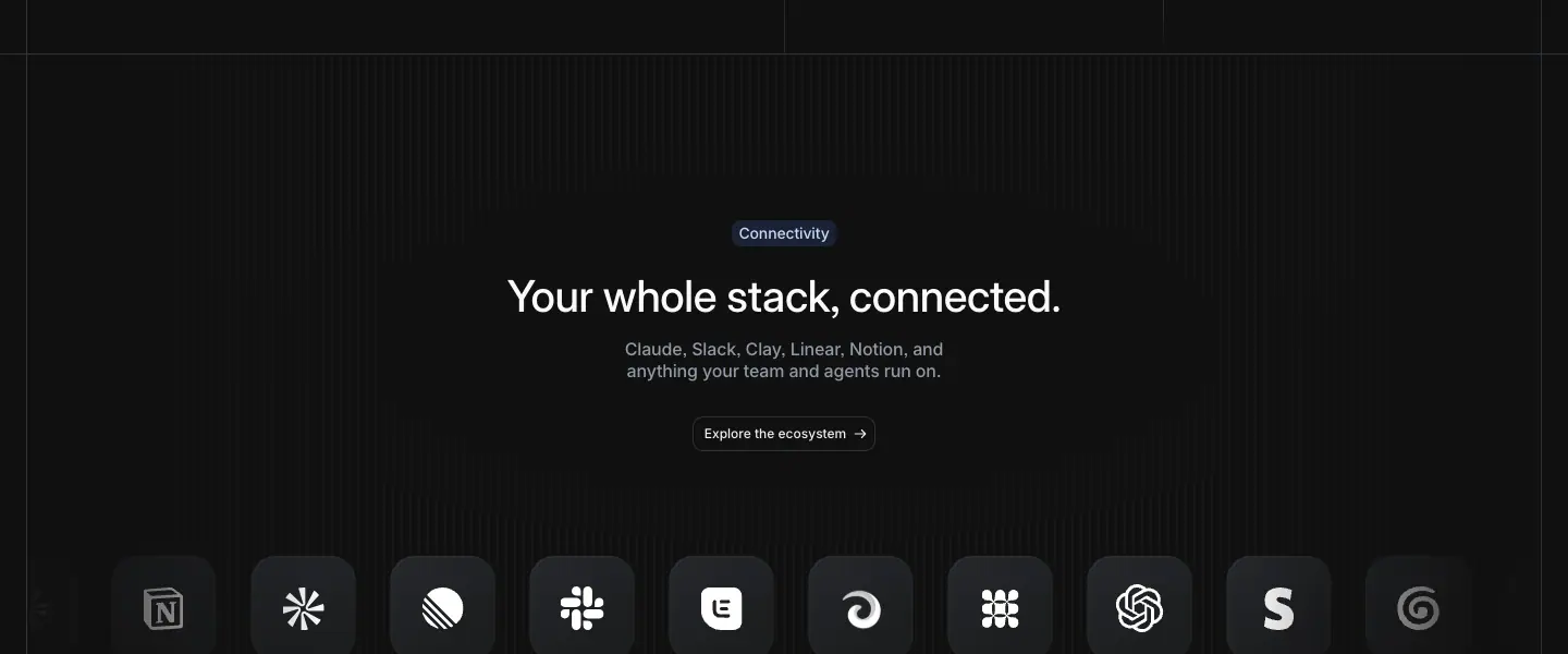
What it is
- A centred eyebrow, the H3 "Your whole stack, connected." (40/44), a 2-line #8f99a8 body naming "Claude, Slack, Clay, Linear, Notion", and "Explore the ecosystem →".
- Below, a row of ≈48px rounded-square app icons: dark tiles with white glyphs, fading out at both edges.
Why
- App icons, not wordmarks. Icons read as "installable apps", which is the ecosystem story.
- Edge fade. It implies an endless list without a "+300 more" label.
9 · SDK band and testimonial
What it is
- The SDK band: a framed cell with "SDK. API. MCP. Build anything on Attio." and "View docs →". On the right is the Attio logomark redrawn as a hatched wire diagram with node dots.
- The testimonial: after the band the page turns white. A pinned Tiempos Text quote, 48/52 weight 400, reads "When I first opened Attio, I instantly got the feeling this was the next generation of CRM." It is attributed to Margaret Shen, Head of Business Operations, Modal.
- Each word starts #a4adba and turns ink as you scroll. The section is ≈2,100px tall so the reveal has scroll distance.
Why
- The hatched logomark. It brands the developer story with the mark itself, drawn as a blueprint: "you can build on this".
- The scroll reveal makes you read the quote at reading speed. Scrolling is the reading pace. The serif signals a human voice (see 03).
10 · Run at any scale
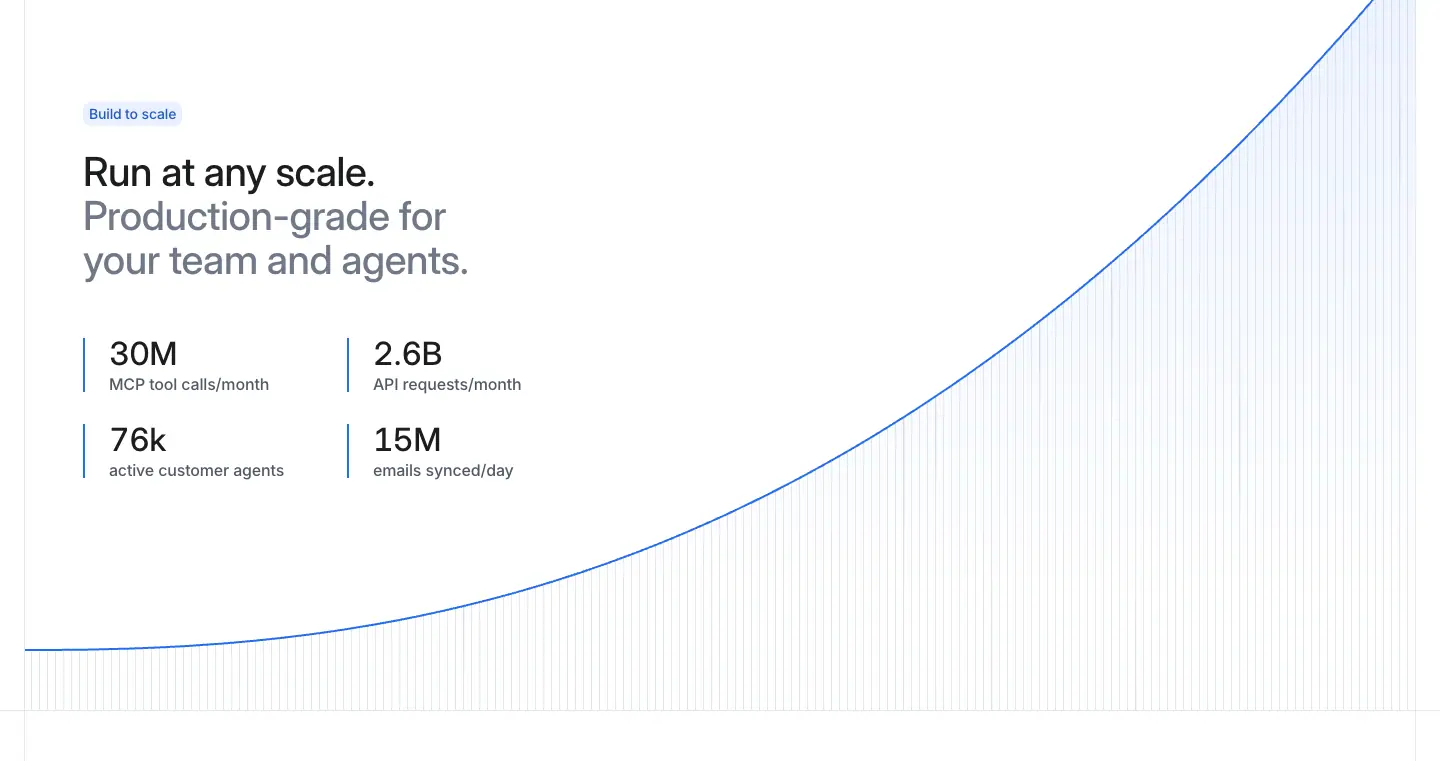
What it is
- A "Build to scale" eyebrow and a two-tone H2.
- Four stats in a 2 × 2 grid, each with a 1px blue left rule:
- "30M" MCP tool calls/month
- "2.6B" API requests/month
- "76k" active customer agents
- "15M" emails synced/day
- Numbers are 32/32 weight 500. Captions are 16/16 #505967.
- A blue exponential curve rises from bottom-left to top-right over a field of fine vertical lines.
Why
- The curve is the chart every buyer wants to see. Drawing it as one line over hairlines keeps it abstract and on-brand, with no fake axis values.
- Stats in product units. "MCP tool calls" and "API requests" speak to the technical buyer, after the earlier sections spoke to the revenue leader.
11 · Customer stories
What it is
- A two-tone H2 and "Read more →".
- A 4-tab strip of logos: Granola (active, #fafafb fill), Railway, Modal, taskrabbit.
- A split card. Left: a caps category "ARTIFICIAL INTELLIGENCE" (12/14, weight 600, +0.72px), then "83% faster lead triage. How Granola turns…" at 32/36.8. Right: a 695 × 429px out-of-home campaign photo (a Granola billboard).
Why
- Tabs keep 4 stories in one viewport. The photo is real-world brand activity rather than a headshot, which feels editorial.
- The metric comes first (see 07).
12 · Changelog and newsletter
What it is
- A two-tone H2 and "View all →".
- Four changelog cards, each 319 × 312px in a ruled row:
- a date "October 29, 2026" (12/14 #6f7988);
- a title (18/24, weight 500);
- a 2-line grey summary.
- A stripe-textured floor under the cards.
- A newsletter row: "Stay ahead of GTM. / Product updates in your inbox." (24/30 two-tone), an email field, and a solid "Subscribe" button (40px tall).
Why
- Four releases with the same date prove "new features every week". The changelog is marketing.
- The newsletter repeats the two-tone voice at 24px. Even utility rows speak the same way.
13 · Closing CTA and footer
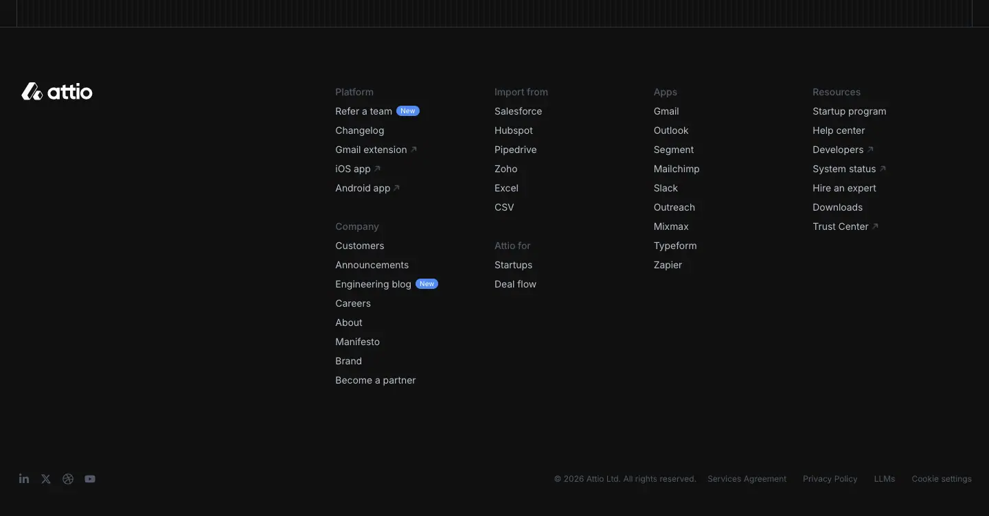
What it is
- The closing CTA: "Agentic revenue runs on Attio." at 56/56, weight 500, white, centred. Below it, "Talk to sales" (dark outline) and "Start for free".
- The footer: linear-gradient(-30.12deg, #1c1d1f 25.6%, #2e3238 163%).
- The logo sits at left.
- Six column groups: Platform, Company, Import from, Attio for, Apps, Resources. Labels are 14/20 weight 500 #505967. Links are 14/20 weight 400 #b5bdc9.
- Small blue "New" badges (10px) sit on "Refer a team" and "Engineering blog".
- A bottom row holds social icons and the legal line in 12/18 #505967.
Why
- The closing line repeats the H1's category phrase. The page is bookended by "agentic revenue".
- Weight 400 in the footer. It is the only place on the page with 400 links, which makes the footer visibly quieter than everything above it.
Pricing · attio.com/pricing
- Captured: 1440 × 900, stitched. The sticky column header was unstuck for the capture, so it appears once.
- Data:
data/pricing.json.

0 · Hero and plan cards
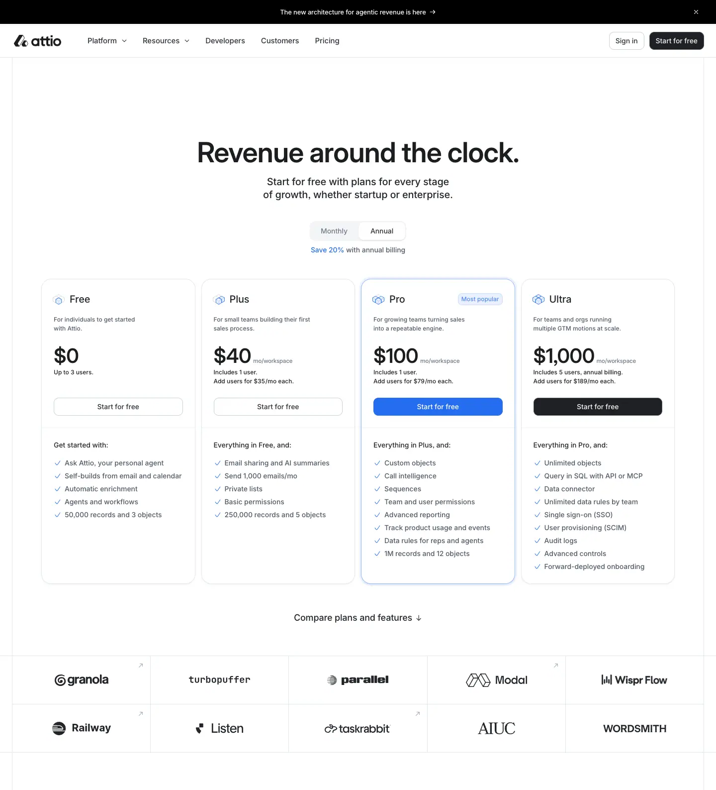
What it is
- H1: "Revenue around the clock." at 56/60, weight 600, centred. A one-line lead follows.
- Billing toggle: a segmented control of two 94 × 36px buttons, "Monthly" and "Annual", with 10px radius and 14/20 weight 500. The inactive option is #6f7988 and the active one #2e3238. Under it, "Save 20% with annual billing": the "Save 20%" is blue #266df0, the rest #505967.
- Four plan cards in one row, each ≈322px wide:
| Plan |
Price (annual / monthly) |
Unit |
Who it is for (12/18, #505967) |
| Free |
$0 |
up to 3 users |
"For individuals to get started with Attio." |
| Plus |
$40 / $50 |
mo/workspace, includes 1 user, +$35/$44 per user |
"For small teams building their first sales process." |
| Pro |
$100 / $125 |
mo/workspace, includes 1 user, +$79/$99 per user |
"For growing teams turning sales into a repeatable engine." |
| Ultra |
$1,000 |
mo/workspace |
for teams that need advanced control |
- Card anatomy:
- plan name at 20/26, weight 500
#232529;
- the price number in Inter Display 40/44, weight 600;
- a "mo/workspace" suffix at 12/18,
#6f7988;
- a 260 × 36px "Start for free" button;
- an "Everything in Plus, and:" line (14/20);
- a feature checklist.
- Pro is the highlighted card: a blue "Most popular" chip (12/18,
#538bf3), a light blue fill and outline, and the only blue CTA in the marketing chrome, #266df0 with a white label. Ultra's CTA is black #202124. Free and Plus use outline CTAs.
- Two numbers per price: the data holds both the monthly and annual figure for every price ("50" and "40" at the same x, 44px apart in y). The toggle slides between two stacked numbers, a vertical roll, rather than replacing the text.
Why
- The only blue CTA on the site is on the plan Attio wants you to buy. Blue is held back everywhere else (02), so here it works as a pointer: the eye lands on Pro first.
- CTA weight steps up across the cards: outline → outline → blue → black. Ultra gets black because it is the "talk to us" tier, which carries the sitewide CTA colour.
- The per-workspace + per-user formula is spelled out under each price in 12px type, so the big number stays simple.
1 · Compare plans table
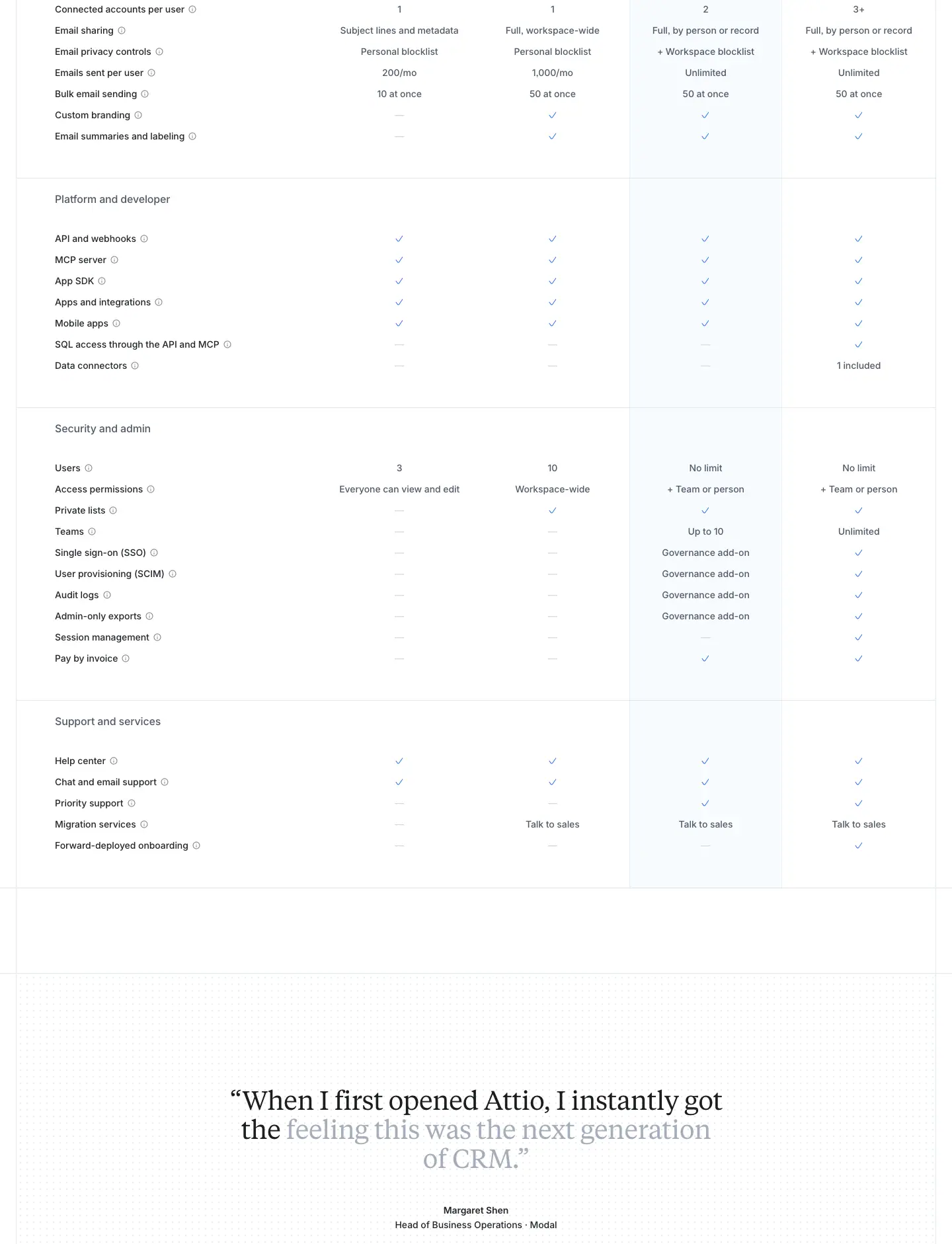
What it is
- A two-tone H2 "Compare plans" at 40/44, weight 500, and a second Monthly/Annual toggle.
- A 5-column table: a feature column 463px wide, then Free, Plus, Pro and Ultra at ≈232px each.
- Category headers (H4 16/22, weight 500, #505967): Agents and AI, Automation, Context and data model, Pipeline and activity, Email and calendar, Platform and developer, Security and admin, Support and services.
- Cells hold ✓ ticks, numbers ("1,000", "10,000") or short text ("Up to 10", "Unlimited") in 14/20, #505967.
- The Pro column carries a pale blue #e8f0ff-ish tint for its full height.
- The column header row (plan name, price and CTA) is position: sticky on the live page, so the plans stay visible while you scroll 2,500px of rows.
Why
- The tinted column carries the "Most popular" highlight down the table. You can follow Pro without re-reading the header.
- The sticky header solves the long-table problem. At row 40 you still know which column is which.
2 · Testimonial, FAQ and closing
What it is
- The Tiempos testimonial from home (Margaret Shen, Modal), with the scroll-driven word reveal.
- FAQ: "Frequently asked questions" at 40/44 on the left (522px), with 13 accordion rows on the right. Each row has a question at 16/22, weight 500, a + icon, and a hairline divider. The questions cover the free plan, trial, annual discount, plan fit, SSO, sales, cancelling, credits, payment, startups, AI tools and migration.
- The standard closing band and footer follow.
Why
- The FAQ handles objections in buyer order: can I try it, what does it cost, can I leave, can it work with my AI tools, can you move my data.
About · attio.com/about
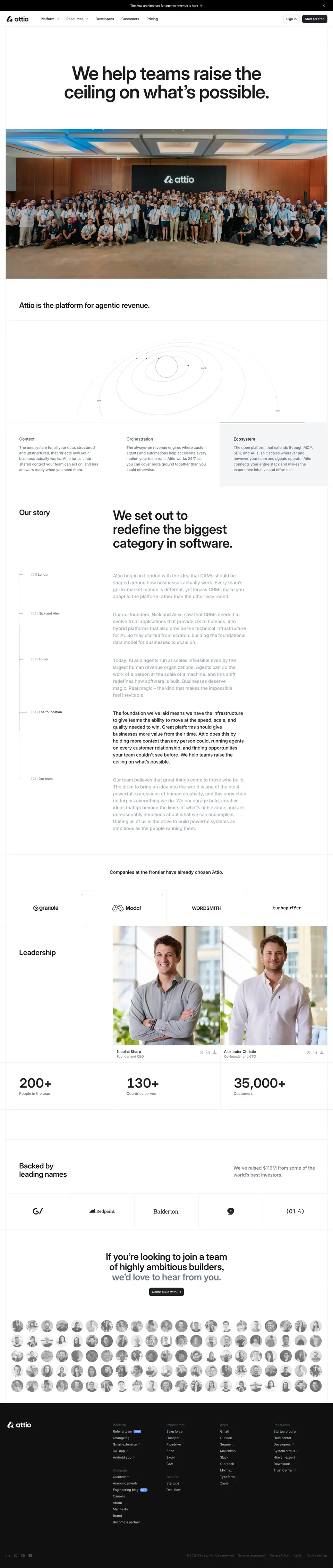
0 · Hero: the biggest type on the site, then the whole team
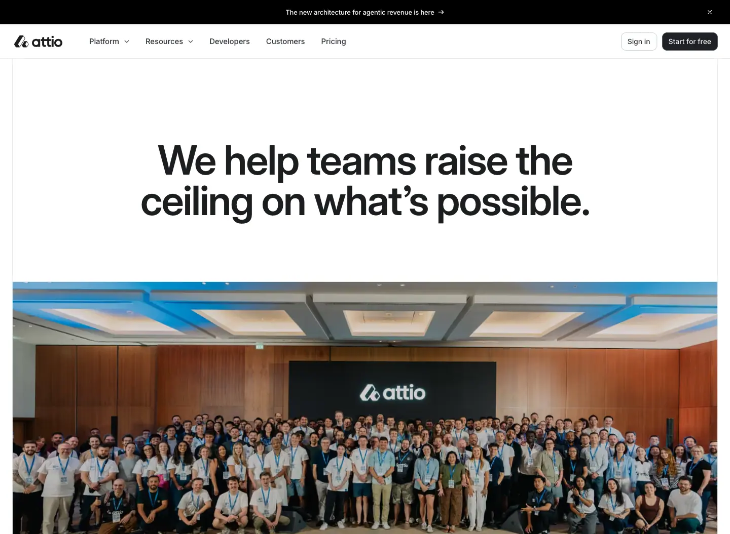
What it is
- The H1: "We help teams raise the ceiling on what's possible." at 80/80, weight 600, −2px, centred, 1,040px wide over 2 lines. This is the largest H1 on the site.
- The photo: a full-width colour photo of the entire company, 200+ people in a hall, with the Attio logo on the wall behind them.
Why
- About is the one page where the subject is people, so the hero image is all of them. The 80px headline is a mission statement, so it gets the most space.
1 · "Attio is the platform for agentic revenue." · orbit diagram
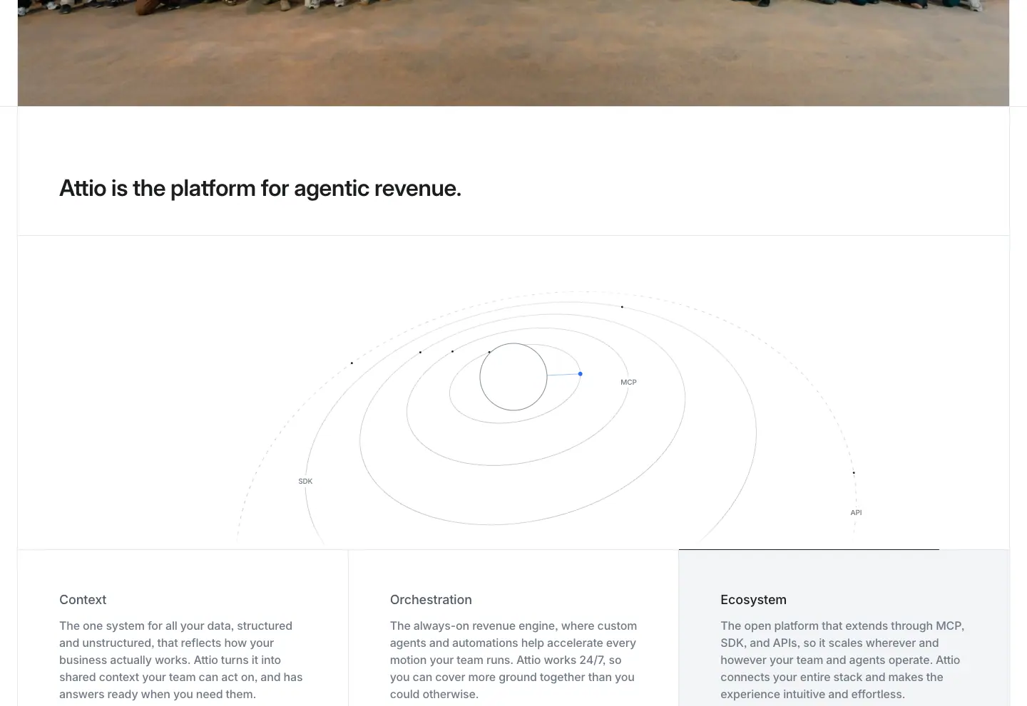
What it is
- An H2 at 32/36, weight 600.
- A hairline orbit diagram: concentric ellipses with small labelled dots.
- Three tabs below it: Context, Orchestration (active, #1c1d1f) and Ecosystem (#505967). Each tab has a short paragraph, and the active cell has a #fafafb fill.
Why
- The orbit is the same hairline geometry as the Signals wormhole and the reporting radar circles. Attio's diagram language is thin ellipses and grids, never filled shapes.
2 · Our story: scroll-lit timeline
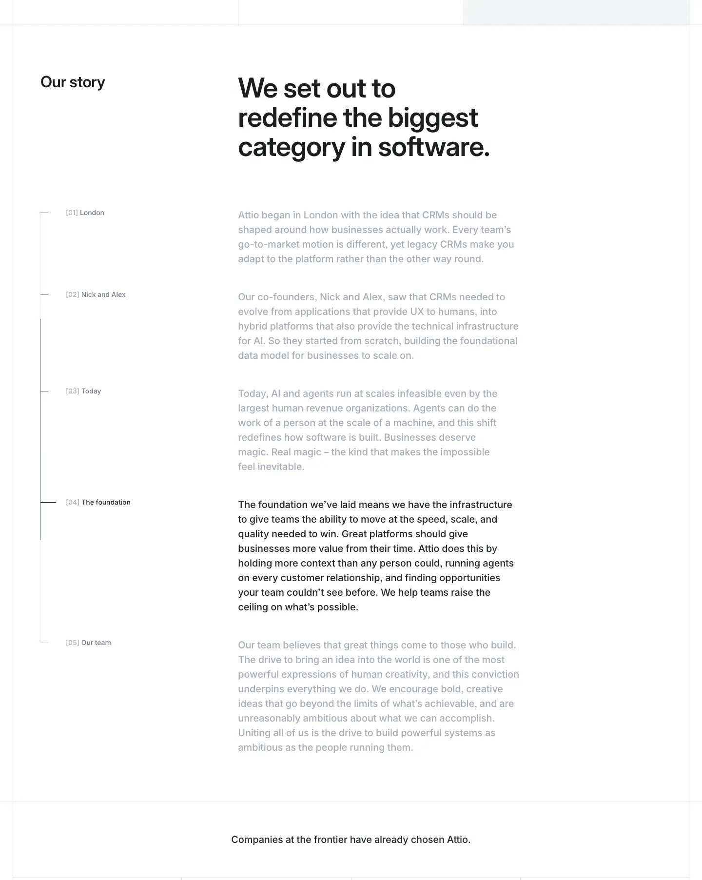
What it is
- Left: "Our story" (32/36), and a vertical timeline of bracketed steps — [01] London, [02] Nick and Alex, [03] Today, [04] The foundation, [05] Our team — at 14/20, #6f7988.
- Right: a 3-line display heading, "We set out to redefine the biggest category in software.".
- Paragraphs: five paragraphs at 20/30, weight 500. Only the current one is ink. The others sit at #a4adba, and the highlight moves as you scroll.
Why
- The same scroll-reveal idea as the testimonial words, applied per paragraph. It paces a long founder story and makes the reader move through it in order.
3 · Leadership and key facts
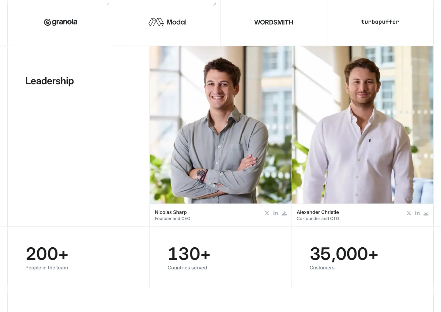
What it is
- Two large colour portraits of the founders against a bright window: Nicolas Sharp (Founder and CEO) and Alexander Christie (Co-founder and CTO). Each has social icons.
- A row of three key facts: 200+ People in the team, 130+ Countries served, 35,000+ Customers. The numbers are in Inter Display at ≈40px.
Inconsistency found: About says 35,000+ customers while the home page says "Trusted by 30,000+ customers". The two pages were last edited at different times.
4 · Backed by leading names
What it is
- Two-tone copy: "Backed by leading names" and "We've raised $116M from some of the world's best investors." (20/30 #6f7988).
- A ruled row of investor logos: GV, Redpoint, Balderton, Point Nine and 01A.
5 · Join the team
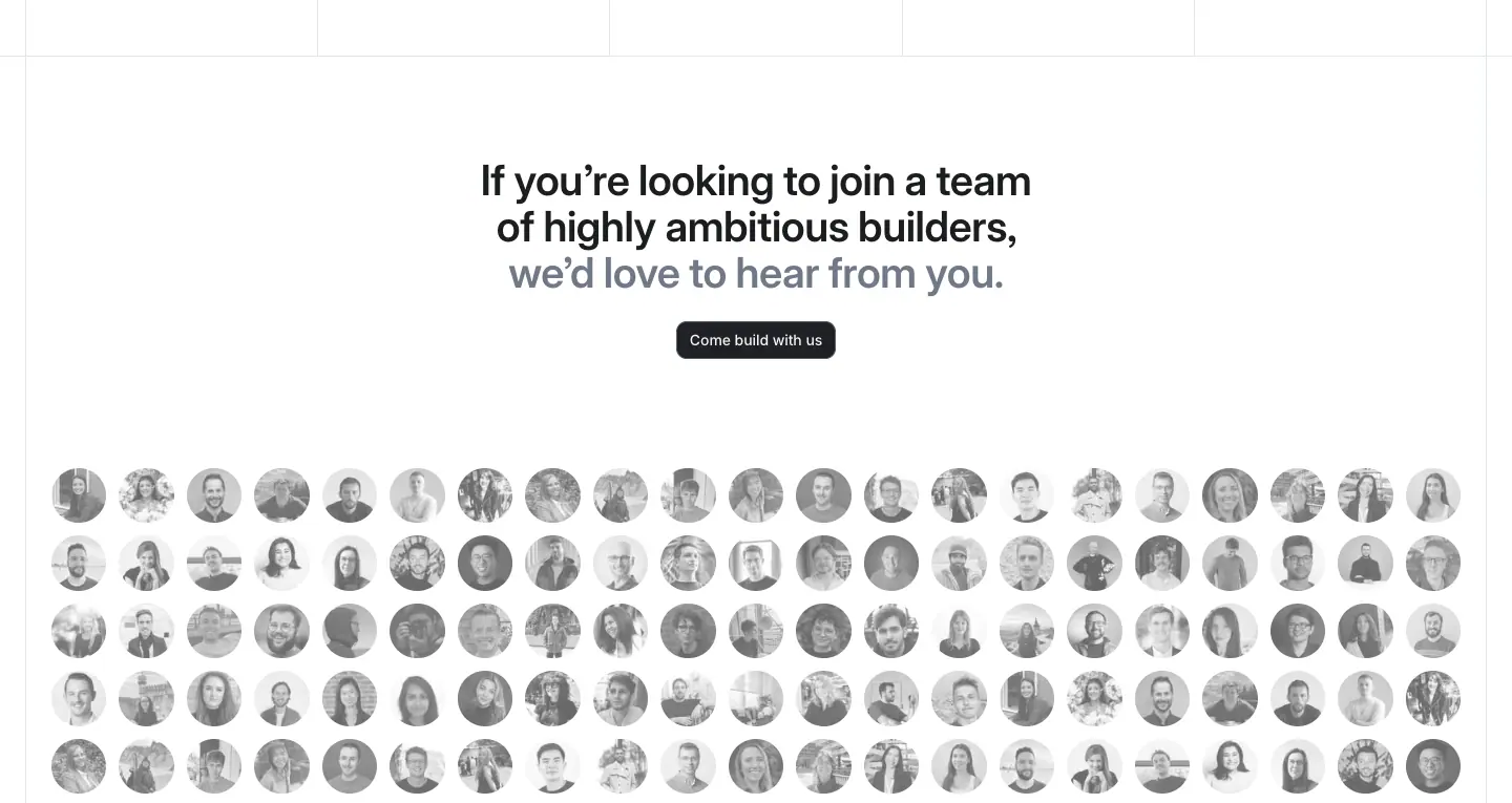
What it is
- The two-tone H2 at 40/44, weight 600, centred: "If you're looking to join a team of highly ambitious builders, we'd love to hear from you.", and a "Come build with us" button.
- A grid of ≈18 × 5 circular grayscale headshots of team members.
Why
- Faces in grayscale stay part of the monochrome page. The grid echoes the dithered avatar mosaic on the customers page: "a crowd" as texture.
Platform · AI · attio.com/platform/ai
This is the template for all 14 /platform/* product pages. platform-workflows, platform-reporting and platform-developers reuse it with different art.
- Captured: 1440 × 900, stitched.
- Data:
data/platform-ai.json.

How the product-page template differs from home
| Trait |
Home |
Product pages |
| Hero alignment |
Centred |
Left, text column 556px, art on the right |
| H1 element |
The headline |
The small eyebrow pill is the <h1> ("Embedded intelligence", 13/18.2). The big headline is an <h2> at 56/60, weight 600 |
| Section headings |
40/44, weight 500, two-tone |
32/36, weight 600, two-tone ("Ask Attio. Search, update, and create with AI.") |
| CTA order |
Talk to sales · Start for free |
Start for free · Talk to sales |
| Product art |
Live HTML mock-ups |
Mostly images from the Storyblok CDN (a.storyblok.com/f/234930/2096x1256/…) at 2× density, plus one <canvas> hero |
| Cell labels |
None |
[01], [02]… in Inter Display 12/14, weight 600, +0.72px, #a4adba |
Why the <h1> is the eyebrow. The pill names the product ("Embedded intelligence", "Workflows", "Reporting"), which is what the page should rank for. The marketing line ("Every rep, infinitely multiplied.") is a slogan. Putting the product name in the <h1> is an SEO choice that leaves the visual hierarchy unchanged.
Why images instead of HTML mocks here. There are 14 product pages and each needs 6–12 product shots. Producing them as 2096px images from the design tool is cheaper than coding live mocks. Home is the one page that justifies hand-built HTML.
0 · Hero
What it is
- The text sits left: an "Embedded intelligence" pill; H2 "Every rep, infinitely multiplied." at 56/60, weight 600, −0.84px, 2 lines and 556px wide; lead copy at 20/26, weight 500, #232529 ("A team of agents on every deal. Qualifying, enriching, researching, and moving to close."); then "Start for free" (solid) and "Talk to sales" (outline).
- On the right is a 580 × 580px <canvas>: a cloud of small dots in pastel rainbow colours (pink, yellow, teal, blue), denser at the centre. A floating UI card sits on it, "Automatically qualify leads · AI" with an input, plus a "Compa…" chip being typed.
- Below is a 2 × 6 grid of 12 customer logos with no cell rules.
Why
- The dot cloud is Attio's visual sign for "AI". It is made of many small data points, like a halftone of an aura. It is colourful against the monochrome page and is used only where AI is the subject.
- The floating card puts a real product control on top of the abstract art. It anchors the metaphor to something you can do.
- The lead copy is darker here than on home (#232529 vs #6f7988). With the text left-aligned and the art on the right, the lead has to hold its own against a colourful image.
1 · Ask Attio (2 × 2 feature cells)
What it is
- The two-tone H2 at 32/36: "Ask Attio. Search, update, and create with AI.".
- A ruled 2 × 2 grid of cells, each 481px wide. Each cell holds:
- a [01]–[04] label;
- a 481 × 289px product image of a chat exchange ("prepare me for the day", "write a follow-up email", "what do you know about the founders of Greenleaf?", "what was their product feedback?");
- an H3 at 18/24, weight 600 ("Start every day ready.");
- a grey 3-line description.
- A centred Tiempos quote sits between the two rows: "Ask Attio enables us to answer important questions, fast…", attributed to Eric Weiss, GTM · Plain.
Why
- The [01] numbering makes the cells read like a specification sheet. It matches the technical, structured tone.
- Real chat prompts as images. Each one is a use case written in the user's own words.
- The quote placed mid-grid breaks four similar cells into two pairs and adds proof where attention dips.
2 · Autonomous work in action
What it is
- A two-column cell. On the left: the two-tone H2, then an accordion — "Create any workflow with AI." (open, with a body and a progress hairline), "Research, enrich, route.", "Custom Agents for custom jobs.".
- On the right: a prompt card, "Build an agent that scores every lead and routes high fit to sales", with an "Auto" chip and a blue send button.
Why
- The same accordion + product-panel pattern as home's Signals section, used here on a light background. Reusing it across pages builds familiarity.
3 · Smarter calls
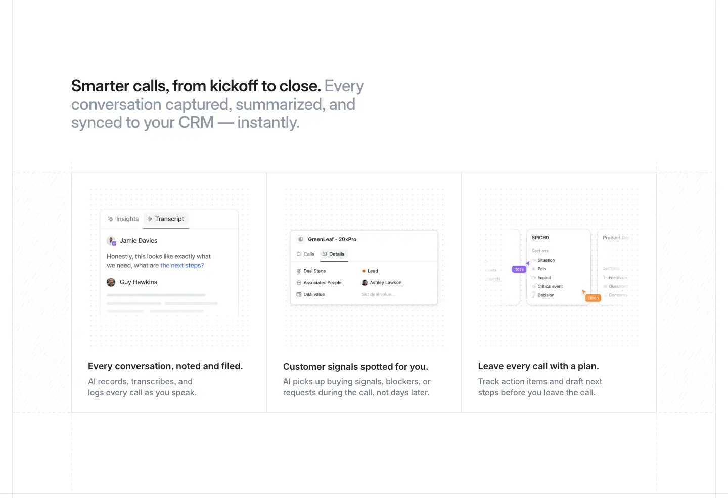
What it is
- A two-tone H2, then three equal cells. Each has a product image (call transcript, signals list, follow-up actions), an 18/24 H3 and a grey body.
4 · CRM, meet MCP
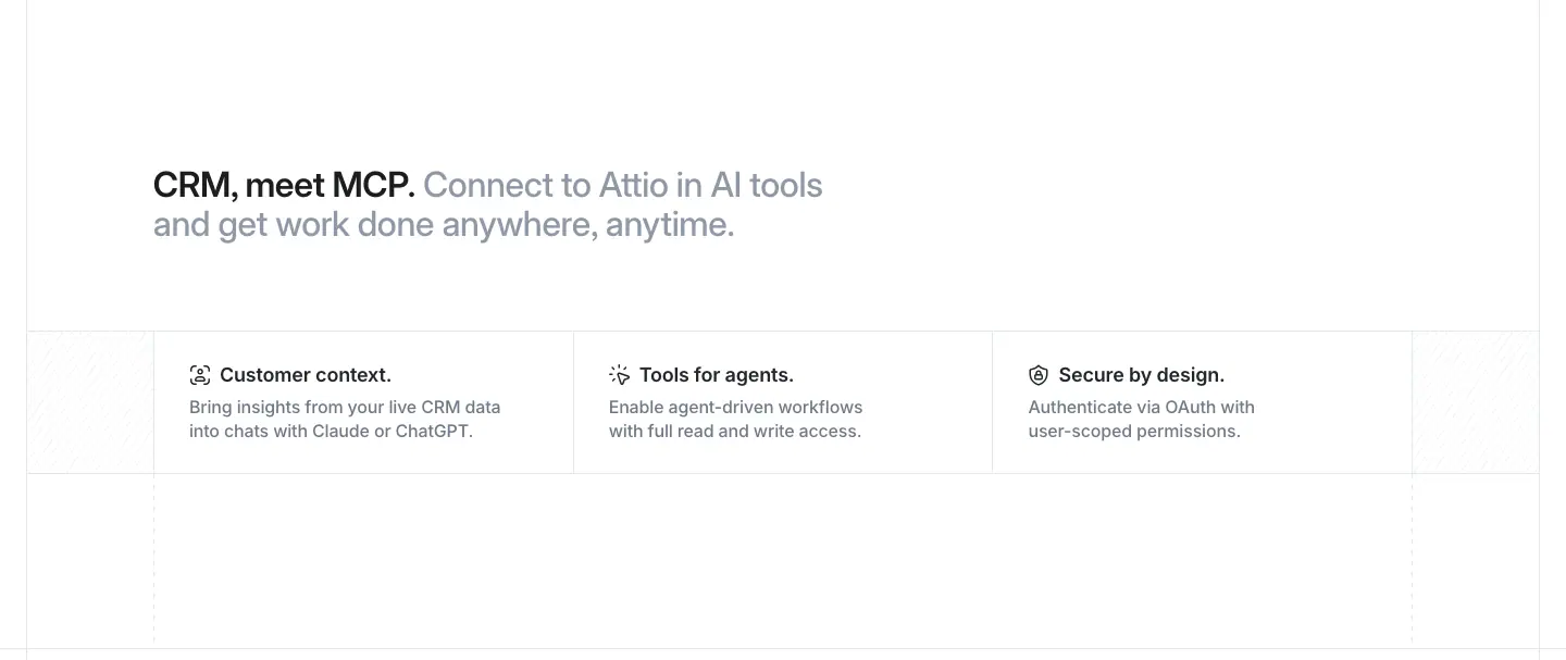
What it is
- A two-tone H2, then three short cells, each with a line icon, a title and one line of grey text: "Customer context.", "Tools for agents.", "Secure by design.".
Why
- The densest possible section, with no images. MCP is a protocol; there is nothing to screenshot, so the page states three properties and moves on.
5 · Cross-links: "Attio plugs in. You take off."
What it is
- A centred H2 at 40/44, weight 600, and the line "Work your way, from outreach to outcomes.".
- A 4 × 2 grid of link cells, each 288 × 120px: [01] Ask Attio, [02] AI, [03] Data model, [04] Apps & integrations, [05] Call Intelligence, [06] Workflows, [07] Sequences, [08] Reporting.
- The current page's cell has a #fafafb fill.
Why
- The grid is a product-page footer nav dressed as a feature grid. It keeps readers inside the product story, and the numbering reinforces "one system, eight parts".
6 · Closing CTA and footer
The same as home: "Agentic revenue runs on Attio." See home.md §13.
Platform · Workflows · attio.com/platform/workflows
This page uses the product-page template from platform-ai.md. Only what differs is described here.

0 · Hero: the workflow graph
What it is
- Left column: a "Workflows" pill; H2 "Revenue agents at your team's command." at 56/60, weight 600; lead copy "Orchestrate your best plays, on every account, over the deepest context layer in agentic CRM." at 20/26 #232529; CTAs "Start for free" then "Talk to sales".
- Right column: a vertical workflow graph.
- The nodes run: "When a new deal is created" (Trigger) → Web Agent → Custom Agent → a branch into "Add to Enterprise target list" and "Add to SMB target list".
- Each node is a white card with a coloured line icon. A green "✓ Completed" badge sits on each node's top-right edge.
- The connectors are 1px green lines.
- Below: the 2 × 5 ruled logo grid from home.
Why
- The hero art is the product's own output. A finished run shows success states on every node. Green appears only in the badges and connectors, so the graph reads as "it already worked".
1 · Cue the agents (agent catalogue)
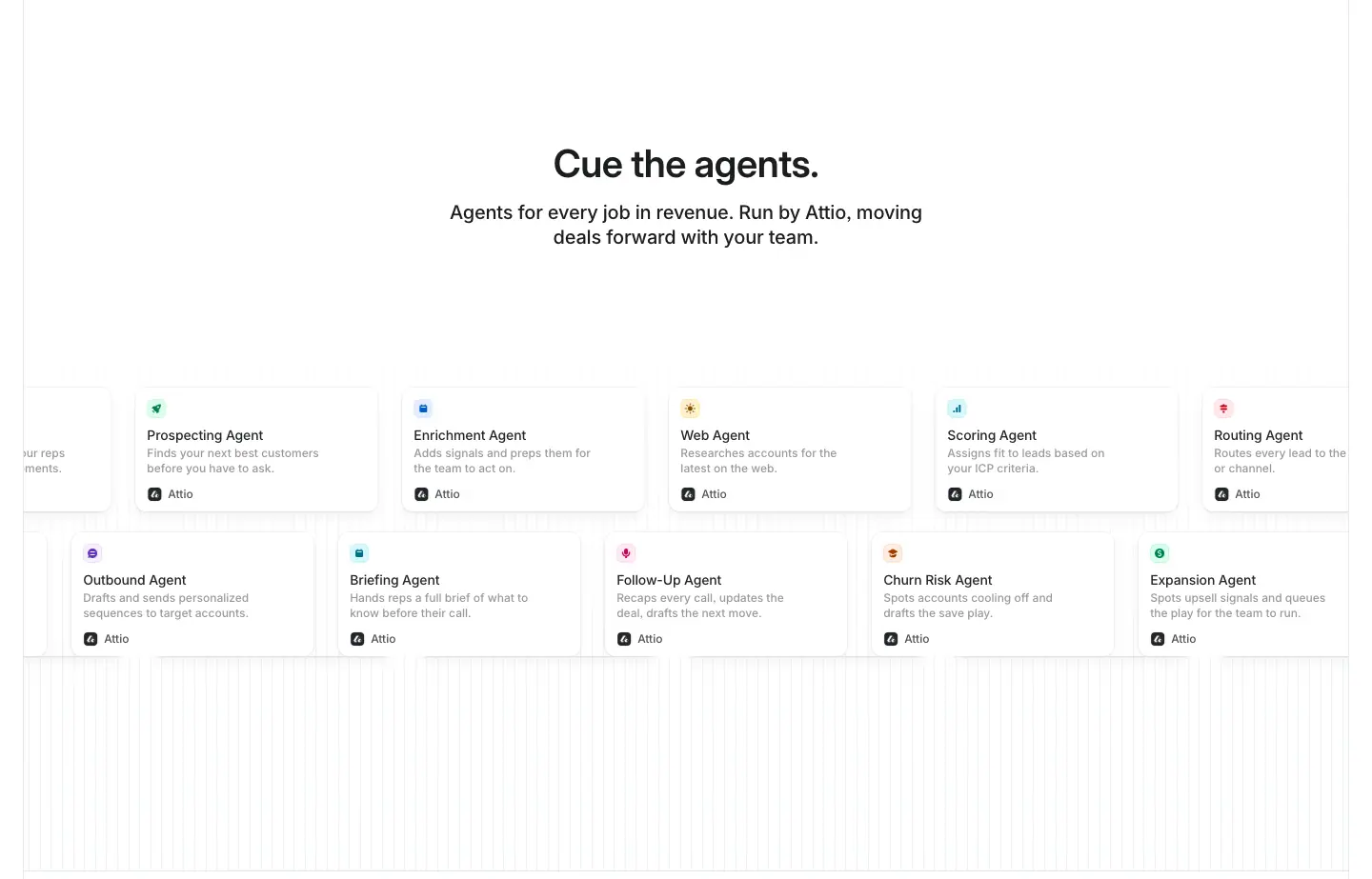
What it is
- A centred H2, "Cue the agents.", and the line "Agents for every job in revenue. Run by Attio, moving deals forward with your team."
- Two rows of agent cards, each 194px wide with a coloured icon, an agent name and two grey lines. The cards include Prospecting, Enrichment, Web, Scoring, Routing, Win/Loss, Briefing, Follow-Up, Churn Risk and Expansion Agents.
- The rows are wider than the viewport: the data has cards at x = −1,520 … −680, so this is a horizontally scrolling or looping carousel.
Why
- Naming agents like job titles ("Scoring Agent", "Routing Agent") sells the product as staff you hire. The next heading says it outright: "Hire the best rep. Again. Again. And again."
2 · Hire the best rep
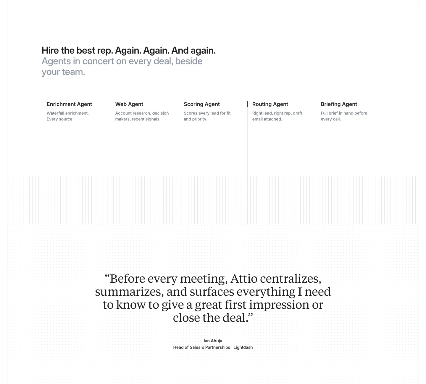
What it is
- A two-tone H2 and five agent columns with one-line descriptions over a stripe-textured field.
- A Tiempos Text quote at 40/44, weight 400, −0.6px, revealed word by word from #a4adba: "Before every meeting, Attio centralizes, summarizes, and surfaces everything I need to know to give a great first impression or close the deal." It is attributed to Ian Ahuja, Head of Sales & Partnerships, Lightdash.
3 · From idea to live agent
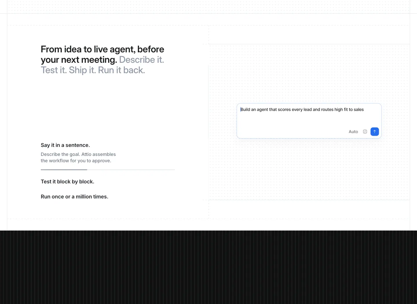
What it is
- The two-tone H2 "From idea to live agent, before your next meeting. Describe it. Test it. Ship it. Run it back."
- An accordion: "Say it in a sentence." / "Test it block by block." / "Run once or a million times."
- A prompt card on the right.
4 · Universal Context™ band
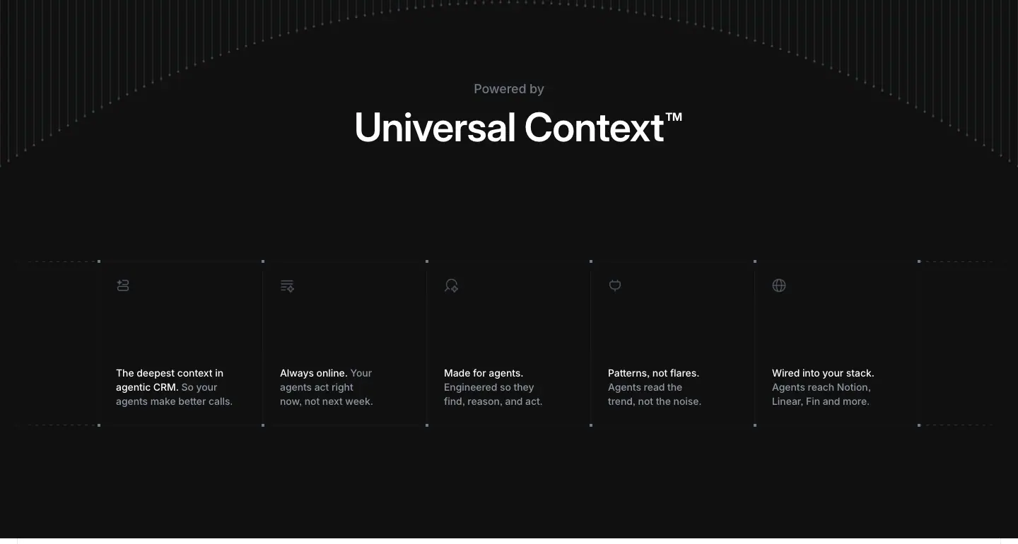
What it is
- A dark #101010 band with a full-width 1440 × 610px <canvas> (horizon art, a variant of home §6).
- "Powered by" above "Universal Context™" at display size.
- Five benefit cells underneath.
Why
- Every product page ties back to the trademarked concept. It is the shared foundation, so the same band reappears as a sitewide component.
5 · Built for the long run · 6 · Trust by default
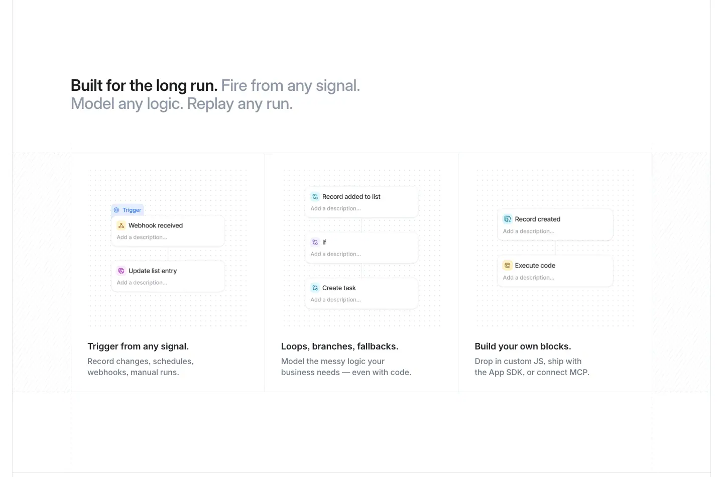
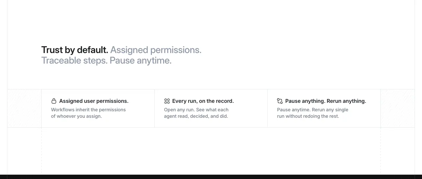
What it is
- Three-column cells with 321 × 321px square product images: workflow webhook, builder, and run-code nodes.
- Then three permission cells with line icons: "Assigned user permissions.", "Every run, on the record.", "Pause anything. Rerun anything."
7 · Closing: "Ask more from CRM. Ask Attio."
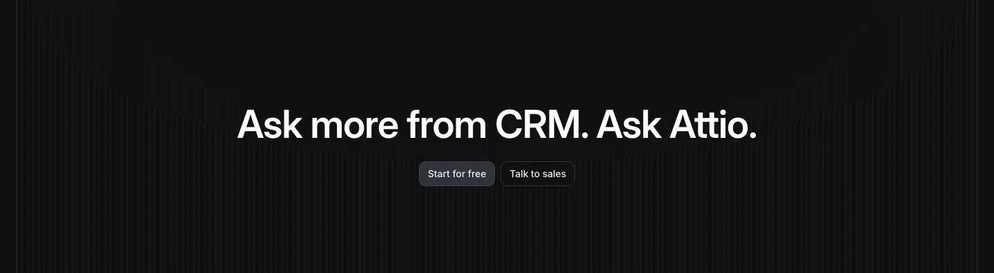
The closing band is customised per page, not the default "Agentic revenue runs on Attio." The buttons switch to the dark style (#2e3238 fill, #505967/50% border).
Platform · Reporting · attio.com/platform/reporting
This page uses the product-page template from platform-ai.md, with one important change: the hero is centred and surrounded by floating charts.
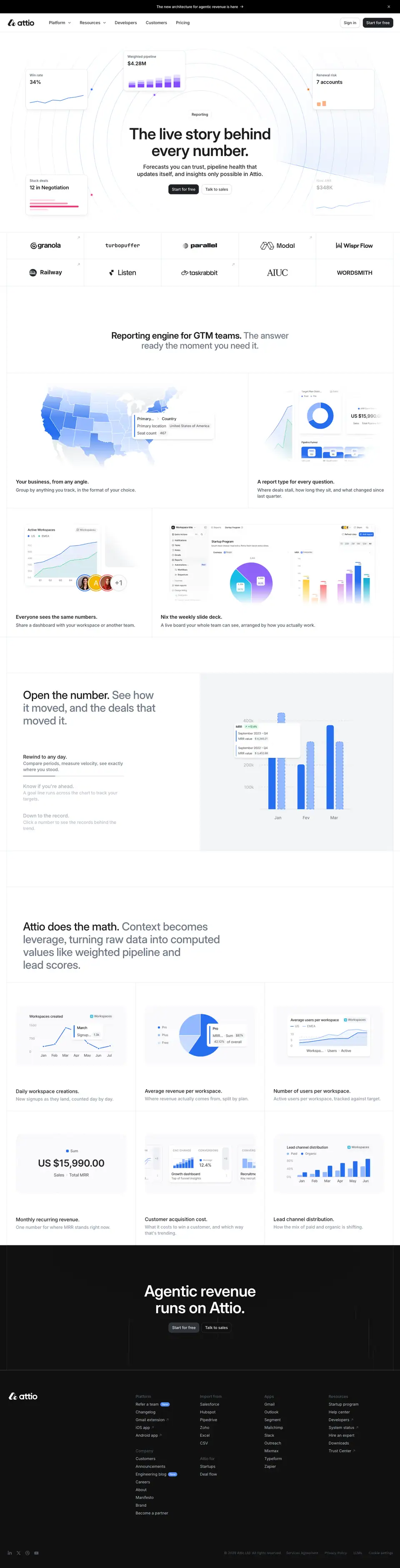
0 · Hero: orbiting metric cards
What it is
- The text, centred: a "Reporting" pill; H2 "The live story behind every number." at 56/60, weight 600, on 2 lines; lead copy "Forecasts you can trust, pipeline health that updates itself, and insights only possible in Attio."; CTAs at x=606 and x=726 ("Start for free", then "Talk to sales").
- Around the text: six small metric cards float at the corners — Win rate 34%, Weighted pipeline $4.29M (with a purple bar chart), Renewals risk 7 accounts, Stuck in Negotiation 12, MRR, and $3,480.
- Behind the text: faint concentric circles, with a soft blue glow at the bottom right.
Why
- The headline is the centre of a dashboard. The cards orbit the claim "every number", so the reader sees numbers before reading the word.
- Circles imply a radar or scope. This is a quiet analytical metaphor drawn in hairlines, which keeps it in the monochrome system.
1 · Reporting engine for GTM teams
What it is
- A centred two-tone H2, then a bento of four cells in two rows. Each row is wide + narrow (804 + 457px), then narrow + wide:
- a US choropleth map, "Your business, from any angle.";
- a donut and bars, "A report type for every question.";
- an area chart with avatars, "Everyone sees the same numbers.";
- a dashboard, "Nix the weekly slide deck.".
- The images are 2,418 × 948px and 1,374 × 948px sources.
Why
- The only true asymmetric bento on the site. The alternating 64/36 split keeps four charts from looking like a uniform grid and gives the map and dashboard the width they need.
2 · Open the number
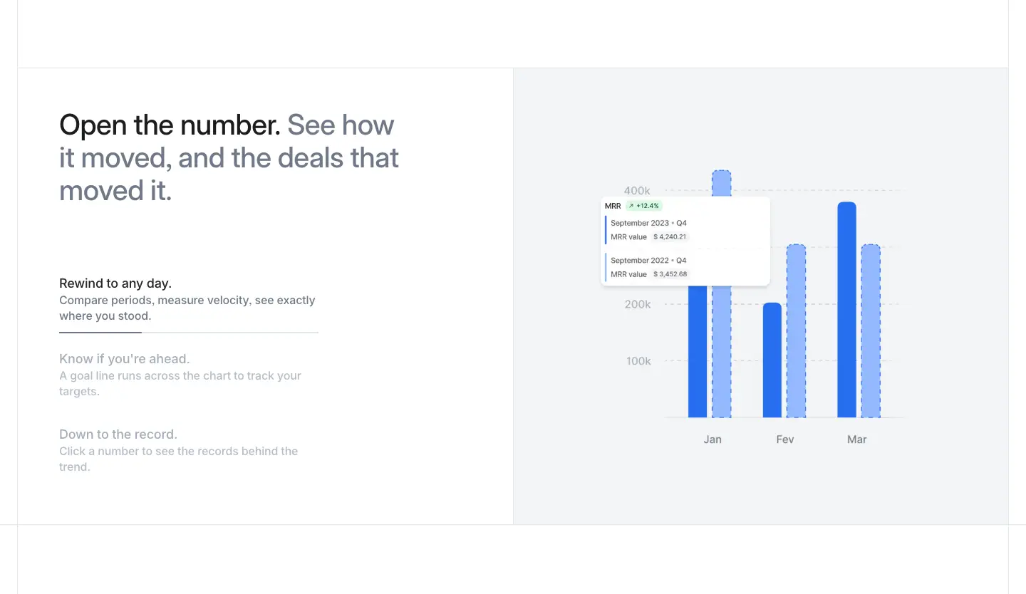
What it is
- Left: the two-tone H2 and an accordion ("Rewind to any day.", "Show if you're ahead", "Drain to the record").
- Right: a #f3f4f6 panel holding a bar chart drilled into an MRR tooltip ("MRR ↗ +12.4%").
3 · Attio does the math
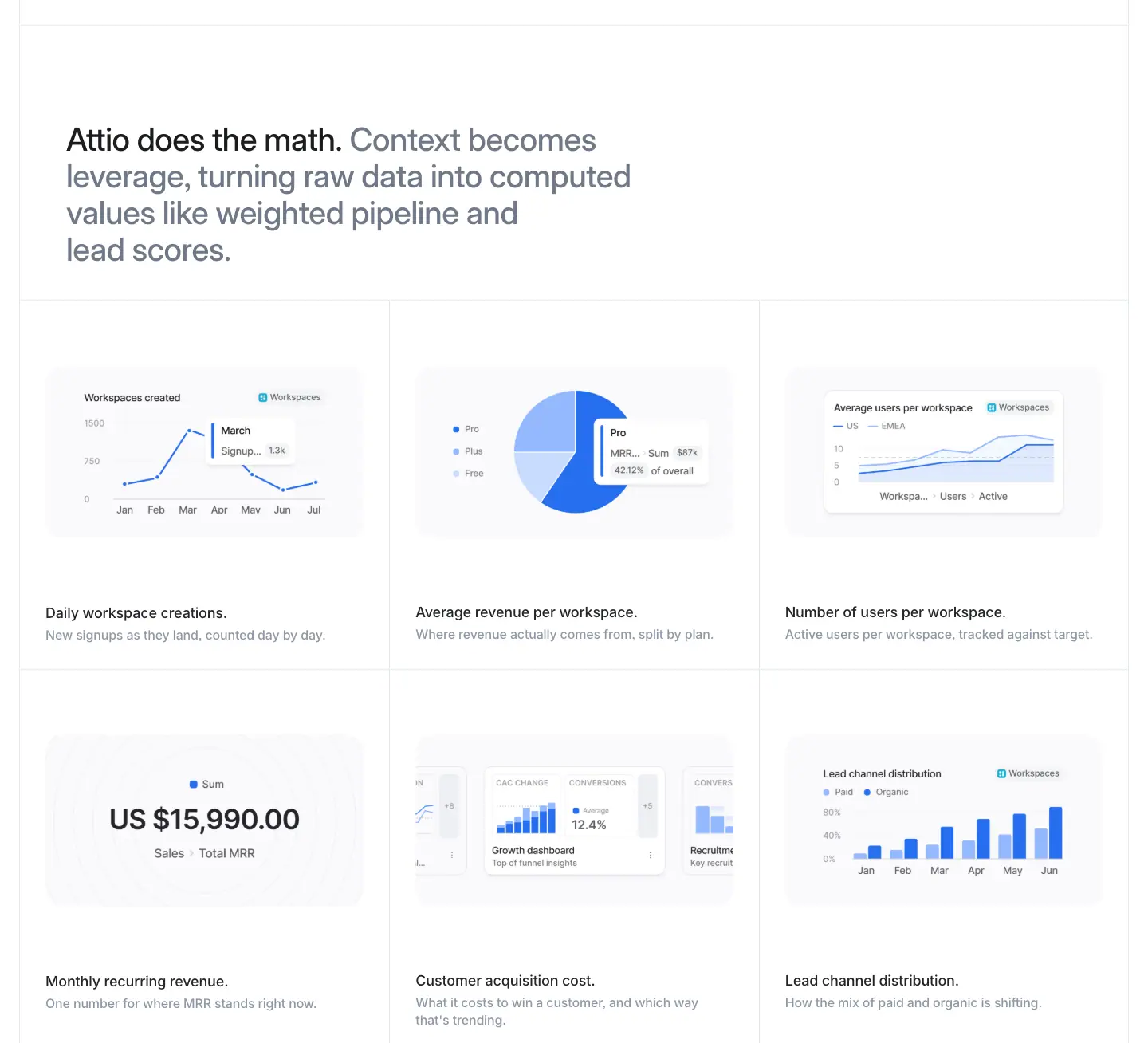
What it is
- A two-tone H2 ("Attio does the math. Context becomes leverage…").
- A 3 × 2 grid of chart cells: workspace creations, average revenue per workspace, number of users, MRR "US $15,990.00", customer acquisition cost, and lead channel distribution.
- Every chart uses only blue tints (#266df0, #538bf3, #94b9ff, #c8dcff).
Why
- One-hue charts stay inside the brand. Six charts in six colour schemes would compete with each other. Here the data shape is the only variable.
Platform · Developers · attio.com/platform/developers
The only fully dark product page. It changes the art direction from "product screenshot" to blueprint.

Art direction for the developer audience
| Element |
Value (measured) |
| Page background |
#101010 (lab(4.677 0 0), painted on 69 elements) |
| Nav |
Turns dark: "Sign in" uses fill #101010, text #edeff3 and a #2e3238 border. "Start for free" uses fill #2e3238 and a border of rgba(80,89,103,.5) |
H1 (<h1>) |
"[ DEVELOPER PLATFORM ]": Inter Display 12/14, weight 600, +0.72px, #8f99a8, in square brackets |
Headline (<h2>) |
"Dream. Code. Ship." at 56/60, weight 600, white |
| Section H2 |
32/36, weight 600, white, with a #8f99a8 second half |
| Grid |
A visible blueprint grid. 1px lines frame every cell, and small "+" crosshair marks sit at each cell corner |
| Cell labels |
[01], [02]… |
| Mono |
JetBrains Mono 12/18, weight 500, #8f99a8, for partner names ("NICK JANES // ATTIO PARTNER") and URLs ("https://docs.attio.com/sdk/", with only the host in #edeff3) |
| Hero art |
The Attio logomark drawn as a hatched isometric wireframe with node dots (two <canvas> elements at 348 × 348px elsewhere on the page) |
| Portraits |
Partner photos are dithered grayscale halftones, cut out on dark |
| Data viz |
A grid of rounded grey squares shaped like a contribution graph, captioned "15,170 PULL REQUESTS MERGED IN THE PAST YEAR" in mono caps |
Why
- Developers distrust glossy marketing. Blueprint lines, brackets, mono captions and dithered photos borrow from technical documentation and terminal aesthetics while keeping Attio's type and spacing.
- Dithered portraits. They make the quote givers part of the drawing rather than stock-photo people, and they cost no colour.
- The pull-request grid. It proves engineering pace with a format every developer recognises: GitHub's contribution graph.
Sections
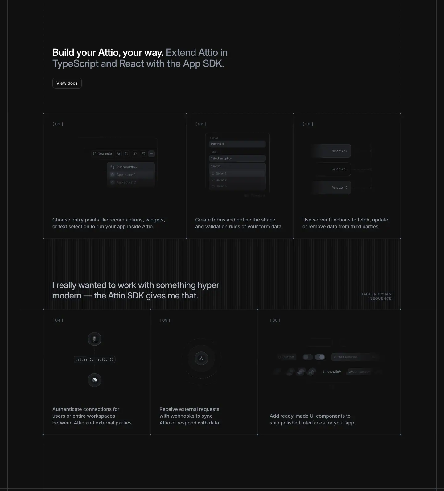
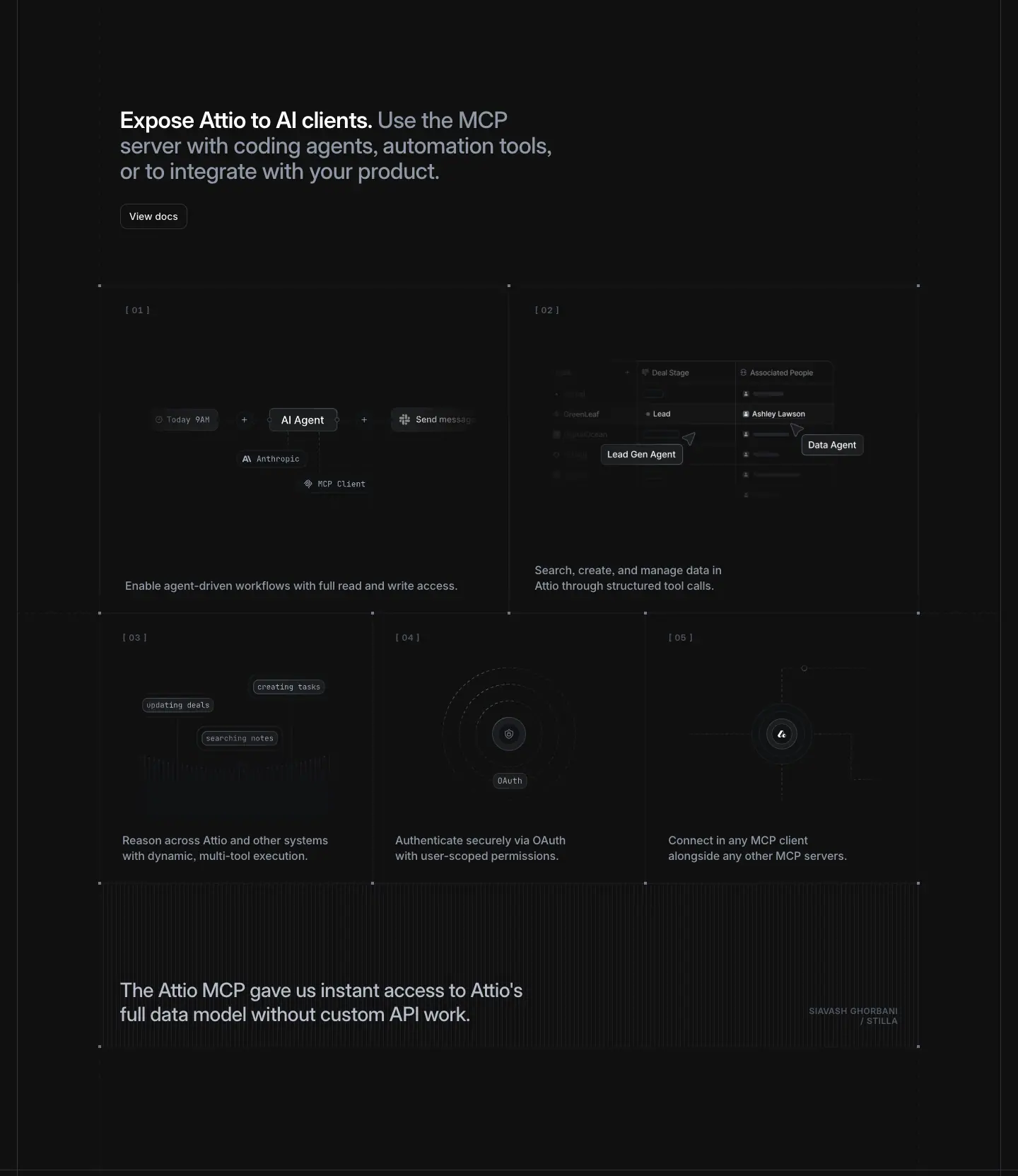
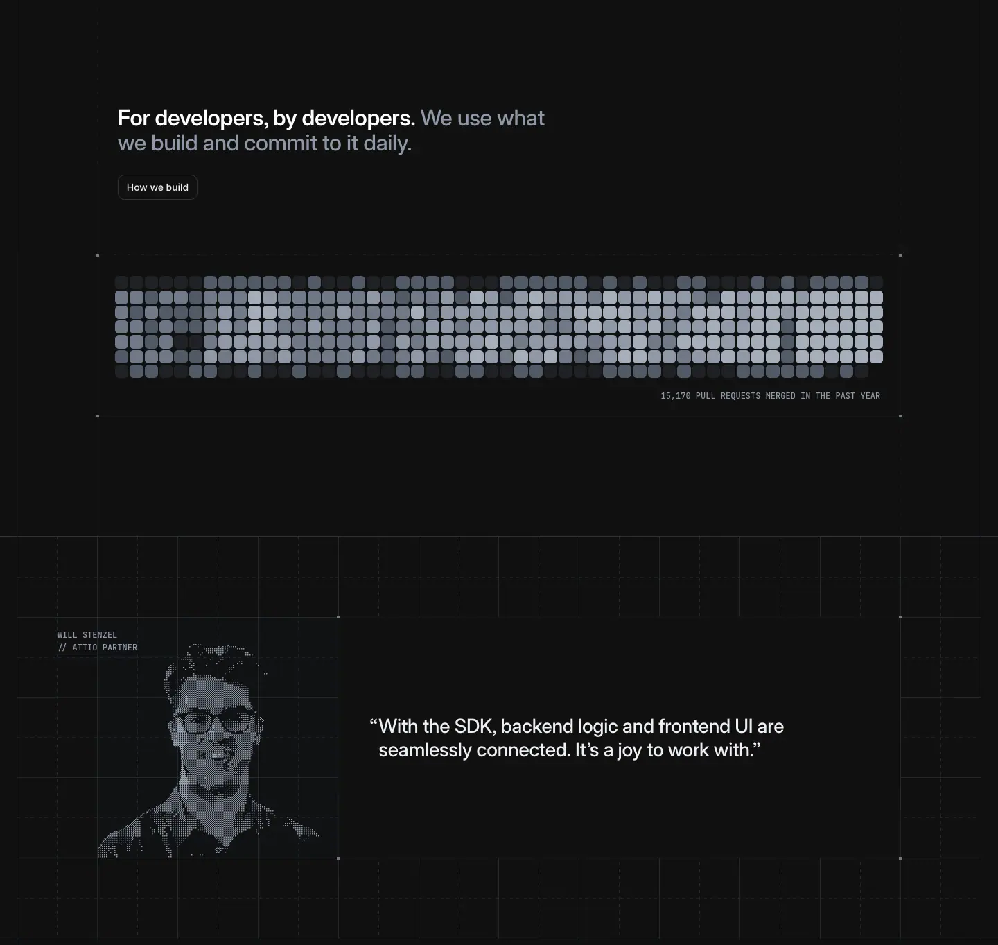
- Hero. Left: the bracket label, "Dream. Code. Ship.", "Connect your GTM stack with the REST API, App SDK, or Attio MCP.", and "View docs" (filled
#2e3238) beside "Browse apps" (outline). Right: the wireframe logomark.
- Integrate Attio with anything. "Start coding with a simple REST API that's secure and built for scale." Three cells show a code snippet, a webhook graphic and an OAuth graphic, all in grey line art. A quote from Nick Janes follows, with his dithered portrait.
- Build your Attio, your way. "Extend Attio in TypeScript and React with the App SDK." Six cells of greyed UI fragments: entry points, forms, server functions, connections, webhooks and UI components. An inline quote reads "I really wanted to work with something hyper modern — the Attio SDK gives me that."
- Expose Attio to AI clients. MCP diagrams: an agent graph with "AI Agent" and "Lead Gen Agent" nodes, a tool-call image (415 × 335px), OAuth rings, and the line "Connect in any MCP client". Closes with the quote "The Attio MCP gave us instant access to Attio's full data model without custom API work."
- For developers, by developers. "We use what we build and commit to it daily." Shows the pull-request grid and Will Stenzel's quote.
- The SDK behind fast, flawless apps. App logos (Aircall, Granola, Linear, Pandadoc, Sequence) in a ruled row, and "See our open source Linear app on GitHub ↗".
- Ready to build? A centred H2 at 32/36, the mono URL
https://docs.attio.com/sdk/, and greyed UI components (date picker, checkboxes, toggles, buttons) scattered around like parts on a workbench.
Customers · attio.com/customers
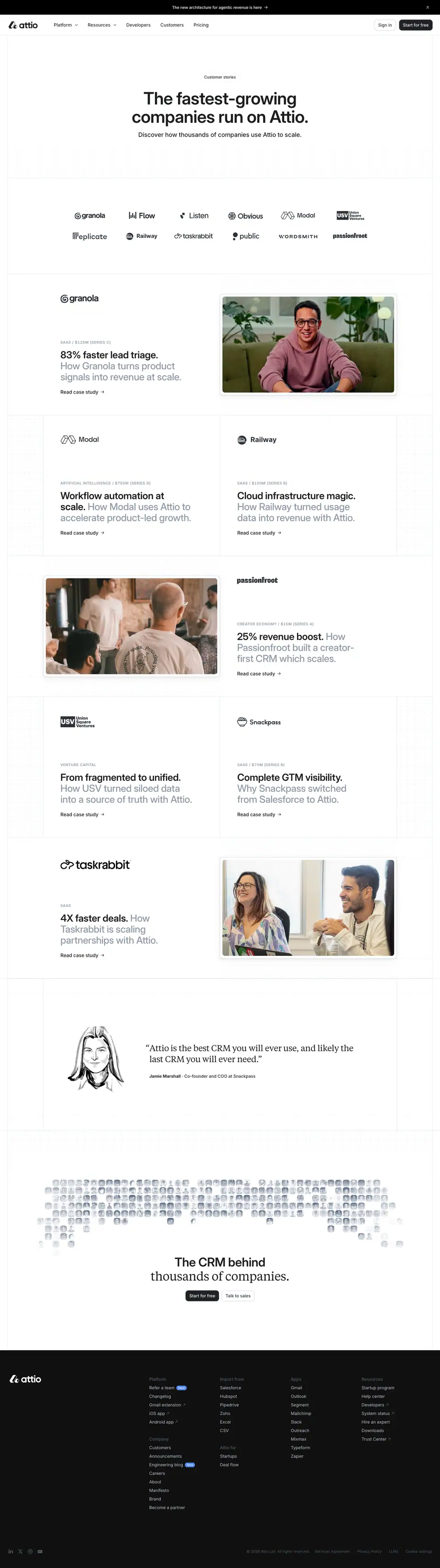
0 · Hero and logo wall
What it is
- A "Customer stories" pill (the <h1>), then "The fastest-growing companies run on Attio." as an <h2> at 56/60, weight 600, centred, 840px wide. One grey line follows: "Discover how thousands of companies use Attio to scale."
- A faint dot-grid texture sits behind the hero.
- A 2 × 6 logo wall, unruled: Granola, Flow, Listen, Obvious, Modal, USV, Replicate, Railway, taskrabbit, public, Wordsmith, passionfroot.
1–5 · Story rows (zig-zag)
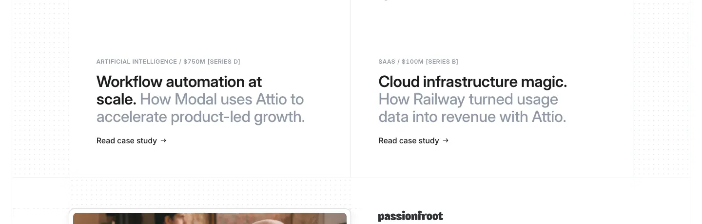
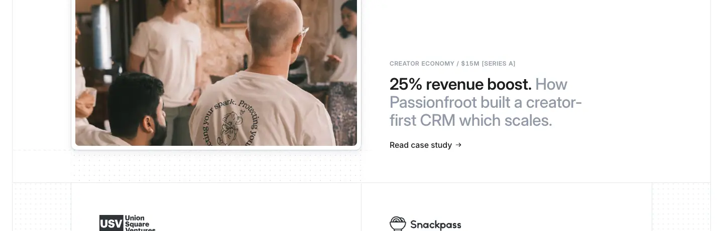
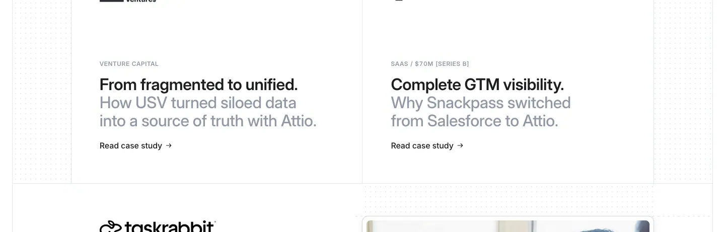
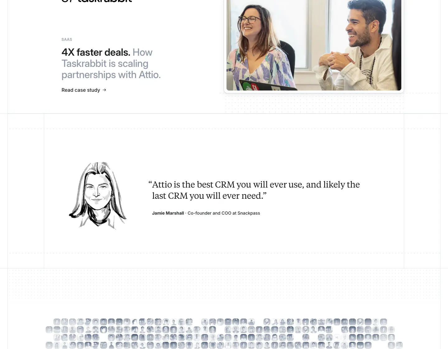
What it is
- Each story is a 460px-tall row split into two cells. Featured stories take the full 1,388px; the others are half-width (578px) and sit in pairs.
- Text cell:
- a caps meta line in Inter Display 12/14, weight 600, +0.72px, #8f99a8, in the format "SAAS / $125M [SERIES C]";
- a two-tone heading at 32/36, weight 500 (the metric in #1c1d1f at weight 600, then "How X…" in #6f7988);
- a "Read case study →" link at 16/22, weight 500.
- Image cell: a 561 × 314px photo of the customer team in their office, or a campaign shot, in an inset white frame with a hairline border.
- Below each row sits a strip with the customer's logo (Modal, Railway, passionfroot, Snackpass, taskrabbit).
- The image side alternates: text-left / image-right, then image-left / text-right.
Why
- The meta line reads like a deal record. Industry, then funding raised, then the round in brackets. Attio's buyers are funded startups, and this line tells them "a company like you".
- Photos of real teams in real offices. This is the only place on the site where photography of people dominates, and it is used for social proof, not decoration.
- The zig-zag stops five stories from reading as a monotonous list.
Pen-drawn testimonial
What it is
- A 240 × 240px line-drawn portrait of Jamie Marshall (Snackpass), in black ink on white.
- Next to it, a Tiempos quote: "Attio is the best CRM you will ever use, and likely the last CRM you will ever need."
- The attribution is 14/20, with the name at weight 700 #232529.
Why
- An illustrated portrait gives a quote warmth without the stock-photo look, and it sits in the same monochrome as the page.
6 · The CRM behind thousands of companies
What it is
- A dense mosaic of tiny dithered grey avatar tiles, hundreds of faces, fading out toward the centre.
- The centred H2 mixes fonts: "The CRM behind" in Inter Display 40/44, weight 600, and "thousands of companies." in Tiempos Text 40/44, weight 400. Then "Start for free" and "Talk to sales".
Why
- "Thousands of companies" shown as thousands of faces. The dithering keeps the mosaic as texture rather than portraits. The same treatment closes every customer-story page (see customer-story.md).
Customer story (template) · /customers/
There are 12 stories. Samples: /customers/granola (4,778px) and /customers/railway (7,478px).
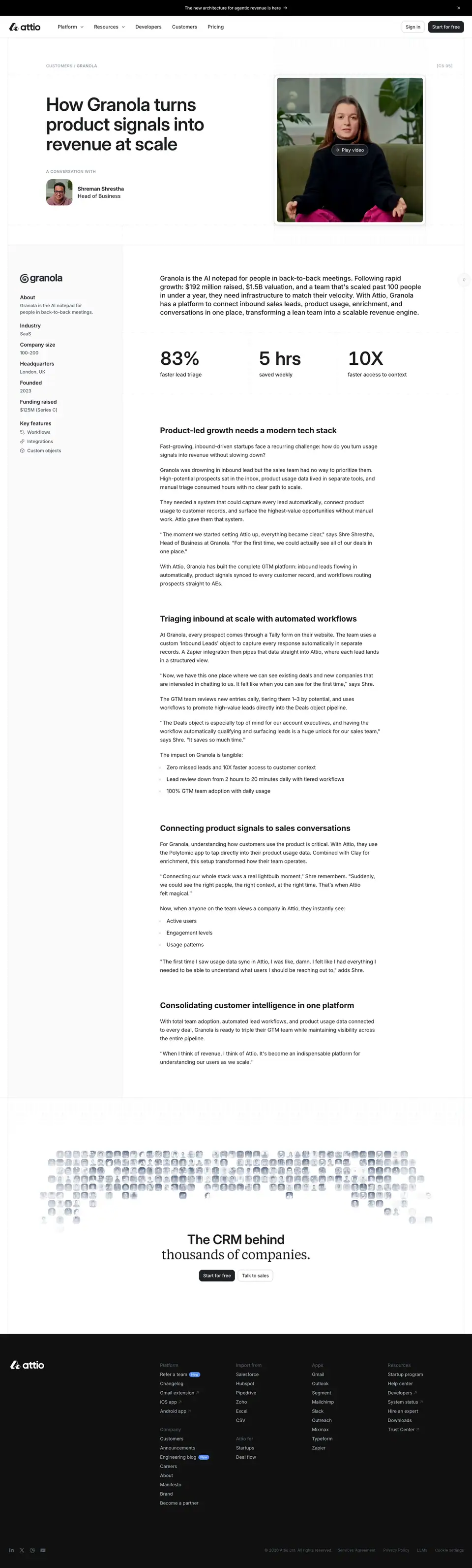

0 · Hero: headline + video
What it is
- Breadcrumb and index: "CUSTOMERS / GRANOLA" in caps at the left; "[CS 05]" at the right. The case-study number is styled like a document reference.
- Headline: the H1 "How Granola turns product signals into revenue at scale" at 56/60, weight 600, 671px wide, on 3 lines.
- Interviewee: "A CONVERSATION WITH" (caps 12/14, #8f99a8). Then a 56px square photo, the name at 16/22 weight 700 and the role at weight 500.
- Video: a <video> element 445 × 440px at the right, an autoplaying thumbnail loop (customer-case-granola-thumbnail.mp4). It sits in a white frame with a hairline border and has a "▷ Play video" glass chip.
- A dotted texture surrounds the hero cell.
Why
- A looping thumbnail instead of a static poster. The interviewee is visibly talking, which invites the play. Two captures of the same page showed different frames.
- The "[CS 05]" reference number. It makes stories feel like a catalogued archive and fits the spec-sheet tone of [01] labels elsewhere.
1 · Company card + stats + article
What it is
- Left sidebar (275px, #fafafb): the company logo, then a definition list: About, Industry (SaaS), Company size (100–200), Headquarters (London, UK), Founded (2023), Funding raised ($125M Series C), and Key features (Workflows, Integrations, Custom objects, with icons). Labels are 16/22 weight 600 #232529; values are 14/20 #505967.
- Intro paragraph: Inter 20/26, weight 500, #1c1d1f, 811px.
- Three stats in ruled cells: "83%" faster lead triage, "5 hrs" saved weekly, "10X" faster access to context. The numbers are Inter Display 56/60, weight 600; the captions are 16/22.
- Article: H2s in Inter 24/30, weight 700 ("Product-led growth needs a modern tech stack"), 16px body, pull quotes, and bullet lists of outcomes.
Why
- The sidebar is a CRM record. "About / Industry / Company size / Funding raised" are the exact fields of a company record in Attio. The story page is formatted like the product's own record view.
- Stats before the story. The outcome is told in numbers first, and the article explains them.
2 · Closing: avatar mosaic
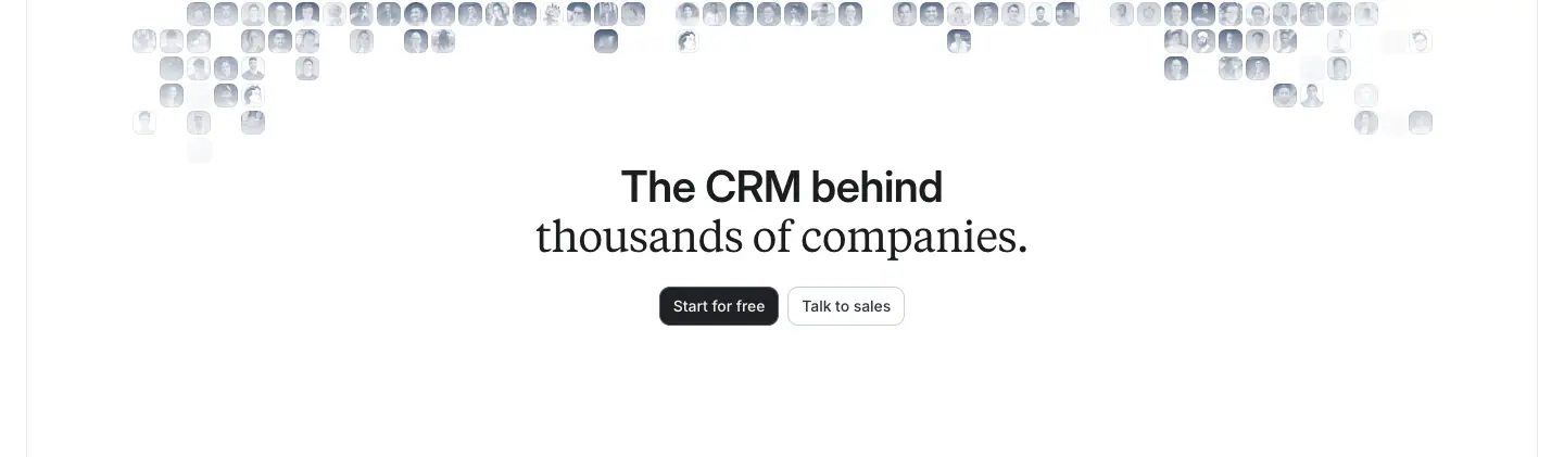
The same dithered avatar mosaic and "The CRM behind thousands of companies." close as /customers. The heading mixes two fonts in one line: "The CRM behind" in Inter Display 40/44, weight 600, then "thousands of companies." in Tiempos Text 40/44, weight 400, −0.6px. It is the serif version of the two-tone heading: the second half changes font instead of colour.
Blog index · attio.com/blog
The public blog holds 36 URLs (see public-pages.md). The index is one featured story followed by a dense list.

0 · Featured story
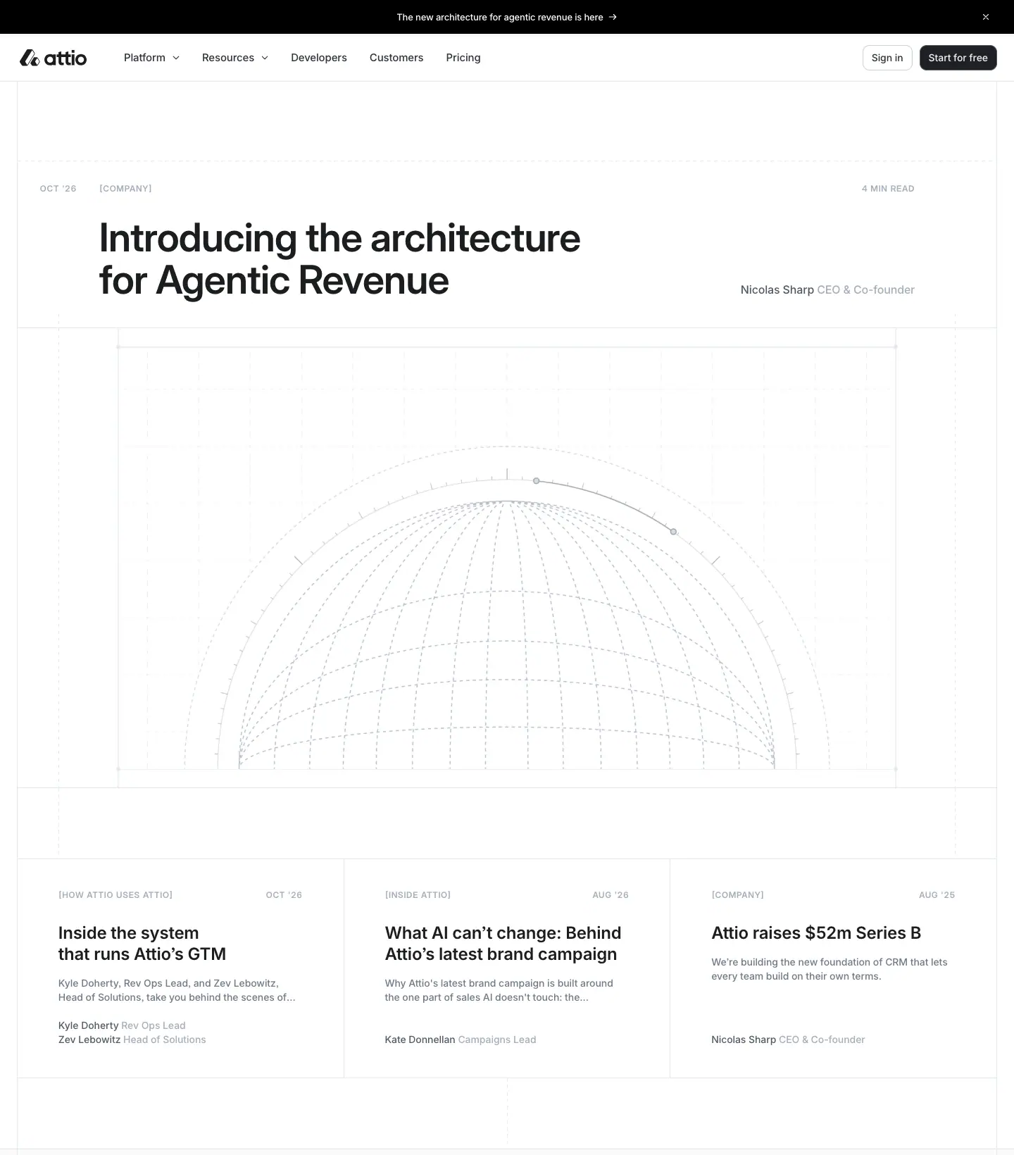
What it is
- The meta row sits under the nav in caps (Inter Display 12/14, weight 600, +0.72px, #a4adba): "OCT '26" at x=57, "[COMPANY]" at x=141, and "4 MIN READ" at the far right.
- The title: "Introducing the architecture for Agentic Revenue" at 56/60, weight 600. It is left-aligned, with the author ("Nicolas Sharp, CEO & Co-founder") in a grey line at the right.
- The cover: a 1,158 × 652px image (source 6,400 × 3,600) of a wireframe hemisphere: a grey line-drawn dome on a fine grid, with measurement ticks.
- Three secondary cards follow, each with caps meta, an 18/24 title, a 2-line grey summary, and author names with roles in grey.
Why
- The same meta system everywhere. Date + [CATEGORY] + read time in spaced caps works like a document header. It matches the changelog and engineering blog, so all editorial content shares one frame.
- Line-art covers, not photos. Blog covers are technical drawings in the same grey as the UI, so a post about architecture looks like architecture.
1 · Latest articles (filtered list)
What it is
- Left rail: "Latest articles" (32/36, weight 600) and a category filter list. The filters are All articles, Company, Guides, How Attio uses Attio, Inside Attio, Perspectives and Product. Each shows a count in small grey type.
- Right: a single-column list of rows. Each row has:
- a title (18/24, weight 500, #1c1d1f);
- a 2-line grey summary;
- a date ("OCT '26");
- a [CATEGORY];
- a → arrow.
- Rows are divided by hairlines and have no images.
Why
- A text list, not a card grid. It scales to any number of posts and loads instantly. The featured block above carries the visual weight, and the list is for scanning titles.
- The filter rail matches the docs and help-center navigation. Editorial content reads as part of one knowledge system.
Blog post (template) · /blog/
There are 35 posts. Samples: /blog/attio-raises-52m-series-b (5,271px) and /blog/ai-and-the-next-generation-of-CRM (8,580px). The same template serves /f/<slug> guides and, inverted to dark, /engineering/blog/<slug>.
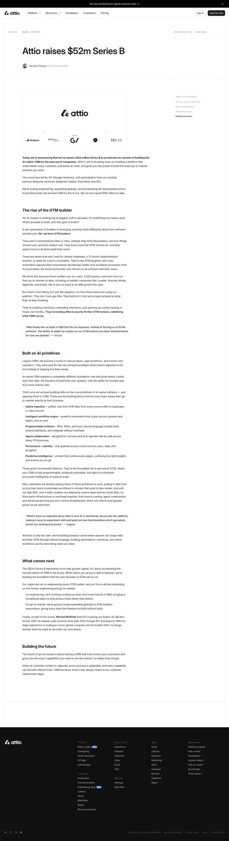

Anatomy (measured on the Series B post)
| Element |
Style |
| Meta row |
"PUBLISHED AUG '25" at x=57, "BLOG / COMPANY" at x=141, "UPDATED AUG '26" and "5 MIN READ" at the right. All Inter Display 12/14, weight 600, +0.72px, #a4adba |
| Title (H1) |
Inter Display 56/60, weight 600, −0.84px, #1c1d1f, left-aligned at x=141 |
| Byline |
24px avatar + "Nicolas Sharp" ink + "CEO & Co-founder" grey |
| Header rule |
A full-width hairline separates the header from the body |
| Cover image |
656 × 345px (source 2,400 × 1,260, the OG image), in a white frame with a hairline border. This post shows the logo and investor logos |
| Body |
Inter 16/26, weight 400, #232529, 656–811px column starting at x=141 |
| Lead sentence |
The first sentence in weight 600 ("Today we're announcing that we've raised a $52 million Series B…") |
| H2 |
Inter 24/30, weight 700, #1c1d1f |
| Pull quote |
Indented, with a left rule; attribution link in blue #266df0 ("— Modal") |
| Bold run-ins |
Bullet lists start with a bold term: "Native ingestion – unified, real-time GTM data…" |
| TOC |
Right rail at x=1104: "TABLE OF CONTENTS" in caps #a4adba, items at 12/18 weight 500. The active item is ink, the rest #a4adba. Sticky on the live page (unstuck for this capture) |
Why
- Two dates in the header (published + updated). That is honest content maintenance, and good for search freshness signals.
- A bold first sentence. It works as a news lede: readers who stop after one line still get the announcement.
- Weight 400 body at 1.625 line height for comfortable long reading (see 03). The marketing pages' weight 500 would be heavy over 2,000 words.
- A sticky TOC with a scroll-spy highlight. It is the same idea as the home feature rail, applied to articles.
Engineering blog · attio.com/engineering/blog
There are 14 URLs: the index plus 13 posts. The section uses the developer art direction: dark #101010, JetBrains Mono and ASCII art.
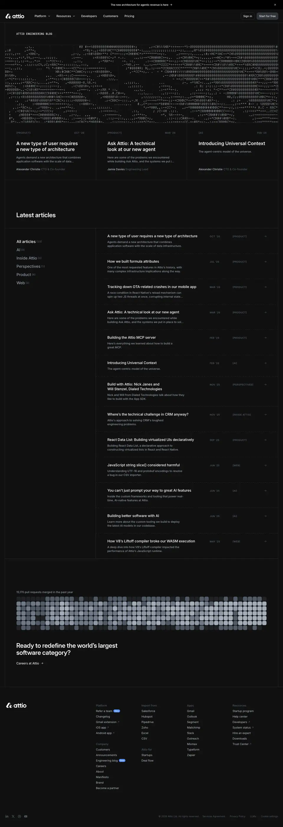
0 · ASCII masthead and featured posts
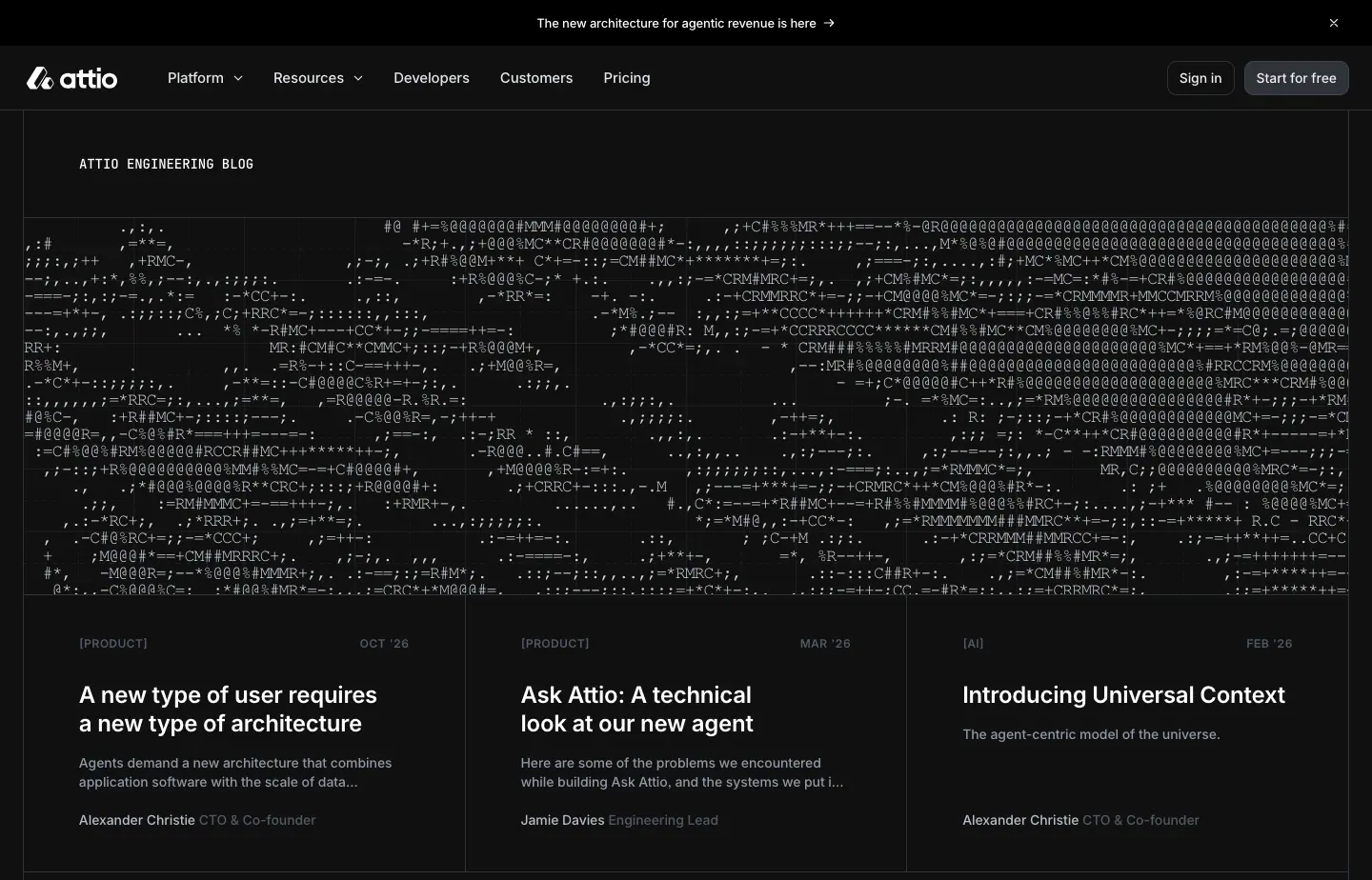
What it is
- The <h1>: "ATTIO ENGINEERING BLOG" in JetBrains Mono 14/20, weight 500, white, uppercase. It is the only H1 on the site set in mono.
- The masthead: a full-width block of ASCII art, made of @ # % * + = - : . characters in mono, white on black. The characters build a noisy landscape-like shape.
- Three featured posts sit in ruled columns. Each has a [PRODUCT]/[AI] caps tag and a date, a white title (18/24), a 2-line #8f99a8 summary, and the author with role ("Alexander Christie, CTO & Co-founder").
Why
- ASCII art is the engineer's illustration medium. It is made of text, renders in the terminal and costs no colour. It says "written by engineers" before any title is read.
- Same layout as the company blog. Only the palette and type change, so the two blogs are clearly siblings.
1 · Latest articles
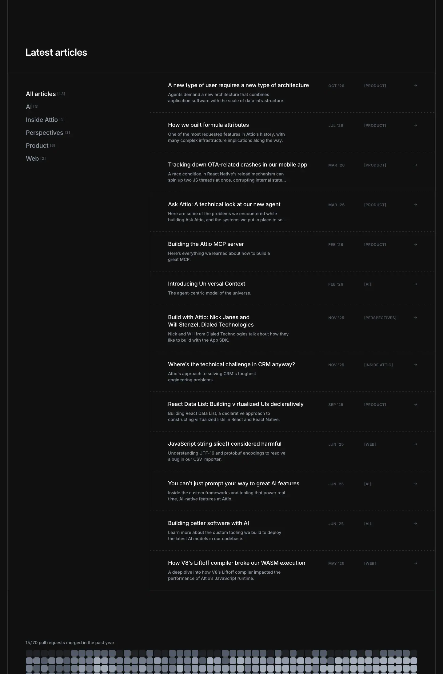
What it is
- The same rail + list layout as /blog. The filters are All articles, AI, Inside Attio, Perspectives, Product and Web.
- Rows are white titles with #8f99a8 summaries, dates, [CATEGORY] tags and → arrows. Dividers are #2e3238-ish hairlines.
2 · Recruiting band
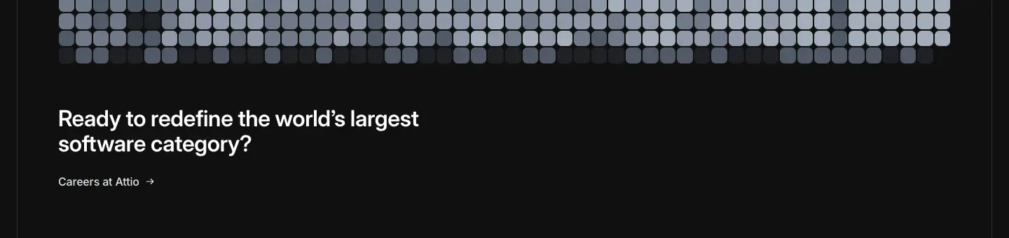
What it is
- The pull-request contribution grid from the developers page, captioned "15,170 PULL REQUESTS MERGED IN THE PAST YEAR" in JetBrains Mono 12/18, #8f99a8.
- Then "Ready to redefine the world's largest software category?" at 32/36, weight 600, white, and "Careers at Attio →".
Why
- The engineering blog is a recruiting channel. The page ends on a careers CTA backed by a shipping-pace metric, not on "Start for free".
Engineering post (template)
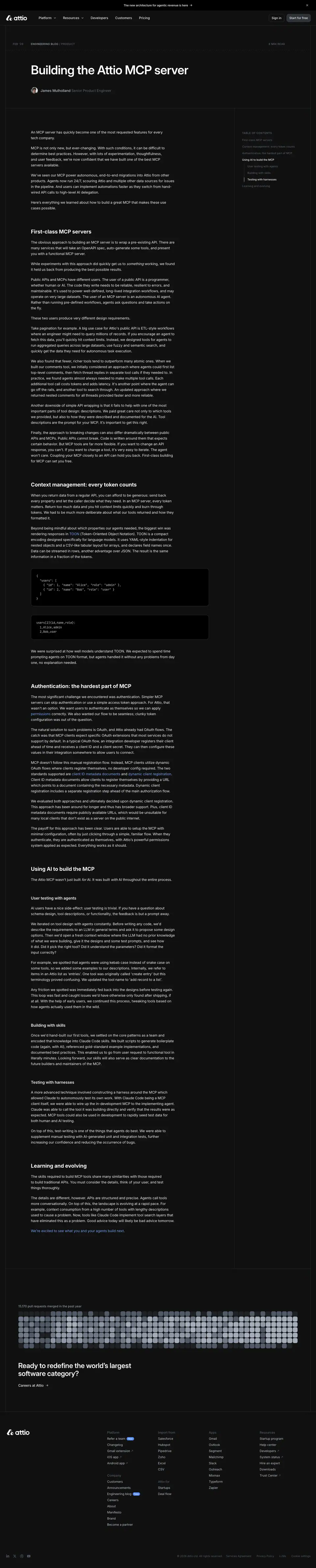
Sample: /engineering/blog/building-the-attio-mcp-server.
| Element |
Measured style |
| H1 |
Inter Display 56/60, weight 600, −0.84px, white |
| H2 |
Inter 24/30, weight 700, white |
| H3 |
Inter 18/24, weight 600, #edeff3 |
| Body |
Inter 16/26, weight 400, #edeff3, 811px column |
| Inline tech terms |
#709ff5 (blue-400), 16/26 |
| Code block |
JetBrains Mono 13/19.5, weight 400, #d4d4d4 |
| TOC |
Sticky right rail, "TABLE OF CONTENTS" in caps #505967; the current item is white, the rest grey |
It is the same template as the company blog post (blog-post.md) with the colours inverted.
Changelog index · attio.com/changelog
/changelog redirects (307) to the current year, /changelog/2026. The sitemap lists 234 changelog URLs: one index per year (2021–2026) plus every entry.

0 · Hero, subscribe and year scrubber
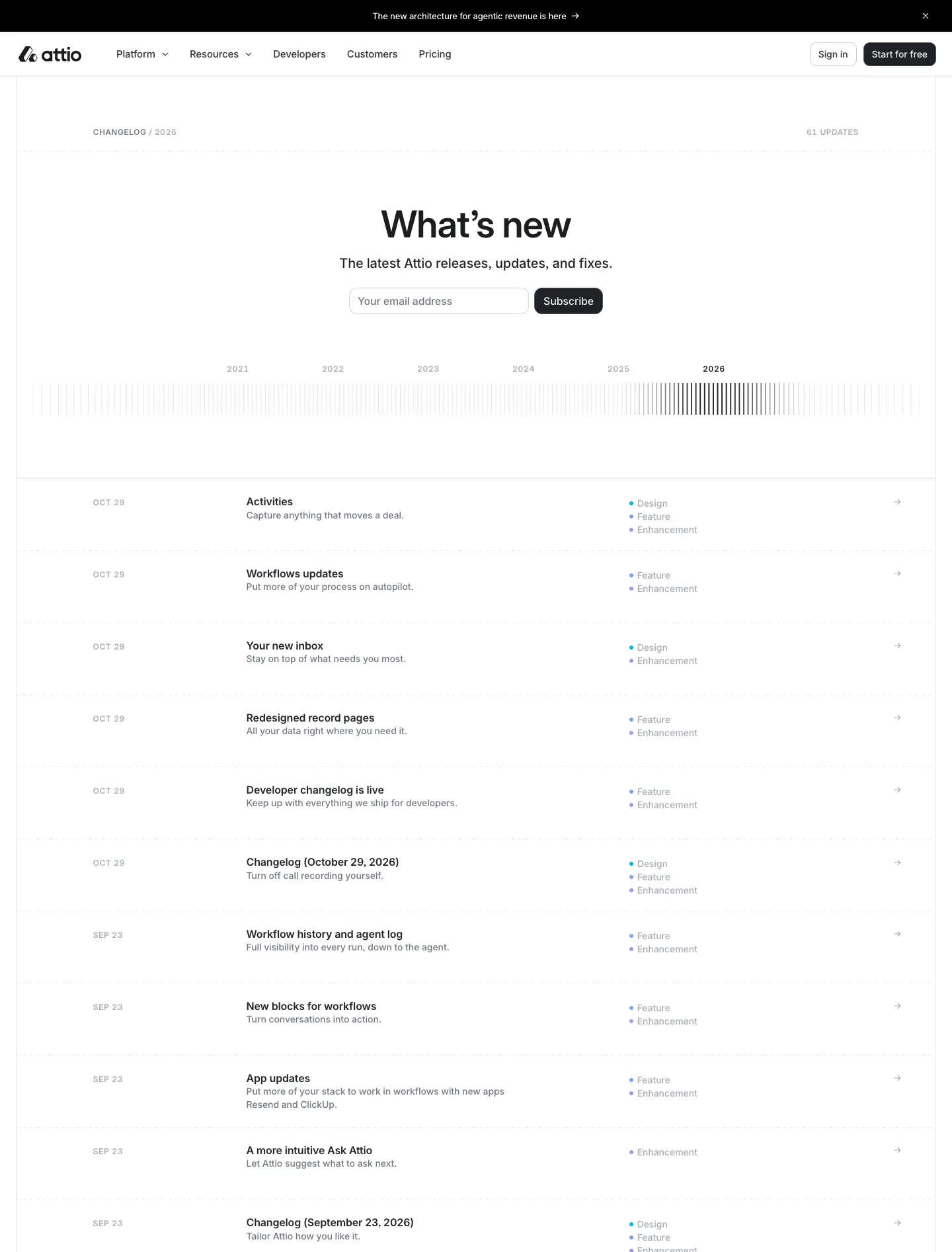
What it is
- Breadcrumb: "CHANGELOG / 2026" in caps, Inter Display 12/14, weight 600, +0.72px. The link part is #6f7988. The right side reads "41 UPDATES".
- Heading: "What's new" at 56/60, weight 600, centred.
- Lead: "The latest Attio releases, updates, and fixes." at 20/26, weight 500, #232529.
- Subscribe: an inline email field and a solid "Subscribe" button.
- Year scrubber: a full-width row of thin vertical ticks, like a barcode or ruler, labelled 2021 · 2022 · 2023 · 2024 · 2025 · 2026. The active year is #1c1d1f, the others grey. Ticks near the current year are dense and dark; the rest are light.
Why
- The ruler turns time into a visible object. You can see five years of shipping before you read a single entry. It is a data-viz version of a year tab bar and reuses the 1px stripe motif from the rest of the site (linear-gradient(#b5bdc9, #b5bdc9) lines, painted 37 times).
1 · Entry list
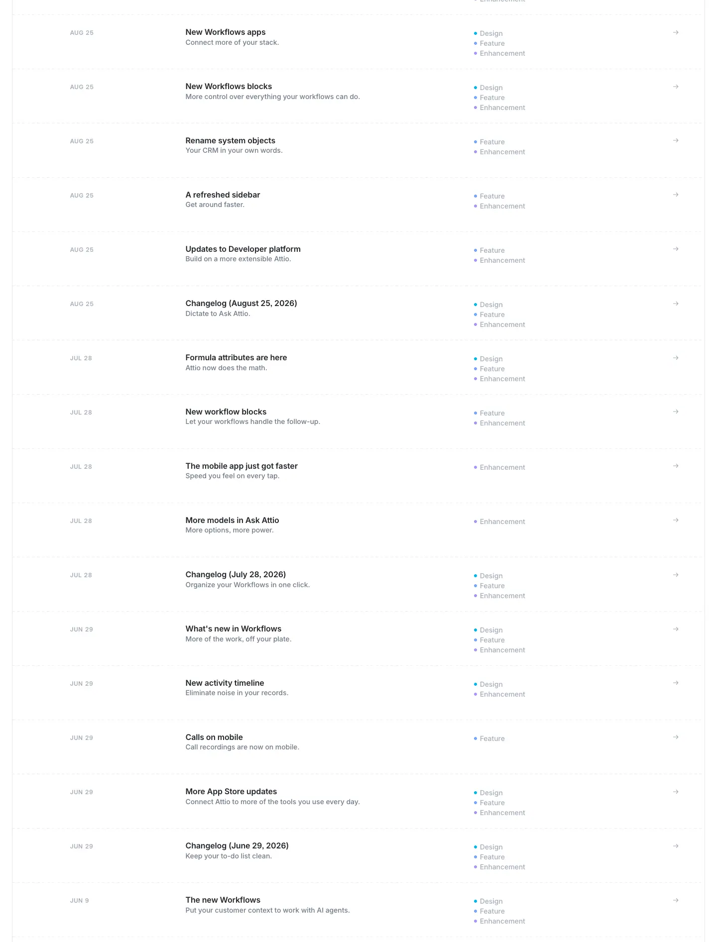
What it is
- Each row is a 4-column line, divided by hairlines (#e4e7ec).
- Date: "OCT 29" in caps, at x=141.
- Title: 16/20, weight 600, #232529, at x=373.
- Summary: 14/20, weight 500, #6f7988 ("Capture anything that moves a deal.").
- Tags: at x=964, in a stacked list such as "• Design • Feature • Enhancement". Each tag is 14/20, weight 500, #a4adba, with a 6px coloured dot. The three dot colours are violet #ab92f1, blue #72a4fb and cyan #00b5e6 (painted 59, 49 and 38 times).
- Arrow: a → at the far right.
- Monthly roll-ups are titled "Changelog (October 29, 2026)" and sit between single-feature entries.
Why
- A table, not a feed of cards. Release notes are scanned by date and type, so a fixed column grid lets the eye run down each column.
- Tags are grey text with a coloured dot. Colour is kept to a 6px mark, so three categories × 41 entries never become a rainbow.
Changelog entry (template) · /changelog//
There are 2 samples, and the template is the same for all ≈228 entries:
- /changelog/2026/your-new-inbox (text only, 1,568px tall)
- /changelog/2025/teams (with a screenshot, 2,012px tall)
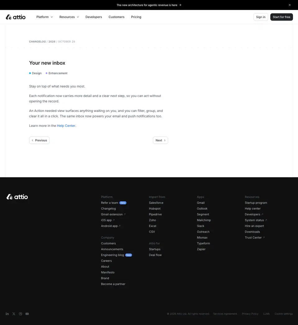
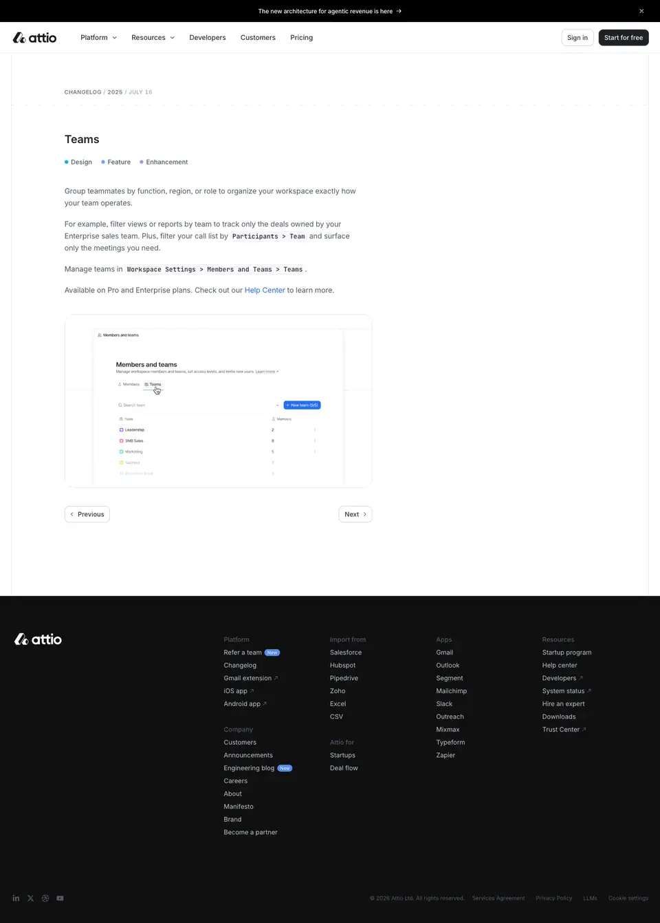
Anatomy
| Element |
Measured style |
| Breadcrumb |
"CHANGELOG / 2026 / OCTOBER 29": Inter Display 12/14, weight 600, +0.72px, #a4adba. "CHANGELOG" is a link in #6f7988 |
Title (<h1>) |
24/30, weight 600, −0.24px, #232529, Inter (not Display). It includes a hidden "Copy link to this entry" control |
| Tags |
Coloured dot + grey label ("• Design • Enhancement"), as in the index |
| Body |
Inter 16/26, weight 400, −0.16px, #505967, column 656px |
| Inline link |
#266df0, the same size |
| Inline code / UI path |
JetBrains Mono 14/20, weight 500, #232529, on a light chip: "Workspace Settings > Members and Teams > Teams" |
| Screenshot |
671 × 378px (source 3,840 × 2,160) in a rounded frame with a hairline border |
| Pager |
"‹ Previous" and "Next ›" outline buttons, 14/20, weight 500, #2e3238 |
Why
- A small H1 (24px) for a small update. The page is a note, not an announcement. Big launches get blog posts instead.
- Body in #505967, not ink. The entry is secondary reading after the title, and the lighter grey keeps the page calm.
- UI paths in mono. Settings paths are instructions you follow. Mono marks them as "literal text you will see in the app", the same convention as the docs.
Apps marketplace · attio.com/apps
There are 313 public app URLs (/apps/<slug>). The index is a searchable marketplace. App pages share one template; see app-detail.md.

0 · Hero: coloured icon grid
What it is
- An "Apps & integrations" pill (the <h1>).
- "One platform, endless possibilities." at 56/60, weight 600, centred.
- The lead "The tools you already love and new ideas to scale your business.".
- CTAs "Browse apps" (solid) and "Become an App Partner" (outline).
- A 2 × 12 ruled grid of full-colour app icons: Clay, OpenAI, Linear, Mixmax, Zoom, Make, Gmail, Slack and others.
Why
- This is the one page where colour belongs to other brands. Showing partner icons in their real colours makes "the tools you already love" recognisable at a glance. The ruled cells keep the colour contained.
1 · Everything you need (featured app tabs)
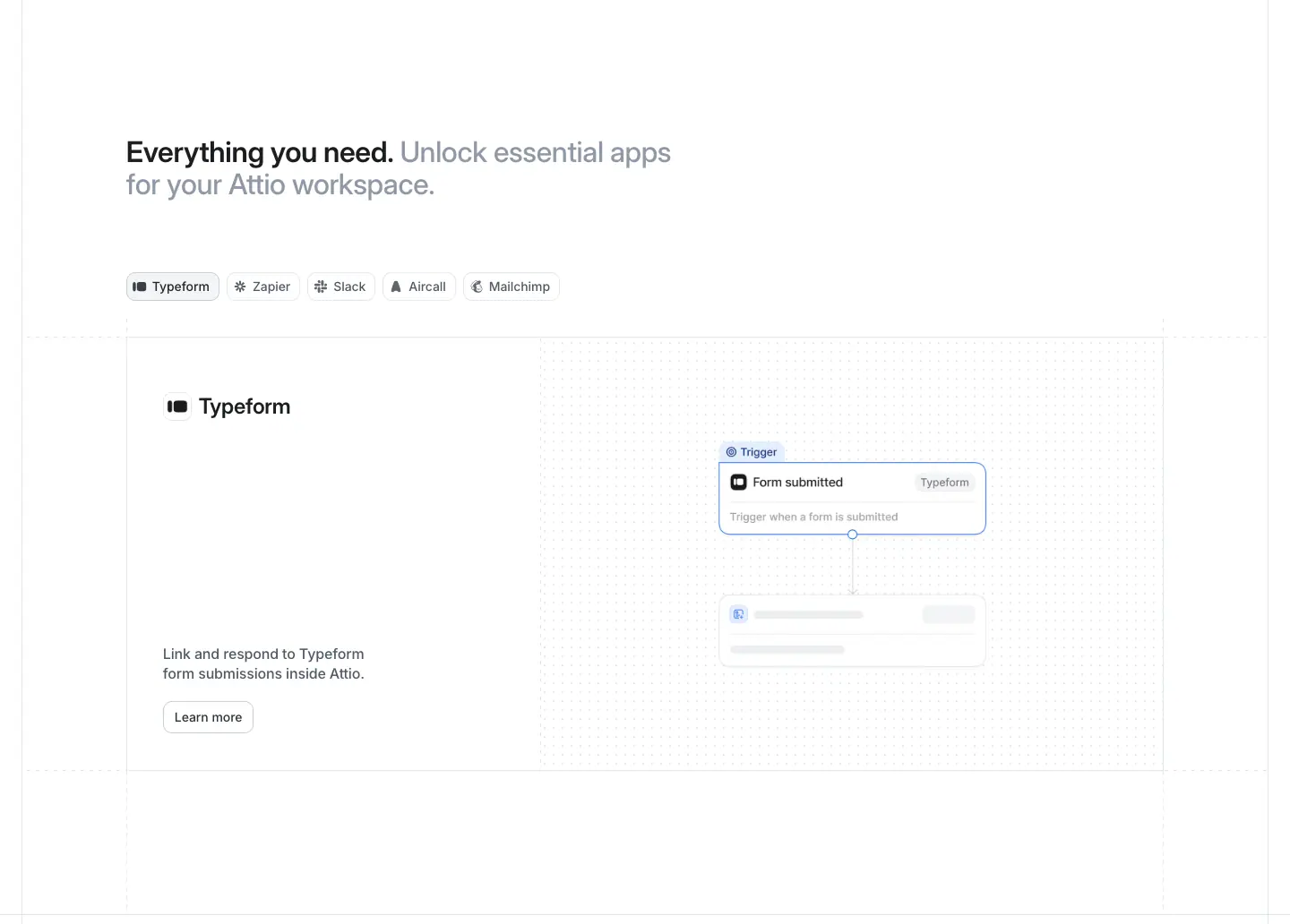
What it is
- A two-tone H2 at 32/36, weight 600: "Everything you need. Unlock essential apps for your Attio workspace.".
- A tab row of app chips: Typeform, Zapier, Slack, Aircall, Mailchimp. The active tab shows a large card with the app name in Inter Display 24/30, a description, "Learn more", and a small workflow-node mock.
2 · Discover apps (directory)
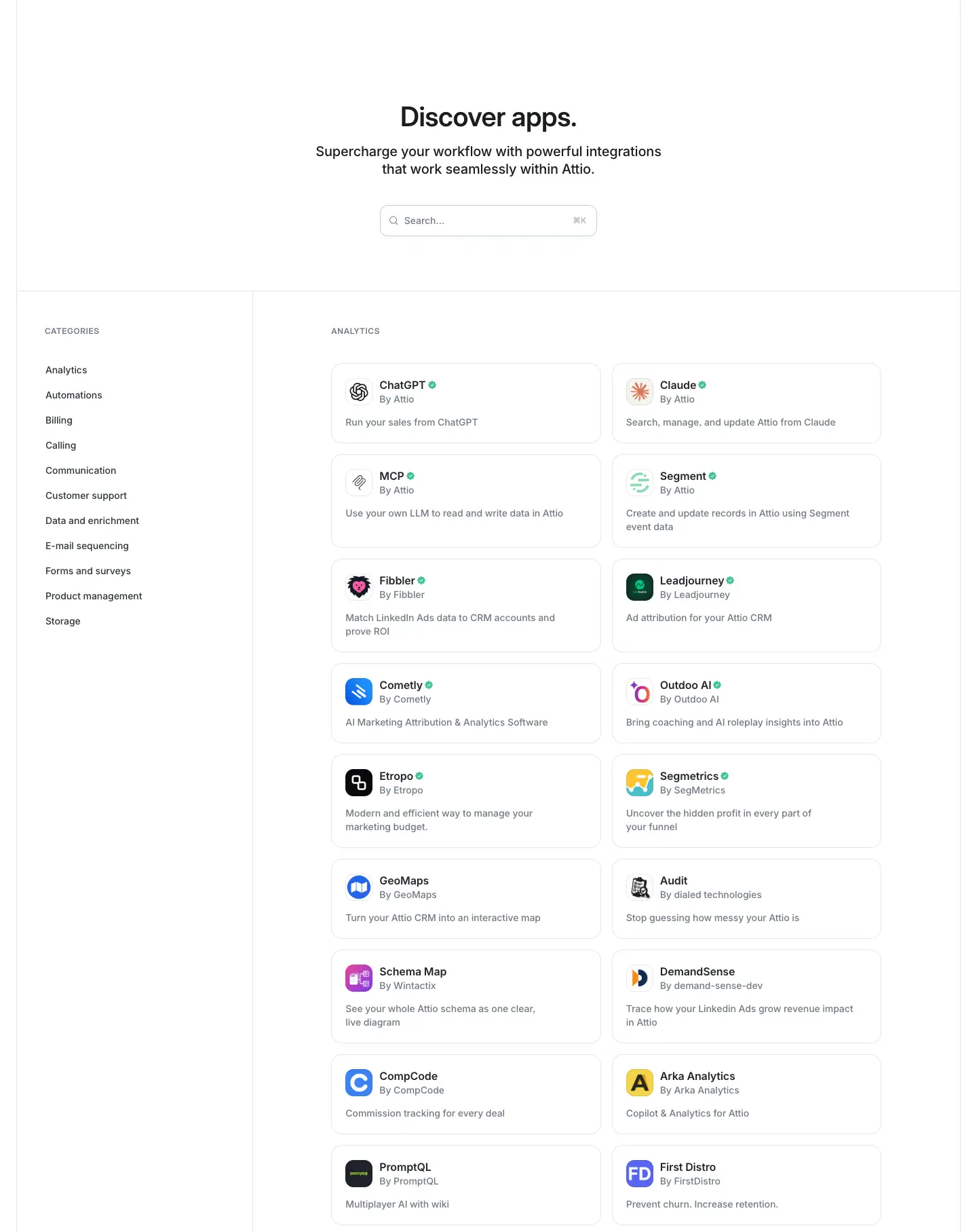
What it is
- A centred H2 "Discover apps." (40/44), a search field, and a two-column directory.
- Left rail: "CATEGORIES" in caps (12/14, weight 600, +0.72px, #6f7988), then Analytics, Automations, Billing, Calling, Communication, Customer support, Data and enrichment, E-mail sequencing, Forms and surveys, Product management and Storage.
- Right: caps group labels ("ANALYTICS"…) over a 2-column list of app rows. Each row has a 28px icon, the app name, a verified badge, "By " and a one-line description.
- The full directory is ≈14 screens tall (crops p1–p14).
Why
- The same rail + list pattern as the blog and help center. Every long collection on attio.com uses one navigation model.
App detail (template) · /apps/
There are 313 pages on this template. Sample: /apps/airtable.
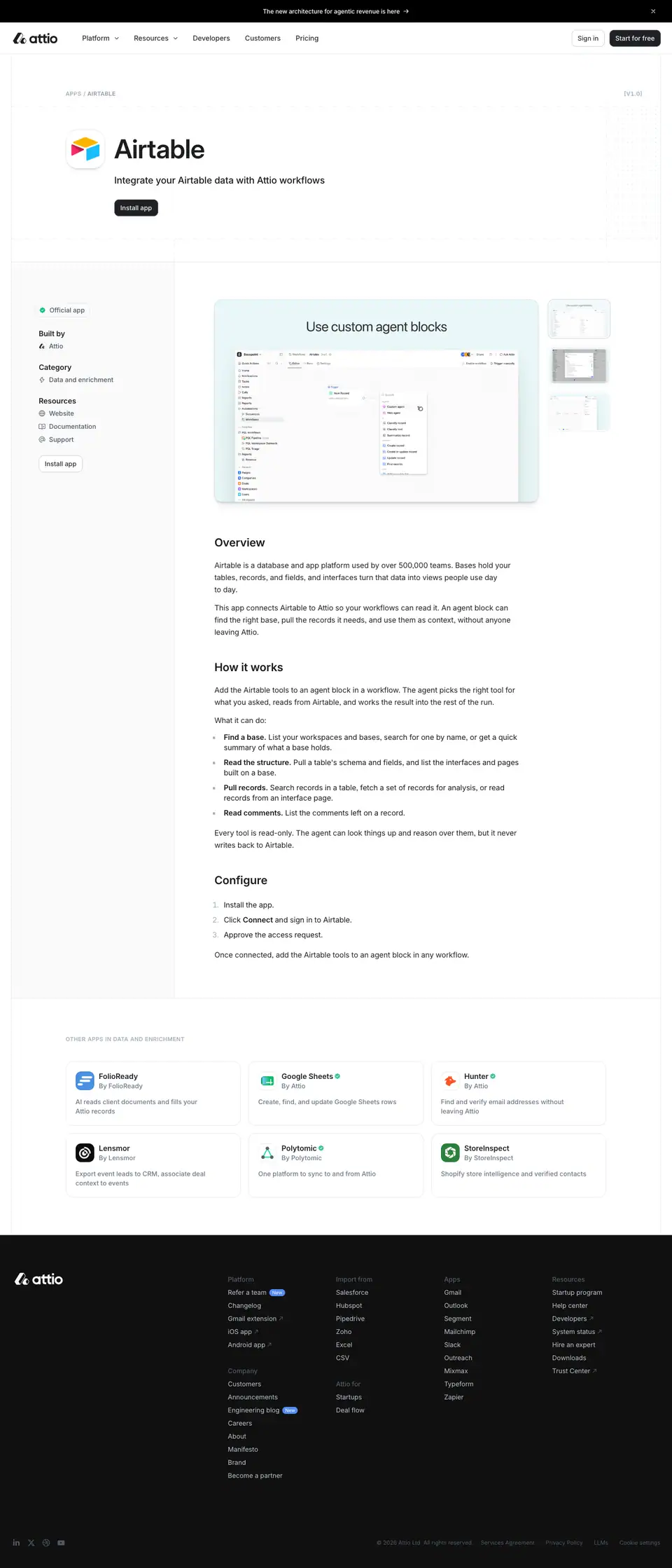
What it is
- Header: a breadcrumb in caps ("APPS / AIRTABLE"). A 64px app icon sits beside "Airtable" at 56/60, weight 600. Then a one-line description and a solid "Install app" button.
- Left sidebar (289px): "Official app" (14/20 #505967) and the field groups Built by, Category and Resources (H3 16/22, weight 600), with a second "Install app" outline button.
- Main column (869px): a hero screenshot "Use custom agent blocks" with thumbnail switchers, then "Overview", "How it works" and "Configure" as H2s at 24/30, weight 600 (Inter). The body is 16/22, weight 400.
- Footer of the page: "Other apps you might like", a 3 × 2 grid of app cards.
Why
- App pages read like documentation, with 400-weight body and plain H2s, because the visitor is evaluating an install, not being persuaded.
- The metadata sidebar mirrors an app-store listing: maker, category, resources.
Workflow template (template) · /templates//
There are 22 pages on this template. Sample: /templates/sales/won-deal-notification.
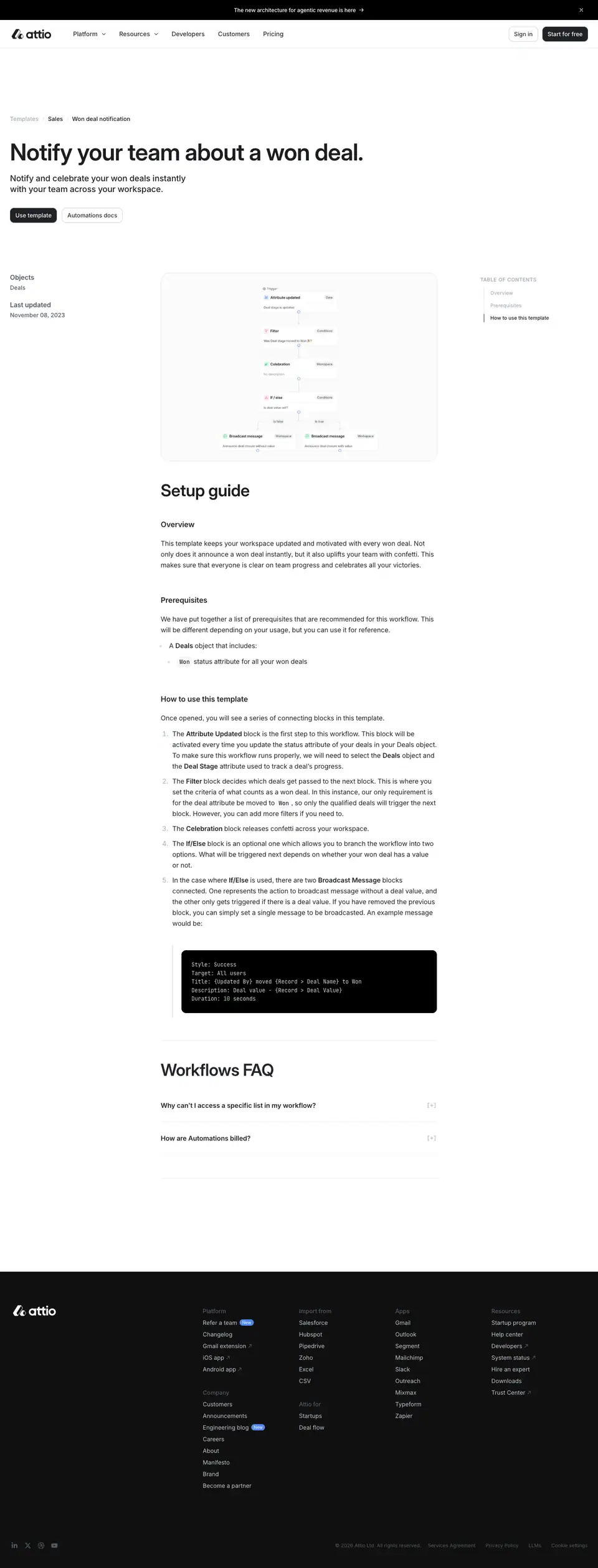
What it is
- Header: the breadcrumb "Templates > Sales > Won deal notification". The H1 "Notify your team about a won deal." is at 56/60, weight 600, left-aligned at x=24, on the outer grid edge. A one-line description follows. CTAs are "Use template" (solid #202124) and "Automations docs" (outline).
- Metadata column (235px): "Objects: Deals" and "Last updated: November 06, 2025" (labels 16/22, weight 600 #505967).
- Main: a workflow-graph image of the template, then "Setup guide" (40/44, weight 600). Under it, H3s at 18/24, weight 600 — Overview, Prerequisites, How to use this template — with numbered steps and a dark code block of workflow variables.
- Right: a sticky on-page TOC.
- A "Workflows FAQ" accordion closes the page.
Why
- Templates are product onboarding dressed as marketing pages. They are indexable for searches like "CRM won deal notification" and turn a search visit into a "Use template" click.
Help center · attio.com/help
There are 253 public help URLs: Academy courses plus Reference articles. The help center is part of the marketing site (same nav, footer and type), not a separate docs product.
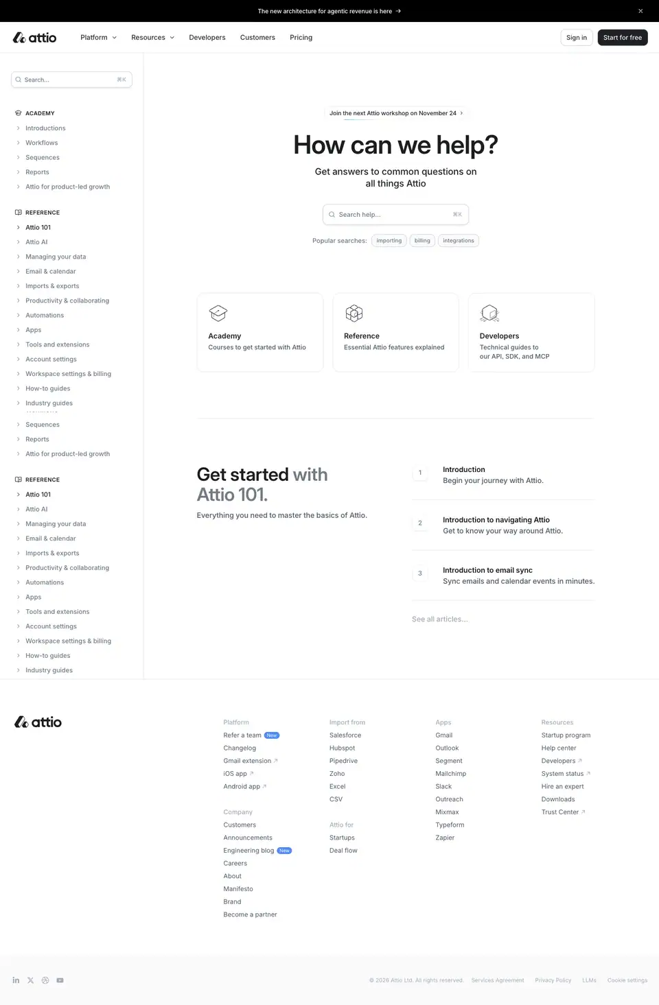
What it is
- Left sidebar (265px): a "Search..." field (36px, 13px placeholder #6f7988). Under it, two groups:
- ACADEMY: Introductions, Workflows, Sequences, Reports, Attio for product-led growth.
- REFERENCE: Attio 101, Attio AI, Managing your data, Email & calendar, Imports & exports, Productivity & collaborating, Automations, Apps, Tools and extensions, Account settings, Workspace settings & billing, How-to guides.
- Items are 16/22, weight 500, #1c1d1f, each 32px tall.
- Main: a webinar notice pill, then "How can we help?" at 56/60, weight 600, centred. A second search field "Search help…" follows, with "Popular searches:" chips.
- Three entry cards with line icons: Academy ("Courses to get started with Attio"), Reference ("Essential Attio features explained") and Developers ("Technical guides to our API, SDK, and MCP").
- "Get started with Attio 101": a numbered list — Introduction, Introduction to navigating Attio, Introduction to email sync.
Why
- Help lives on the same domain and design system as marketing, so search traffic for "how to…" lands inside the brand. Every help visit also shows "Start for free" in the nav.
- Two search fields (sidebar and hero) serve two intents: people who browse and people who know what they want.
Help article (template) · /help/reference/
Sample: /help/reference/workspace-settings-billing/update-workspace-name-and-logo.
Capture note: the left sidebar is taller than 600px, so the capture script left it sticky. It therefore appears twice in the stitched image.
What it is
- Three columns: the help sidebar (265px), the article (640px, starting at x=430), and a TOC at the right.
- Header: the breadcrumb "Help > Reference > Workspace settings & billing > Update workspace name and logo". The H1 "Update workspace name and logo" is at 56/60, weight 600, on 2 lines and 640px wide. H2s are Inter 24/30, weight 700, each with a hidden "Copy link" anchor. A one-line summary follows.
- Availability block: a bordered box with "Available on all plans." (14/20, weight 500) and "Available for admins." (weight 400).
- Body: H2 sections ("Update your workspace name", "Update your workspace logo"), 16px body text with bold UI labels ("Workspace settings", "General"), and product screenshots in hairline frames.
- A "Frequently asked questions" accordion closes the article.
Why
- The plan and role availability box answers "can I do this?" before the steps. That is the most common support question, so it is answered first.
- Bold UI labels match what the reader sees in the app.
Careers · attio.com/careers
There are 23 URLs: the index plus 22 open roles. Role pages are described in career-post.md.

Sections
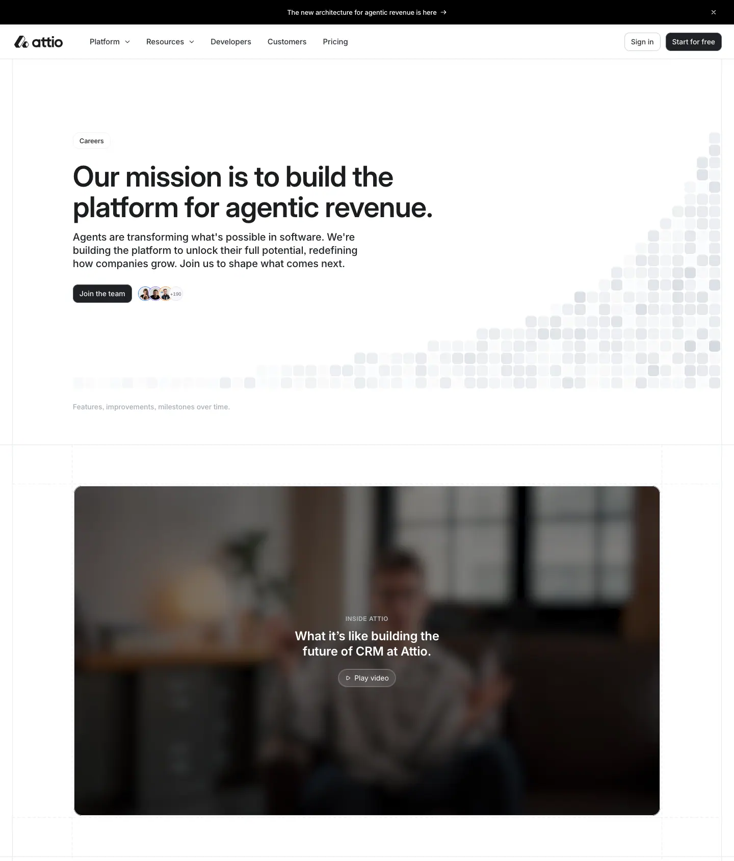
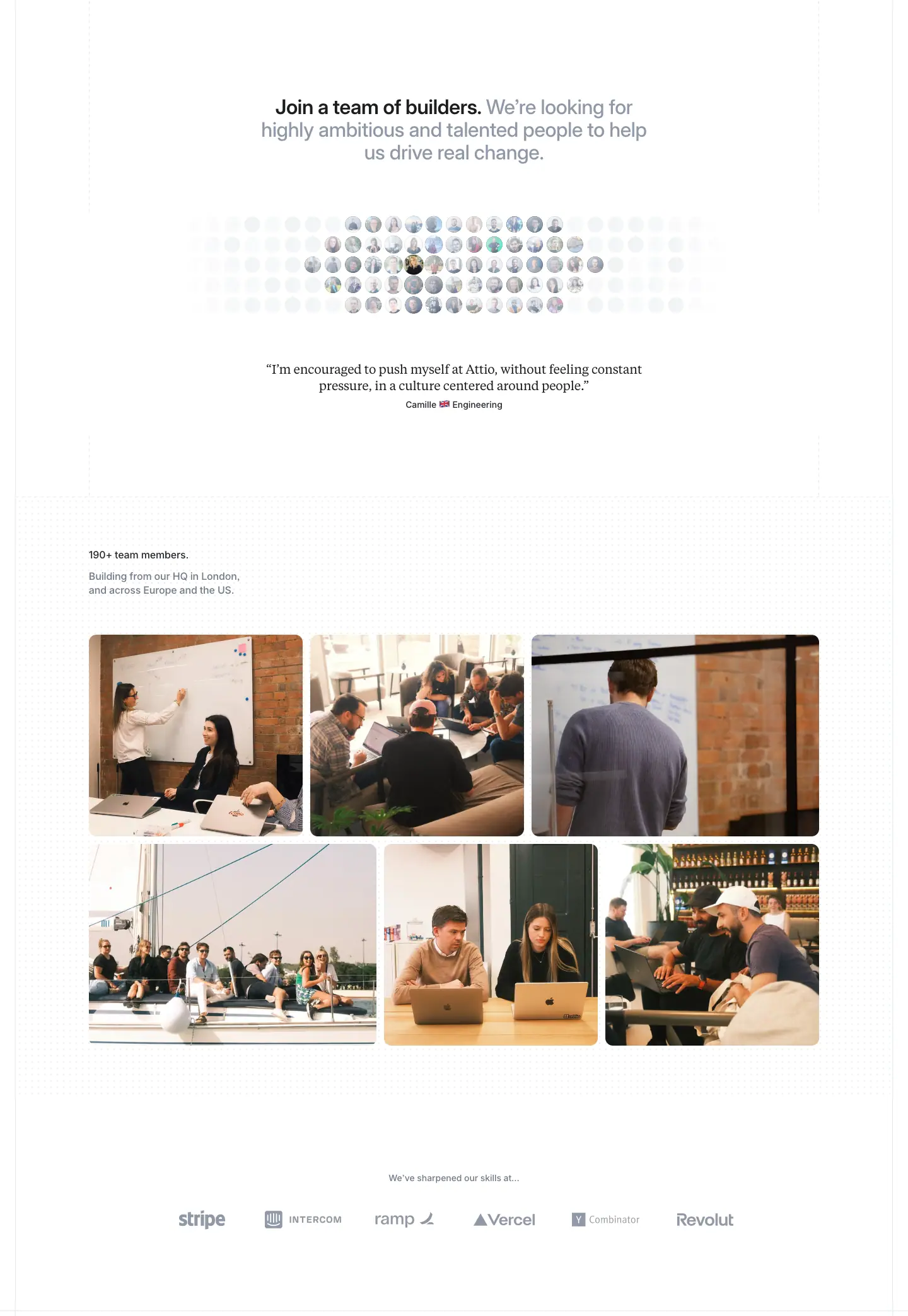
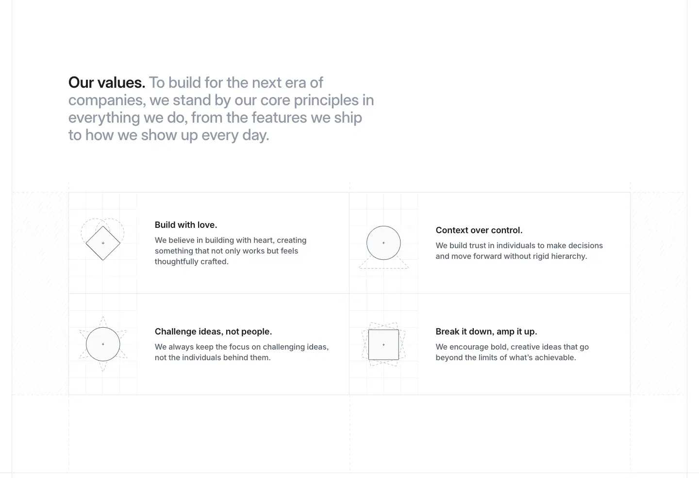
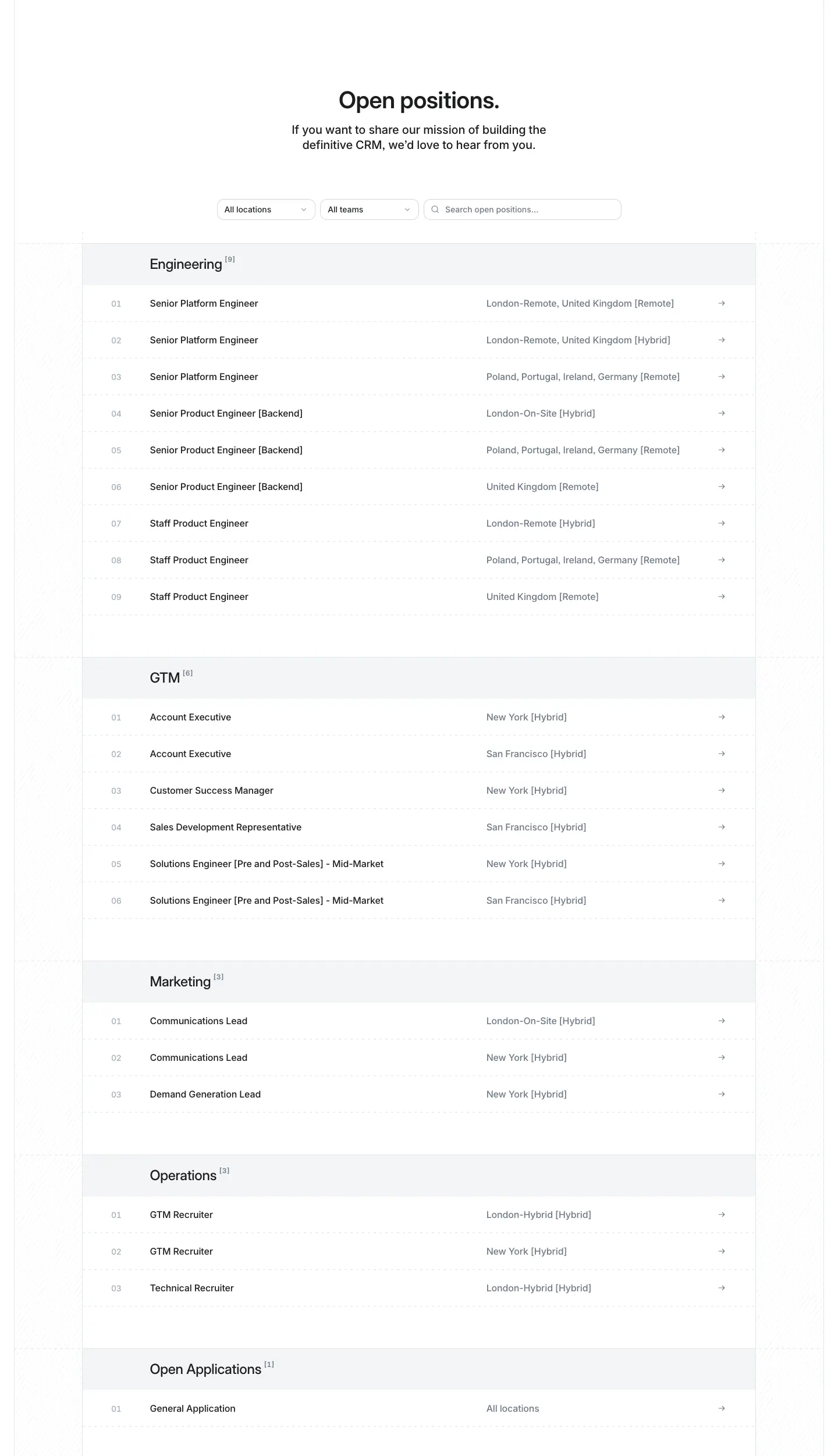
- Hero.
- A "Careers" pill. The headline "Our mission is to build the platform for agentic revenue." is at 56/60, weight 600, left-aligned, 840px wide.
- The lead is at 20/26, weight 500,
#232529, followed by a "Join the team" button and a stack of small avatars.
- On the right, a cloud of small grey squares fades in from the bottom-right corner. It is a monochrome version of the AI dot cloud.
- Below sits a full-width video poster, "What it's like building the future of CRM at Attio", with a "Play video" chip on a blurred office shot.
- Join a team of builders.
- A two-tone H2 at 32/36, weight 600, centred.
- A circular cluster of team headshots in grayscale, desaturated toward the edges.
- A quote set in Tiempos Text at 20/26 ("Everyone at Attio constantly reflects on how we can do better…").
- "190+ team members." and a 3 × 2 grid of colour office photos. The careers page alone uses colour photography of the team.
- A logo row of where the team has worked: Stripe, Intercom, Ramp, Vercel, Revolut.
- Our values. A 2 × 2 grid of values: "Build with love.", "Context over control.", "Challenge ideas, not people.", "Break it down, amp it up.". Each has a thin line icon in a hairline circle or diamond and a grey paragraph.
- Open positions.
- A centred H2 with filters "All locations" and "All teams", and a search field.
- Roles are grouped by team: Engineering, GTM, Marketing, Operations, Open Applications. Each group has a light grey header bar with a count.
- Each row shows the role, the location in grey ("London (Hybrid)") and a → arrow.
- A "Keep up to date" newsletter row and the standard footer.
Why
- Photos of real people only where people are the product, meaning careers and about. Everywhere else the product is the image.
- "Context over control" reuses the product's key word ("context") as a cultural value. The brand vocabulary is consistent inside and out.
Career post (template) · /careers/
Sample: /careers/staff-product-engineer-london-remote-hybrid.
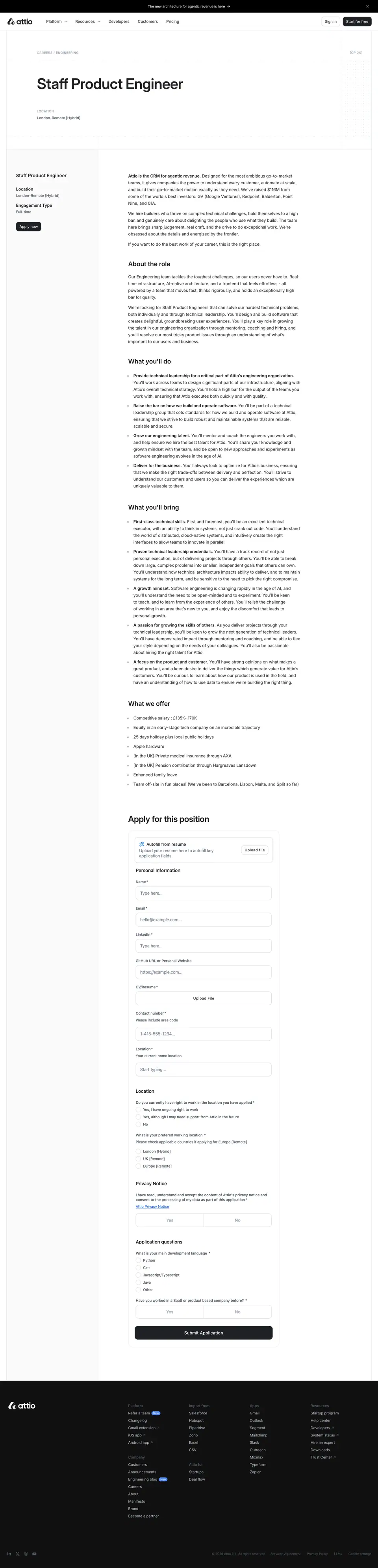
What it is
- Header: the H1 "Staff Product Engineer" at 56/60, weight 600, 857px wide. Below it, caps meta columns such as "LOCATION" (12/14, weight 600, +0.72px, #a4adba) with their values.
- Left sticky card (276px): the role name (18/24, weight 600), Location, Engagement Type, and an apply button.
- Main column (656px): "About the role", "What you'll do", "What we're looking for" and similar sections as Inter 24/30, weight 600 H2s, with 16px body and bullet lists.
- "Apply for this position": the application form is embedded on the page. It has text inputs, file upload and selects, all in the site's 10px-radius field style.
Why
- The same document layout as a blog post (meta caps, 656–811px reading column, sticky side rail). A job description is long-form reading.
Brand guidelines and press kit · attio.com/brand
Attio's own brand rules. This page is the primary source for doc 10 (brand assets).
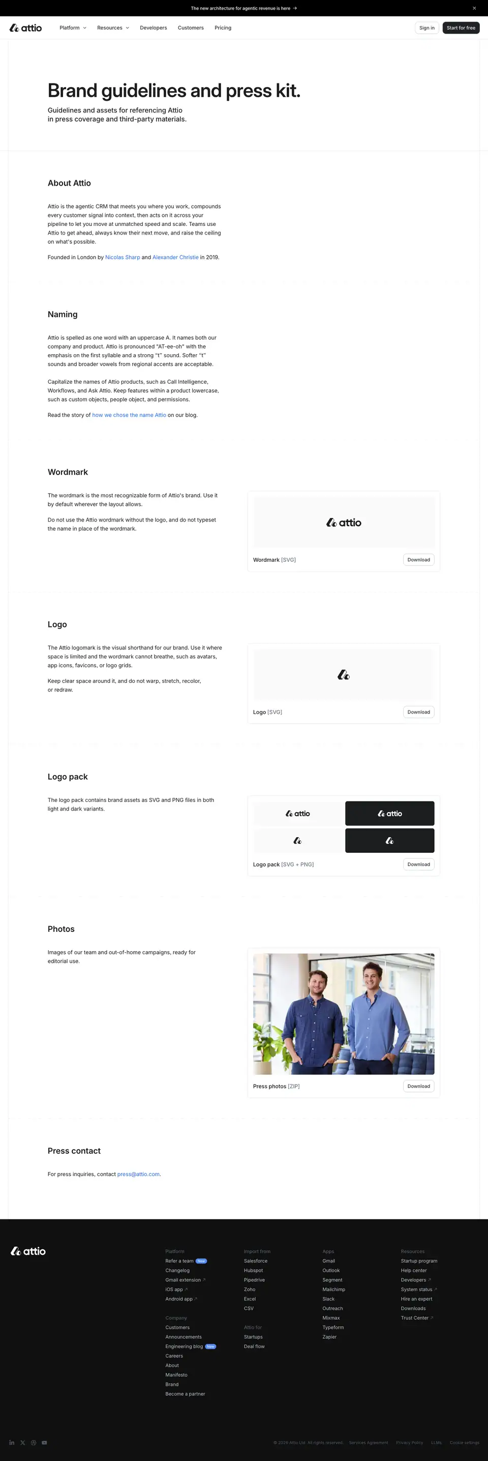
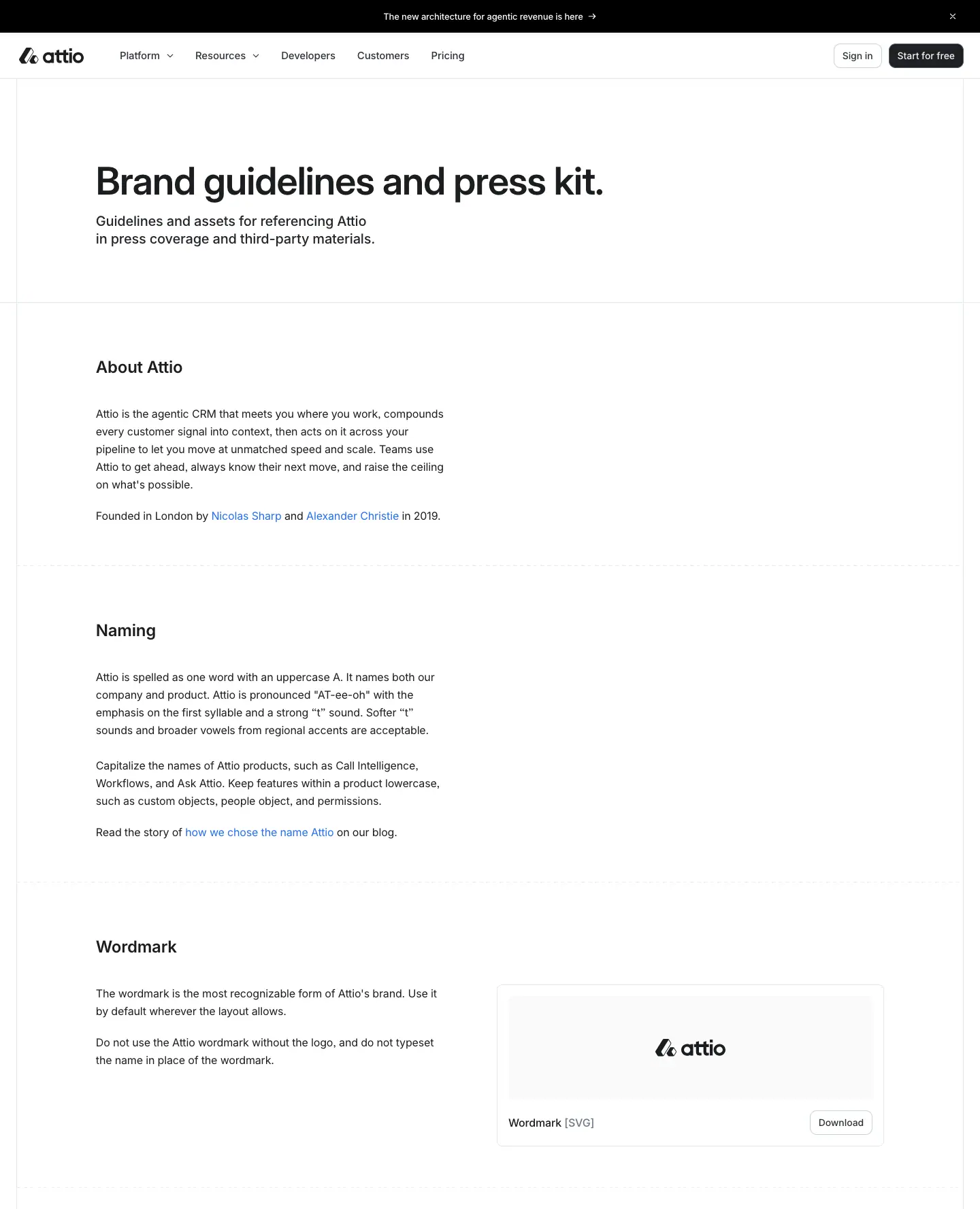
What it says (quoted from the page)
- About Attio: "Attio is the agentic CRM that meets you where you work, compounds every customer signal into context, then acts on it across your pipeline…" Founded in London by Nicolas Sharp and Alexander Christie in 2019.
- Naming: "Attio is spelled as one word with an uppercase A. It names both our company and product. Attio is pronounced 'AT-ee-oh' with the emphasis on the first syllable and a strong 't' sound." Product names are capitalised (Call Intelligence, Workflows, Ask Attio); features stay lowercase (custom objects, people object, permissions).
- Wordmark: "The wordmark is the most recognizable form of Attio's brand. Use it by default wherever the layout allows. Do not use the Attio wordmark without the logo, and do not typeset the name in place of the wordmark."
- Logo (logomark): "Use it where space is limited and the wordmark cannot breathe, such as avatars, app icons, favicons, or logo grids. Keep clear space around it, and do not warp, stretch, recolor, or redraw."
- Logo pack: "brand assets as SVG and PNG files in both light and dark variants."
- Photos: "Images of our team and out-of-home campaigns, ready for editorial use."
Official downloads (linked from the page, not mirrored here)
| Asset |
URL |
| Wordmark (lockup) |
https://attio.com/brand/v1/attio-lockup.svg |
| Logomark |
https://attio.com/brand/v1/attio-logomark.svg |
| Logo pack (SVG + PNG, light and dark) |
https://a.storyblok.com/f/234930/8a6f825750/attio-logo-pack.zip |
| Press photos (ZIP) |
https://a.storyblok.com/f/234930/f502925ba2/attio-press-photos.zip |
This research site does not redistribute the files. Crops of the logo as rendered on the site are in images/assets/.
Layout
What it is
- A document layout. The H1 "Brand guidelines and press kit." is at 56/60, weight 600, left-aligned. A 20/26 lead follows.
- Each topic is an H3 at 24/30, weight 600 (Inter) with a 2-column row: text on the left, and on the right a ≈560px asset preview tile with a "Download" link (14/20, weight 500, #2e3238). The tiles are a light #fafafb box with the mark centred, and the logo pack shows light and dark versions side by side.
- The photo tile shows the two founders, in colour.
Why
- A brand page that is itself an example of the brand: monochrome tiles, hairline frames, 500-weight Inter, and no decoration.
Startup program · attio.com/startups
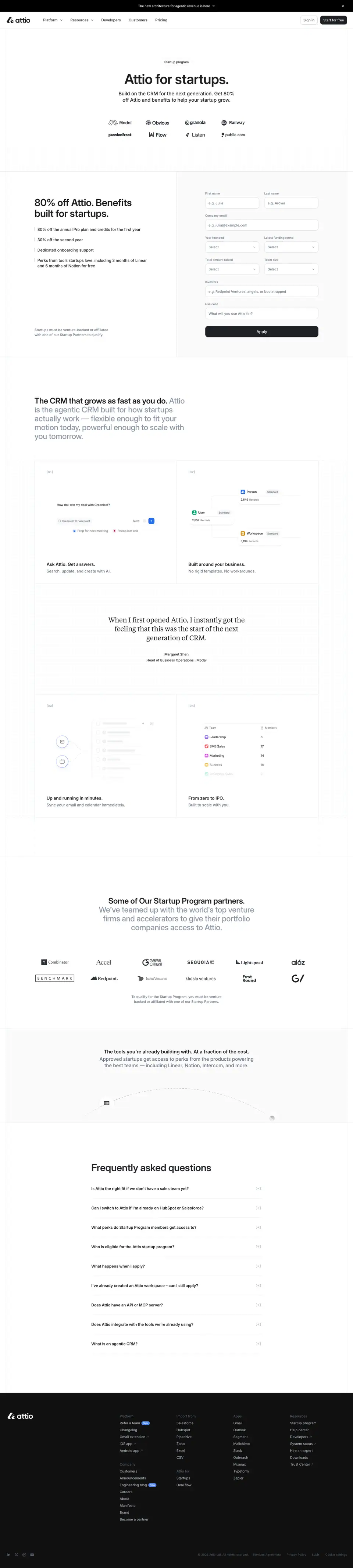
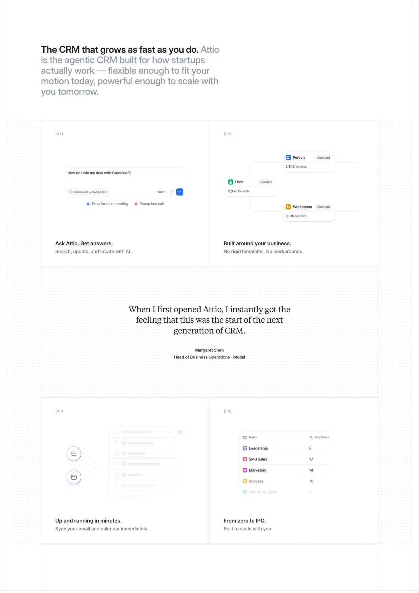
What it is
1. Hero. A "Startup program" pill. The headline "Attio for startups." is at 56/60, weight 600, centred. The lead "Build on the CRM for the next generation. Get 80% off Attio and benefits to help your startup grow." is at 20/26. A 2 × 5 unruled logo wall follows: Modal, Obvious, Granola, Railway, passionfroot, Flow, Listen, public…
2. Offer + form.
- Left: a second <h1>, "80% off Attio. Benefits built for startups." at 40/44, weight 600, with a list of benefits ("80% off the annual Pro plan and credits for the first year", "50% off the second year", "Dedicated onboarding support", "Perks from startups tools…").
- Right: an application form on a #fafafb panel. It has paired fields (First name / Last name, Company email, Plan to purchase, Latest funding round, Total amount raised, Investors, Start date) and a full-width black "Apply" button.
3. The CRM that grows as fast as you do. The product-page 2 × 2 cell grid ([01]–[04]), with the Tiempos testimonial in the middle.
4. Startup program partners. "Approved startups get access to perks from the products powering the best teams — including Linear…" at 20/26 #6f7988, over a grid of partner logos.
5. FAQ accordion.
Why
- The form sits beside the offer, above the fold of section 2. The page is a conversion page: the offer, the eligibility fields and the button all live in one screen.
- The form asks for funding round and investors. It qualifies the startup and doubles as lead data for sales.
Partner programs · attio.com/partners
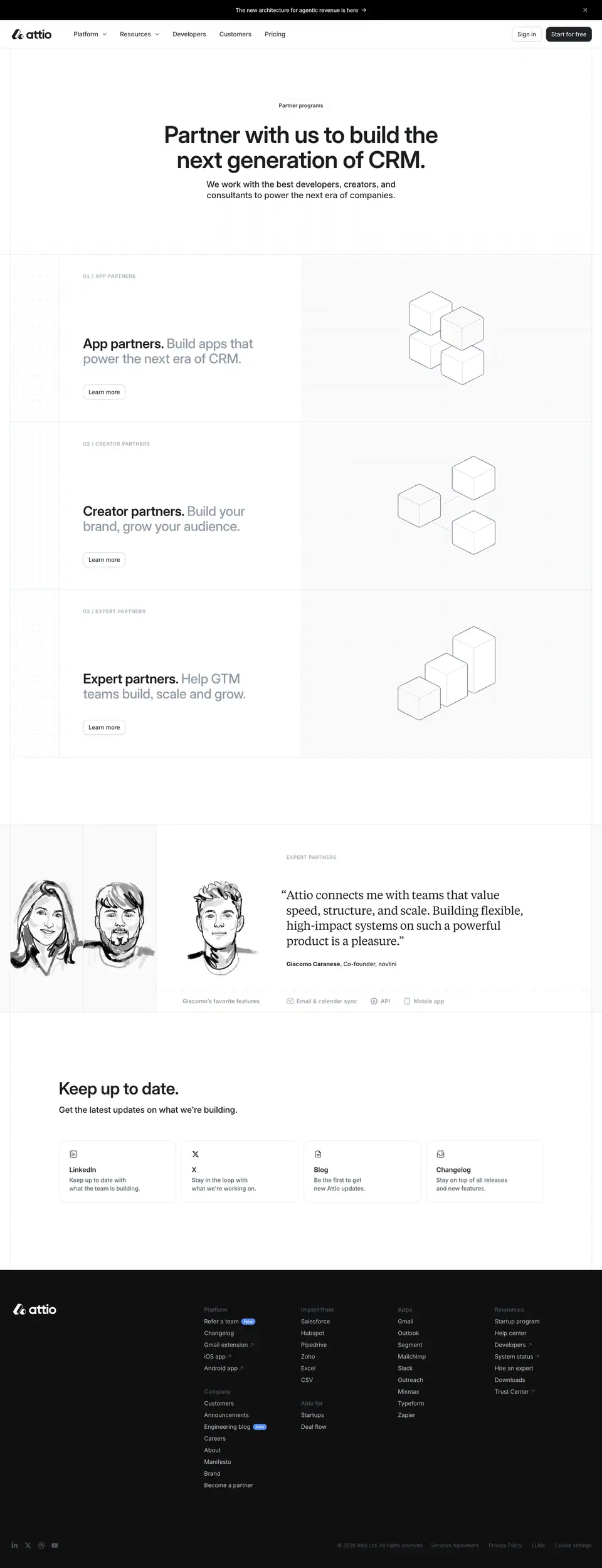
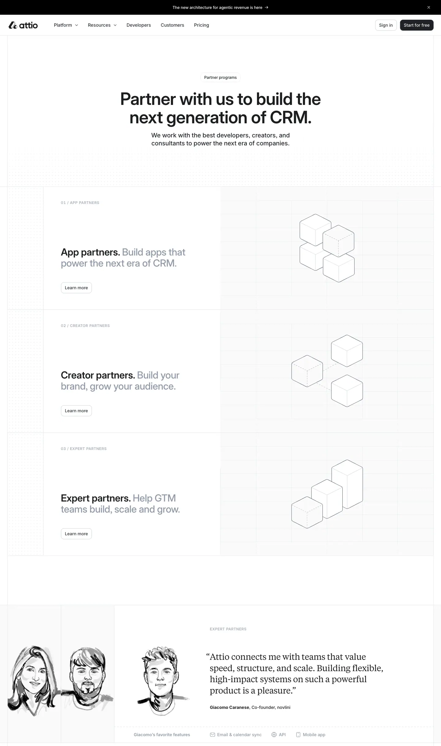
What it is
1. Hero. A "Partner programs" pill. The headline "Partner with us to build the next generation of CRM." is at 56/60, weight 600, centred, 840px wide. The lead "We work with the best developers, creators, and consultants…" is at 20/26.
2. Three programme rows, each a split cell:
- Left: a numbered caps label "01 / APP PARTNERS", "02 / CREATOR PARTNERS" or "03 / EXPERT PARTNERS" (12/14, weight 600, +0.72px, #a4adba). Then a two-tone heading ("App partners. Build apps that power the next era of CRM.") and "Learn more →".
- Right: an isometric wireframe illustration of stacked hairline cubes, a different arrangement per programme, on a #fafafb panel.
3. Expert partners quote. Pen-line portraits of two partners sit next to a Tiempos quote: "Attio connects me with teams that value speed, structure, and scale…". Below are the partner's name and small service tags.
4. "Keep up to date." A newsletter row at 40/44 + 20/26.
Why
- Isometric cubes = building blocks. That is the literal metaphor for an ecosystem of add-ons. They are drawn in the same 1px grey line as every other Attio diagram.
- Pen portraits for people outside the company, dithered photos for developers (platform-developers.md), and colour photos for employees (careers.md). The rendering style tells you who you are looking at.
Guides feed and guide post · /f and /f/
/f is a separate sitemap (/f/sitemap.xml, 28 URLs) of SEO explainers and comparison pages ("Best CRM API in 2026", "Zoho CRM alternatives", "What is a CRM?").
Feed index · /f
What it is
- The H1 "Feed" is at 56/60, weight 600, left-aligned. The subtitle is "A library of explainers on CRM and GTM.".
- A plain list of rows, each with a title (H2 at 18/24, weight 500, 695px), a 2-line grey summary and a date on the right. Rows are divided by hairlines. There are no images and no categories.
Guide post · /f/what-is-a-crm
What it is
- The blog-post template (see blog-post.md): an H1 at 56/60, "By Attio Team", body at 16/26 weight 400, H2s in Inter 24/30 weight 700, and a sticky TOC.
- New element: "Open in ChatGPT" and "Open in Claude", two 36px outline buttons (140 × 36 and 128 × 36) under the byline.
- "More articles" closes the page with a 32/36 H2 and a card list.
Why
- The "Open in ChatGPT / Claude" buttons serve the AI-search era. They hand the article to an assistant as context, the same idea as Attio's "LLMs" footer link and its robots.txt, which explicitly allows GPTBot, ClaudeBot, PerplexityBot and Google-Extended. SEO content is now written for LLM answers as well as Google.
- The minimal list design. These pages exist for search traffic. The index is a crawl hub, not a destination.
Paid landing page and Download
Paid landing page · /p/ai-crm
The sitemap lists 54 /p/ pages plus 171 localised copies (/de/p/…, /fr/p/…, and Danish, Spanish, Italian, Dutch, Polish, Portuguese and Swedish). These are ad landing pages with campaign-coded slugs such as crm-eu-security-1302-26.
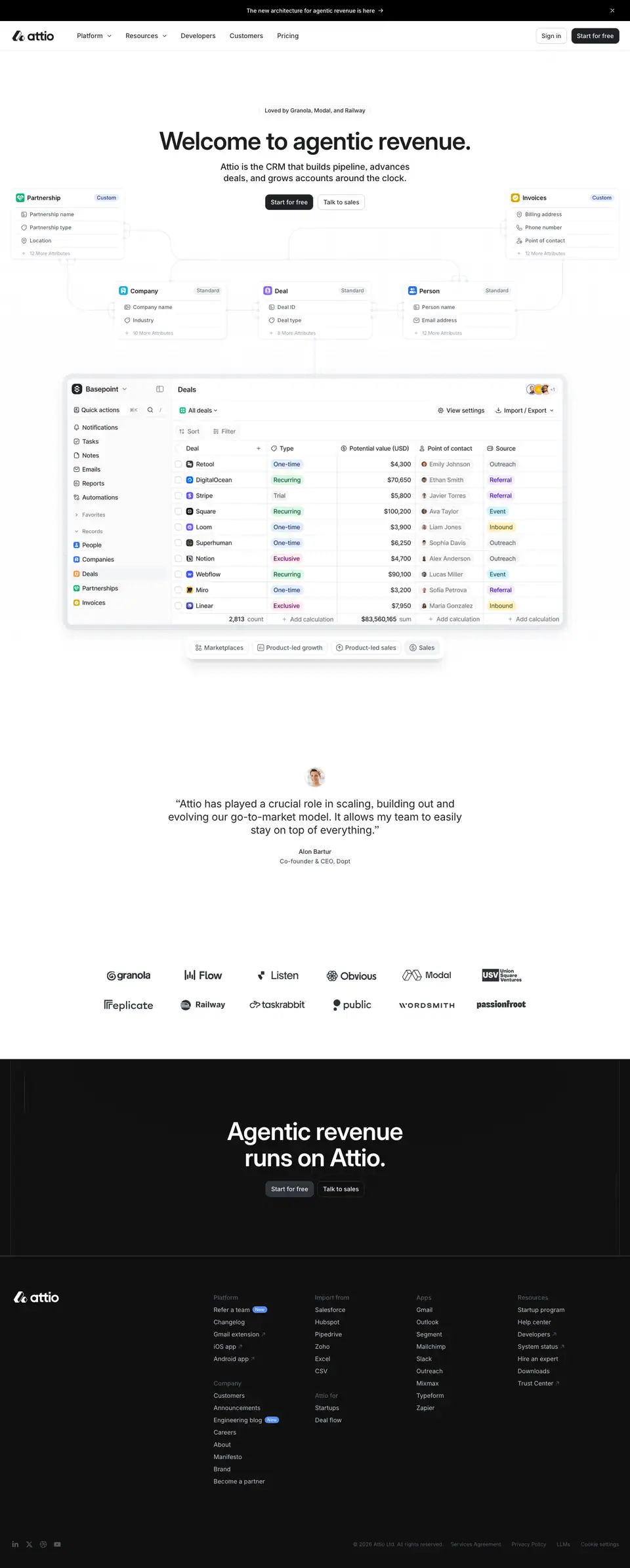
What it is
- The nav is the full sitewide nav (Platform, Resources, …). It is not stripped for the ad page.
- Hero: the pill "Loved by Granola, Modal, and Railway" (13/18.2), the home H1 "Welcome to agentic revenue." (56/60 here, not 64), and the lead and CTAs.
- Product: a large product window shows a Deals table (Basepoint workspace) surrounded by floating object cards — Partnership, Company, Deal, Person, Analytics — connected like a data-model diagram.
- Proof: a centred testimonial with a small avatar, then a 2 × 6 logo wall.
- Close: "Agentic revenue runs on Attio." and the footer.
- Total height is 3,583px, about a fifth of the home page.
Why
- One screen of promise, one screen of product, one screen of proof. Paid traffic gets the shortest path to "Start for free". The social proof moves into the pill above the H1, so it is read first.
- Localised copies under language prefixes let ad campaigns run per market without touching the main site.
Download · /download
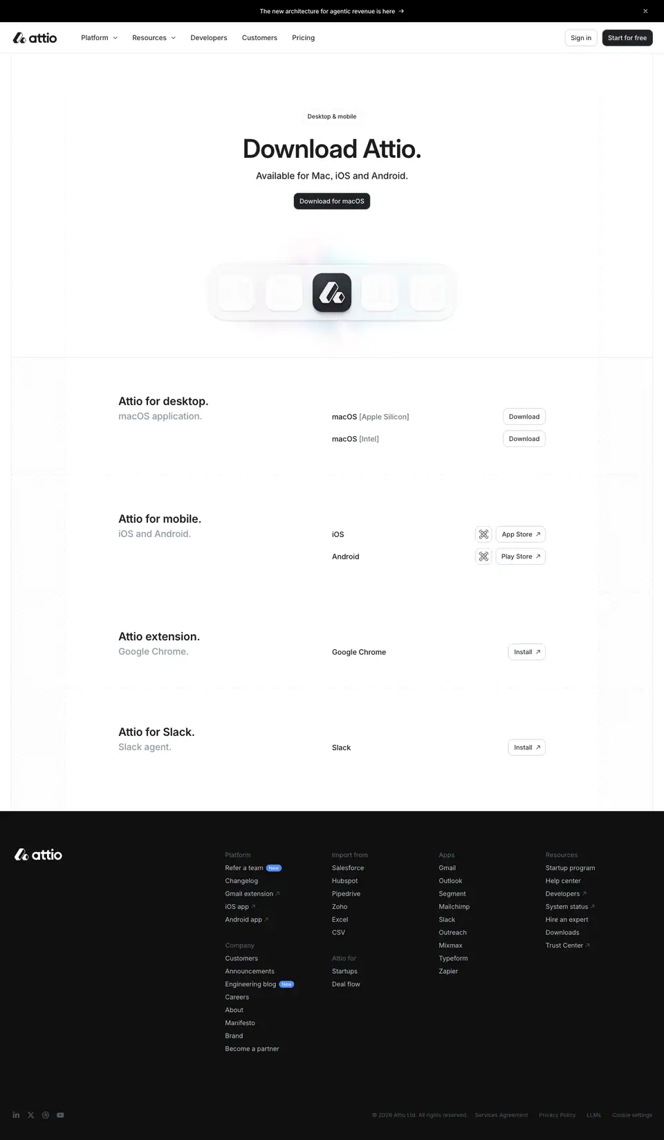
What it is
- A "Desktop & mobile" pill and "Download Attio." at 56/60, weight 600, centred.
- Four rows (H3 at 24/30, weight 600, 927px): "Attio for desktop.", "Attio for mobile.", "Attio extension.", "Attio for Slack.". Each row has its own download buttons and a product image.